
A Hit And A Miss
Standing out for the right and wrong reasons.

I don't do a ton of design critique here, but there were two big things I saw this week that are worth talking about because they're so good/bad and speak to larger themes.
The Hit
The design work done by Forge, for the Zohran Mamdani's campaign for mayor of NYC is amazing. I don't care what your political affiliations are. It is objectively good design. And he won his primary in what sounded like an upset – so, also effective.
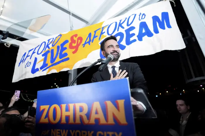
American political advertising is boring as hell. Some combo of red, blue, a star, a stripe, and a generic sans serif font – an eagle if you're fancy. Sometimes the Dems tend toward blue, sometimes the Reps tend toward red. (Has anyone considered purple as a genius move?) I get it, it's the flag colors. But this is demonstrative of the larger theme of no one wanting to actually stand out. When someone does want to stand out, it's not really that hard to do, and it stands out loudly – bright red, bright blue, and bright yellow. The use of an additional warm color (yellow) makes everything feel more energetic and exciting. That yellow stands out really well in every press photo I've seen. The cool blue and warm red of most campaigns kind of cancel each other out. Not to mention a lot of folks use dark blue and dark red. I barely consider dark red a warm color. In a bid to seem trustworthy and stable with these dark colors, it comes off as barely breathing.
The typography feels like hand painted signs, and this reel talks a bit more specifically about the references than I can, not being a New Yorker. But lots of bodega sign and local vernacular inspiration. Makes a lot of sense for a city office, right. Some references are even drawn very specifically from places like the iconic Silvercup Studios sign. This all feels very local, personal, and like there is a human behind everything. It feels like it represents someone who is in touch with the city as it is, rather than as it is imagined to be. To be clear, this does not feel homemade. It is clearly a professional campaign, but anti-corporate in a way.
And this is just the visual design. I'm not even getting into messaging here. Every visual element – color, type, illustration, references – serves to communicate his position. He is signaling something very different. No notes.
The Miss
While I was aware of the upcoming Bezos wedding, I was not paying attention until I saw someone on the socials make fun of the invitation as being very "put a bird on it." In case you forgot or just need a laugh:
Of course I searched for it, (you should too if you want to see it) and the assessment was spot on. I really couldn't decide if it was a joke or not. They say it was "leaked," but maybe this was a decoy. Seems like kind of an awesome practical joke to play. There are birds, butterflies, a dragonfly, gondolas (because Venice), feathers and shooting stars. Every crap cute thing crammed in without even being artfully arranged. Not much love given to the type either – there's no heirarchy and it's not even ragged.
If it is real, they are welcome to like what they like, but it sure goes to show that even that kind of money doesn't buy you taste. It's not even fun or weird or so tacky it's good. And who is the designer? Or was the issue that there wasn't one? It almost seems like it was done by an assistant who had used Canva once. As a counterpoint, I've been seeing a lot of folks post about this Dior invitation which is a little wacky, but has a historical reference and is a beautifully made object.
I do think it's incredibly important right now for brands to stand out from the sea of anti-risk. Hire a pro, and stand out for the right reasons.