
A Poke In The Ribs
A new (old) structure for looking at design.

I was reminded the other day of Roland Barthes', Camera Lucida. It's a small book, and in it he talks about how he looks at photography, what it means and why he likes what he likes. I did my photography thesis on it. He splits looking at a photograph into two parts: the studium and the punctum. (Which autocorrect keeps endlessly changing to stadium and puncture so apologies if I miss one.)
But it seemed to me like it might make just as good a way to look at design or even think about design feedback.
Barthes says, "...application to a thing, taste for someone, a kind of general, enthusiastic commitment, of course, but without special acuity...it is culturally (this connotation is present in studium) that I participate in the figures, the faces, the gestures, the settings the actions."
Put simply, I think of the studium as the facts of the photograph. What is happening? What are the elements that you see? What is the historical context? What is the contrast? And these facts can be interesting unto themselves.
However, "The second element will break (or punctuate) the studium...it is this element which rises from the scene, shoots out like an arrow, and pierces me. A Latin word exists to designate this wound, this prick, this mark made by a pointed instrument..."
The punctum is that punch in the gut feeling you have had about a photograph (or any artwork) that is visceral and emotional. You don't just appreciate it as interesting, you feel strongly about it. It stops you.
Can we apply it to design? Let's give it a shot.
Studium:
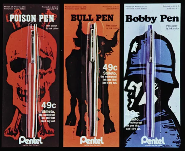
If we talk about the studium, the facts, these are really bold illustrations. The colors illustrate the pen colors. Each one has a slightly different flair with typography. He did some other pretty ballsy stuff for Pentel, and sadly, I don't see it happening today (historical context).
Punctum:
But these stopped me. I had never seen pen packaging that I felt excited about. Was this real? How did he get away with "Poison Pen" for pete's sake? It's not just based on boldness in the design sense, but a strategic boldness. I imagine Pentel went there because they wanted to stand out in a hugely saturated everyday pen market. Job done. I want every color.
I'll use his TFIB's words broken into the two parts:
Studium:
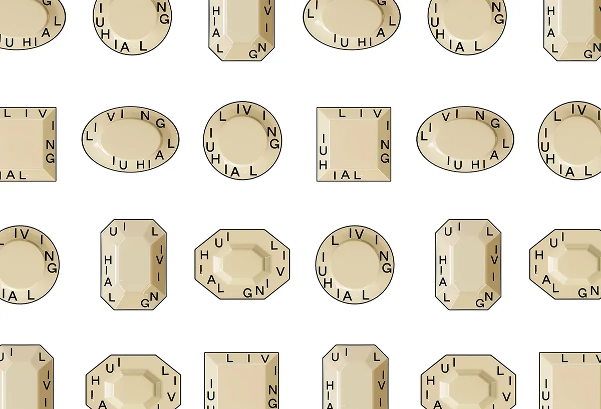
A recent project they released is for LAI HUI Living, a new Cantonese restaurant under the brand of Laihui. They created a brand visual system that utilizes encircling typography situated around differently shaped plates. They say that this represents “sitting around the table and eating together with the same plate,” giving a sense of community to the branding.
Punctum:
For me, the plates end up looking like gemstones, giving the brand a very luxe feeling while still having a very approachable essence. The concept is so simple, yet when you see it in all it’s applications, it all comes together in such a nice way.
Agree. It's one of those projects I see and think, "Why has nobody else thought of that." Or, "Why the hell didn't I think of that." The emotion here is pure jealousy because it's so damn beautiful.
So much punctum here that we just celebrated the 40th anniversary of this spot.
I think studium/punctum is helpful because it forces you to think about separating the logical from the emotional when talking about design. What parts of the design are which? How do they help each other? On top of whatever logical things you need to communicate, the goal really is to make you feel something about a product or brand. Test it out and let me know how it works for you.