
Boring on Purpose
Not not a post related to Pantone’s Color of the Year.

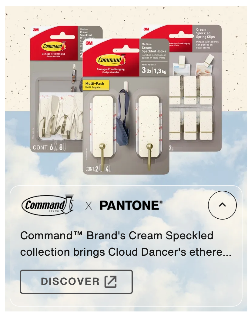
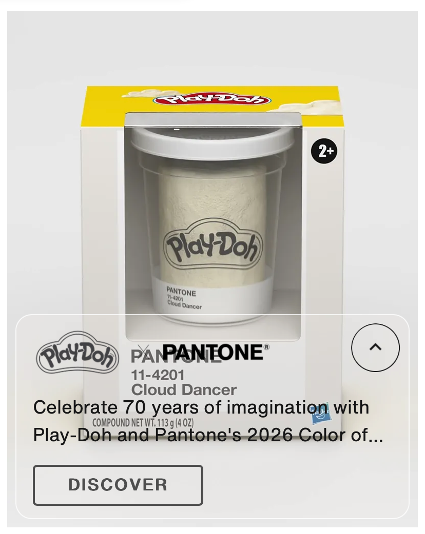
Nobody needs another post about Pantone’s new Color of the Year, which is basically Wheige, so I’ll get this set up out quickly. On the one hand, could it be more boring? On the other, and to their credit, I have not heard this much conversation about the COTY in years. Someone pointed out that the Oxford Word of the Year is “rage bait” so you shouldn’t really be surprised. The collabs listed on the Pantone page are hilarious – Command Strips were already white.
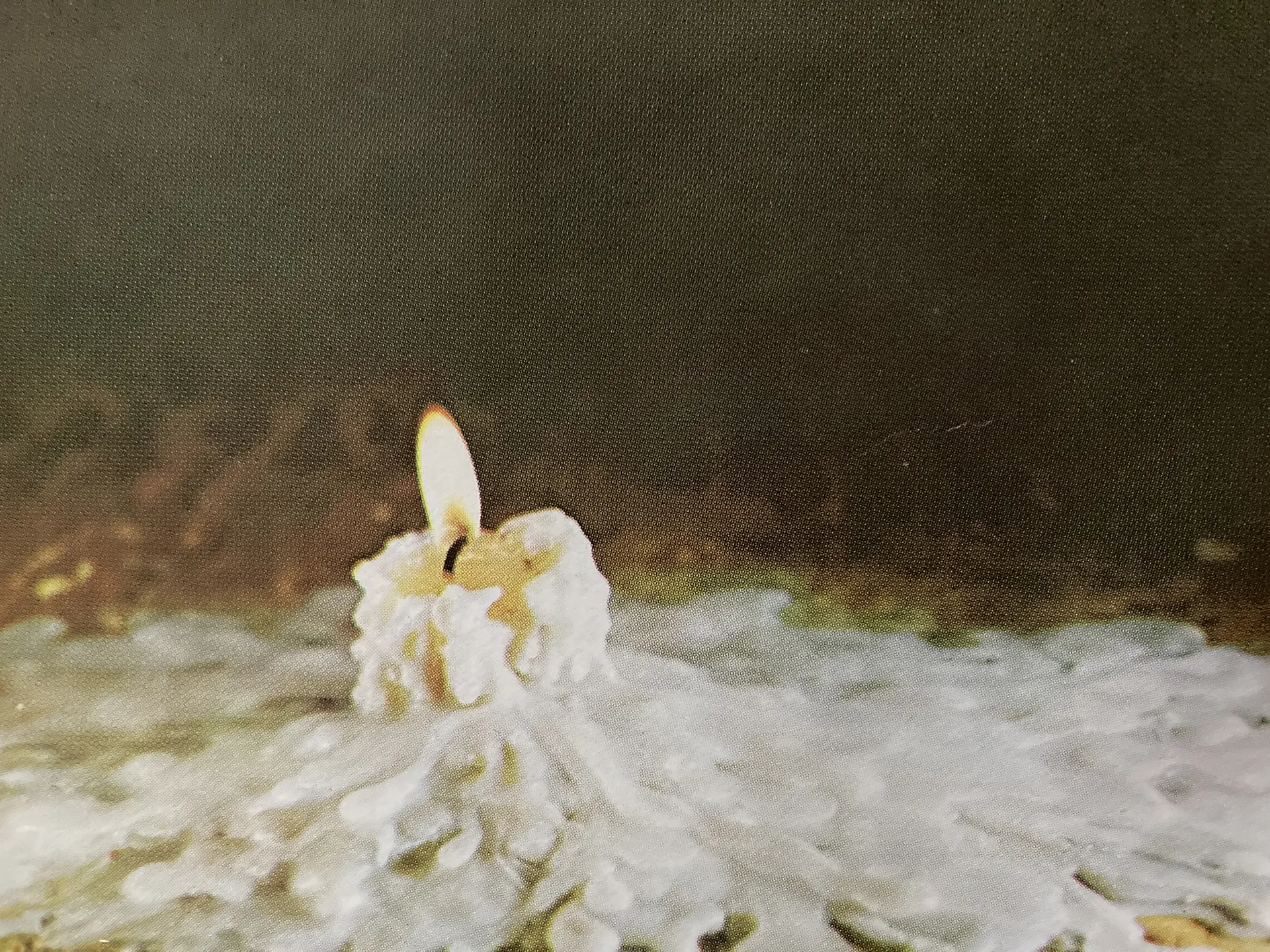
Look, white is a design signifier as any other color*, and can stand in for a fresh start or cleanliness or whitewashing or in some cultures, funerals. But this conversation got me thinking about other places where we use “boring” colors on purpose. For example, this NYTimes article titled “Beige Is the Color of Money:”
Neutral hues have overtaken St. Moritz and other moneyed enclaves. “The ultrawealthy don’t want to show off,” says one luxury designer.
I just put together a home interiors trend report, and I haven’t really seen this trend toward less color. Instead of some overarching trend, what I see is a break between areas where there is more color and areas that are more neutral at the same time. And the break is about appearing boring on purpose.
Gen X grew up with core movies and TV shows where either the richies – Pretty in Pink, Karate Kid, Trading Places – or corporations – Office Space, The Running Man, Weekend at Bernie’s – were the bad guys. It’s our origin story. We can forgive a lot of villains, but not Steff.
There are new commercials running from United Health Care. And they have done a classic thing in response to the vitriol unleashed against them and the health insurance industry in general, which is to focus on lower level employees who you cannot possibly hate. How can you hate Crystal, a midwestern Mom-type who is recovering from some unnamed illness herself, and just wants to help others. They are real people, so I don’t want to diminish them, but the strategy behind it is to tell you the good stories so you don’t ask about the bad ones. Lots of white/beige/neutral backgrounds. Do not get upset, we are just regular folks here.
What started off as quiet luxury has become luxury-in-hiding for both individuals and corporate entities. The wealthy who show it off these days are generally either in the entertainment industry where there is some expectation that they will show you theirs, or influencers who show you theirs for profit. A lot of other wealth is laying low with whites and neutrals. Boring colors are sometimes boring on purpose.
In her IG Stories, Emily Keegin talked about how in more conservative times, white backgrounds tend to supplant black or dark backgrounds in photography. She offered up examples, and you can see the shift back and forth over time. (She doesn’t save all her Stories to Highlights, unfortunately.)
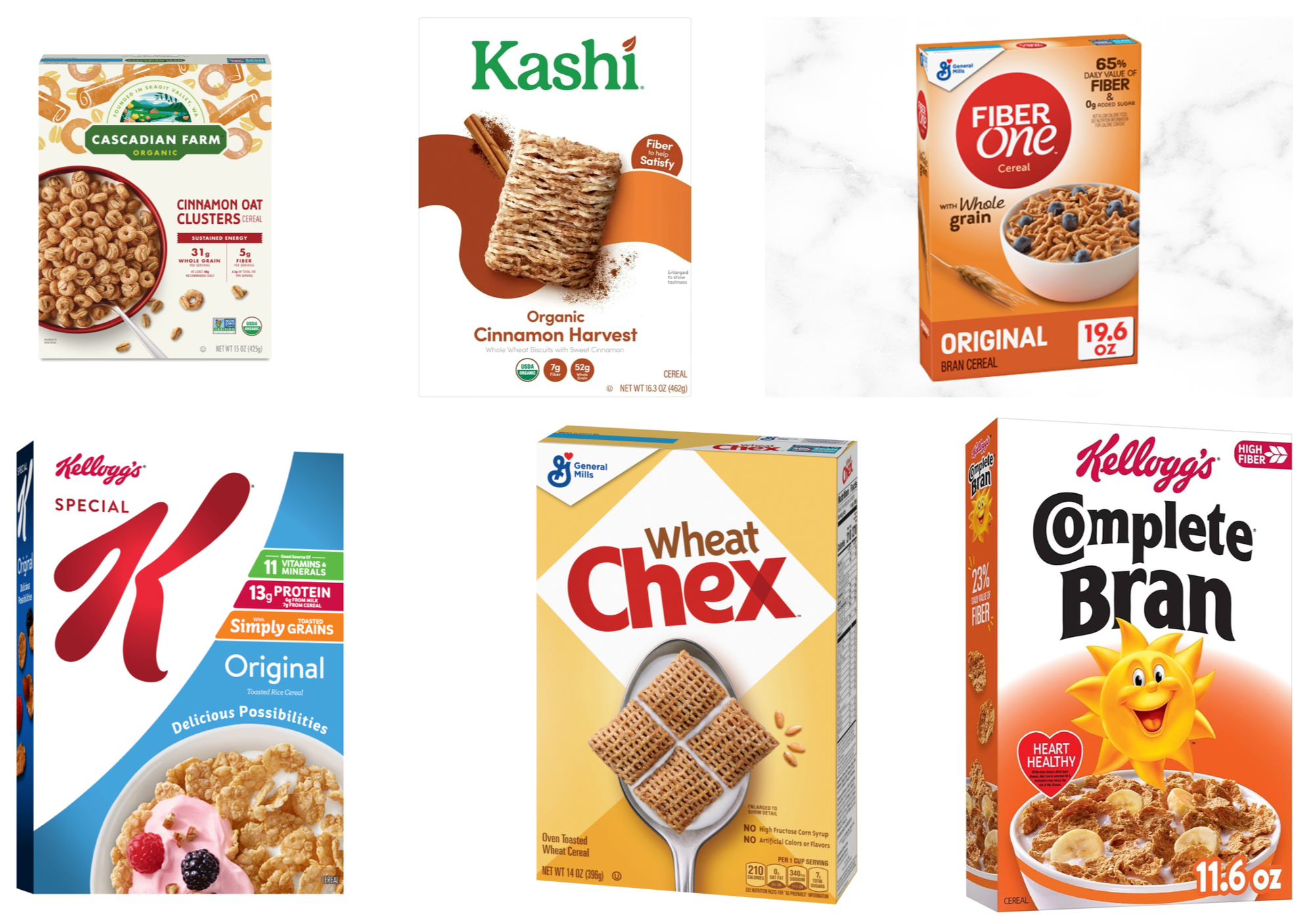
Patton Oswalt explains beautifully the difference in color between kid and adult cereals – where “bargaining beige” equals healthy. View here if the embed doesn't show.
Using white isn’t bad. It can signify wealth or health. Cleanliness or blandness. A blank canvas or forgetting. These “boring” colors can speak as loudly as anything else. Even if what they’re communicating is a desire to be understated.
*I’m not here to debate whether white is a color or all colors or no color. If it is a signifier I can use in design, it is a color for my purposes here.