Connect the Dots
How do designers get from text to visual?

I’ve been thinking about how designers connect the dots. Like how do you really get from a sentence or two in a brief to a packaging design for instance?
Here was my definition of creativity from a previous article:
Creativity in Design: I think this is a way of making connections between things that don’t seem related – a way of remixing in your brain anything and everything you’ve ever taken in, to solve a problem or look at a problem holistically. You might use unique applications or materials or references to do so, and apply it to visual communication.
This connecting of dots has another name and that is “intertextuality.” Which is actually a totally SFW concept other than it sounds. It is using one text to better read another text. Now, you might think this is all very literary, but “text” can mean a novel, a painting, a song, a podcast, etc. So that if you are looking at a painting and it reminds you of a novel from the same period, that may give you a better understanding of both. Or it could remind you of another unrelated artwork. We all connect things in our minds uniquely, and this ultimately helps us “read” whatever we’re looking at in a deeper way.
Here’s the Connect the Dots Experiment:
You need to communicate farm fresh fruit flavor.
•
Fresh fruit has bright colors: yellow for lemon or a different yellow for banana, red for sweet apple, green for tart apple, orange for orange.
•
A font could feel juicy by being rounded in some way. Or the roundness could mean fresh in that it is the opposite of rotten since a rotten apple is wrinkly and dry. Or maybe the font could just be really simple and clean.
•
Maybe the fruit should look fresh by having some water droplets on it. This could signify that it’s freshly picked representing dew from the farm. Or, maybe like your grocery store, they mist the fresh produce. This might also help convey juicy which is a related concept to fresh. The water droplets could also mean cold by representing condensation.
•
Going back to farm, there could be something like a fence or orchard in the design. Or, maybe the fruit is presented with a few leaves still on to say freshly picked right off the tree.
•
To balance out other things that may come to mind about a farm, you want to convey that it’s clean, so using white in some way can create balance. Fresh and direct from the farm, but delivered to you in a clean way.

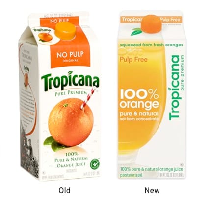
Tropicana takes another step and stabs a straw directly into the orange. What’s fresher than that? They got into trouble with the redesign on the right because they took too much personality out of the design. Gone are the signifiers of farm or the fruit itself. You’re left with something that feels generic, and they have since gone back to a design more similar to the old.
But this experiment is a good example of how a simple sentence can connect the dots in a designer's mind with a variety of different design elements. You could show the farm. You could cut the fruit and see the inside. You could show a whole bushel of oranges. There are infinite ways to take it and still be within the one sentence brief. That’s why a more specific insight is useful in drilling down to the particular thing you’re communicating. Designers need some constraints.
I’ll get off my Rory Sutherland appreciation society tip real soon, but he says that advertising is the kind of job where:
"...almost anything you do can make you better at your job."
This is true especially as a designer. The more you experience different kinds of “texts” the more connections you can make. The better you can "read" those texts. The more connections you have available, the better you can connect the dots to the final design.

