Deciphering Feedback
Make the form of your feedback more clear and avoid errors.

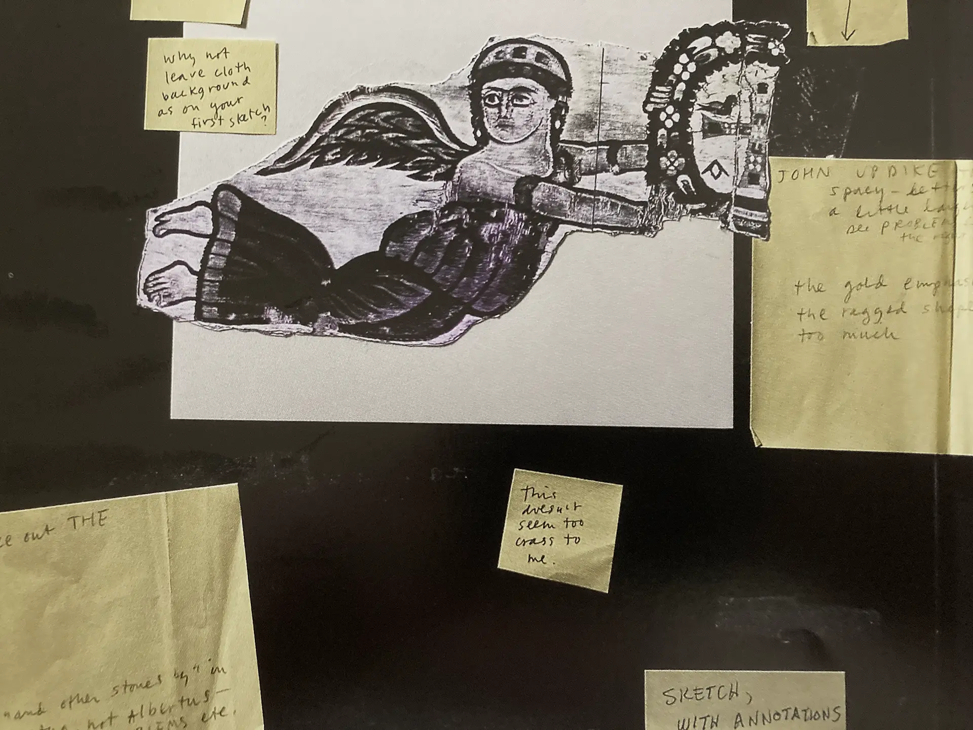
I’ve already written about improving the content of feedback by using The One Rule. This is about the form of your feedback. I spend a surprising amount of time deciphering feedback. There are two general ways that designers receive feedback that is not a direct meeting (meaning in person or video conference). In that context, either party can ask a question and clear things up. But it’s not always possible or convenient to get together at every round of edits.
Direct Digital Markup
This tends to be the least confusing way to make the form of your feedback clear whether it’s marking up a pdf or using some other digital platform. You can mark up the exact spot where you want the comma removed or the image that needs to be switched out. That right there does a ton for clarity, especially for us visual thinkers. The alternative of having to say, “in paragraph three, line ten, delete the second comma" becomes a scavenger hunt.
One curious thing I’ve noticed happening is instead of simply marking out a single word that needs to be deleted or replaced, many folks will now say, “replace [this whole sentence] with [this whole sentence].” I can’t figure out why. It’s much simpler and more direct to say “delete [word]”.
There are also some who like to print out your layout and mark them up in pen and send back a photo of the marked up layout. This is also totally cool. It still has all the benefits of marking things up digitally in that the notes are attached visually to exact places on the layout. For copy edits, this is probably even better.
Written Out as Copy or Bullet Points
Whew, this can really go either way. Some people will write down concisely in organized fashion what edits need to be made. Others follow a stream of consciousness that takes translation. This happened the other day. The only way I could make sense of it was to copy and paste it into a text editor, remove the stuff that wasn’t useful, and reorder the rest so that notes about the same thing went together. I figured it out with a little help from a colleague, but there’s where your half hour went.
Clarity is about decreasing errors. The fewer errors designers make in deciphering your feedback, the fewer times you'll need to review it.
Could we have contacted this person to clarify? Sure. And that happens a lot. In this case, the information was there, we just had to pull it out of the word salad surrounding it. Sometimes having that call doesn’t actually save any time.
A note on using page numbers. This seems really sensible. However, your page numbers and mine may not correspond. Possibly because you are looking at a pdf document in spreads. Your page 3 is really my page 4 or 5. If the content of your feedback is specific enough, I can figure it out. But this is another place where marking up directly on the layout is more clear. And if you’re commenting on video, the time code is your (our) best friend. For example, “Widget is misspelled at 1:43.” You might think this would be clear without the time code, but what if the word appears multiple times in the video?


Take a Moment
Here's what happens: I get two edits on a project. Cool. Two hours later I get three more edits. OK. Day later it’s another edit. People are busy and someone looks very quickly at the layout and sees a couple edits and sends those through. Later, they realize they have ten more minutes to hop back over to the layout, and see more edits. Again, later they’re really going to concentrate on it, and more edits show up. Some folks think they are really good multi-taskers. They’re not. It’s science. If this sounds like you, or if you need to pass layouts through multiple people on your end, it’s more efficient to take a beat and collect the notes until you have them all. Read them through one time before you hit send. You’d be surprised how often people send through notes that are contradictory.
Bonus Resource

I have't listened to this yet, because it just came out, but Freakonomics is generally great.

