Design is Visible Language
Three ways that designers are translators.

Translating words into design language for action
If you think about typical language translation, this is probably what you think of – word to word. Most people didn’t go to art school, so often designers need to translate what they say into different words that make sense to us as ways to take action. For example: Something feels flat about this design. Or it needs more punch. Or the dreaded, "make it pop." Depending on the context, I might translate those statements into something like: it needs more contrast. Or the colors need to be brighter. Those have been translated to statements that are easy to do something about. Now, did I translate that correctly? It’s an educated guess. I could always ask more questions. Sometimes you just have to take your translation and see if it works.
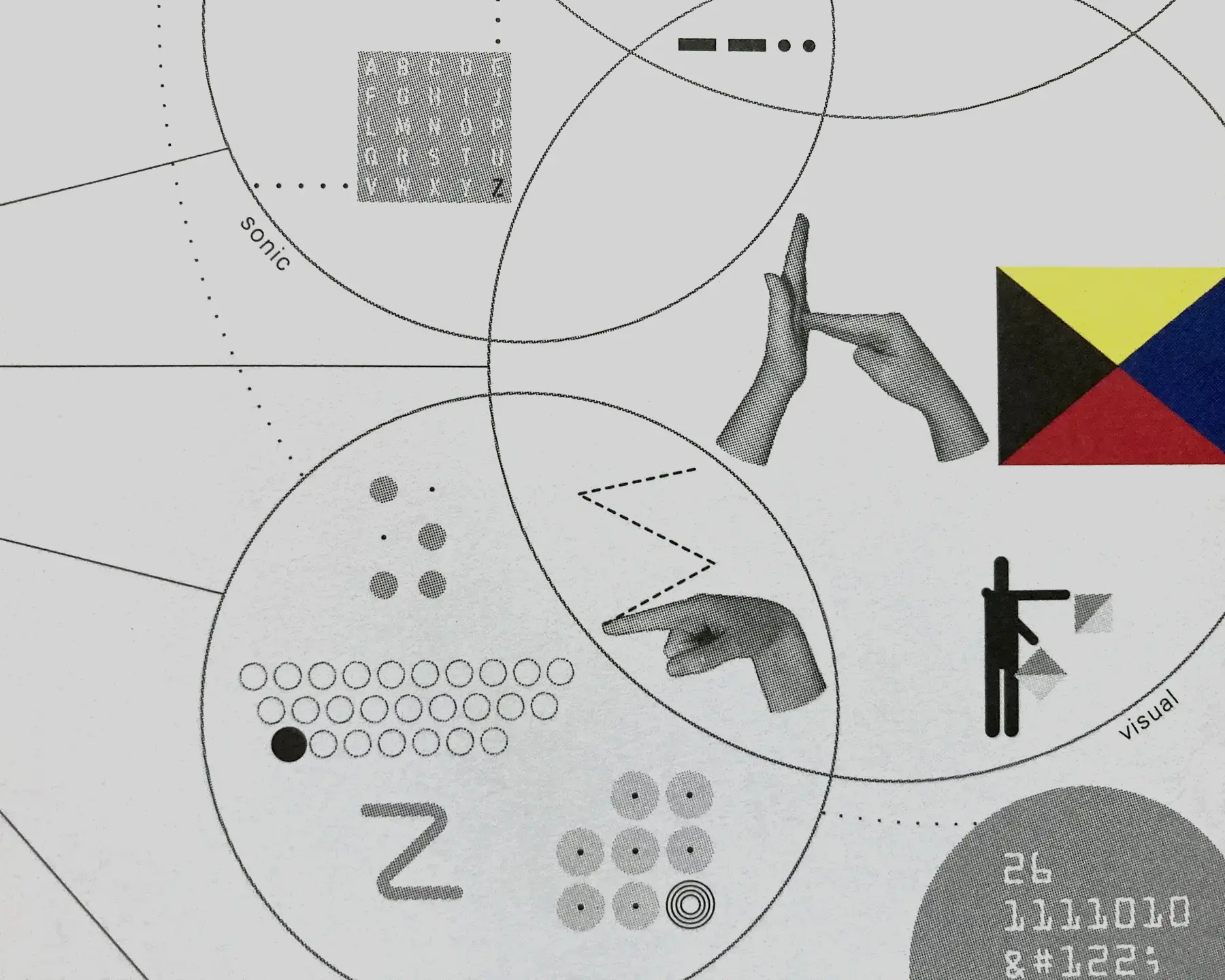
I love the phrase "visible language," and I stole it from Muriel Cooper.
Translating what is too much information or not enough
Sometimes what we need to do is translate what is the right amount of information. Generally, and hopefully, you start with a lot of information and part of the job of design is to distill that into an amount of information that is both appropriate to the project and worthy of someone’s attention.
I had a project where someone had a ton of data about a project, and they really wanted to go through ALL of it in a presentation. The other person had mostly a vibe that they wanted to get across. I got called in to translate. The solution was to edit only the most relevant data, and combine that with visuals to set the vibe that would connect that data with actual people. Any more information and the client would likely max out their attention and just stop listening. Any less, and we’re not making the case.
Translating words (or visuals) into visuals
A lot of what designers do is take words – a brief or brand statement – and translate those into visuals. You say the word “sad” and you understand what it means, but what does sad look like? What shape is sad? That's one translation. But we might also translate visuals into other visuals. Think about a time when you have given a designer a folder of logos or websites you like and you say, kinda like this but not this. That’s also translation. What are the elements that make sense to take forward and what is not useful? Maybe the folder tells us you like soft colors and organic shapes. It’s an intermediary translation where we take your input and filter it through context and strategy to create a translation. Then we take that translation and use it to build the final thing.
Call it translating, call it editing, maybe we're in the business of state change:
A change of state is a physical change in a matter. They are reversible changes and do not involve any changes in the chemical makeup of the matter. Common changes of the state include melting, freezing, sublimation, deposition, condensation, and vaporization.
I actually like this chemistry definition because it acknowledges that the matter (or design) could go back and forth between all these states of words, visuals and communication.

