
Design Trends (Sort of)
Make your own.

I miss the days of yearly design trend reports. I never put a whole lot of stock in them, but they were fun to read, and offered some inspiration when you might be in a rut. Design trends basically don't exist anymore, except for a nanosecond, unless someone overuses a Canva template. Everyone is exposed to everything online, and technologies that used to dictate certain design choices, don't really anymore. Is that good or bad? I'm not sure.
On a whim, I downloaded PSFK's 100 Ideas in Consumer Electronics for Spring 2025 precisely because it was not a graphic design trends piece. And, actually, I found a lot of inspiration in it. I got to make my own associations with what that could mean for graphic design. Whether or not these trends are accurate doesn't really matter. It just got me thinking about widening my graphic language of late, and put something in my visual archive to chew on.
You can download the whole thing for free here, but I picked 5 of the trends that I thought were the clearest translation into graphic design. A lot of them have to do with a play between digital and physical. Can't not mention Teenage Engineering here as a great design example of this. I present these for inspiration, and to show how I interpreted them, but the fun part is making your own associations.
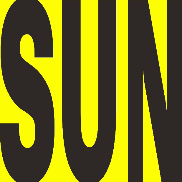
1 Bold
This kind of thing never goes out of style, but who doesn't want an excuse to make something bold every now and again. Really guys, the zeitgeist said so. Also, I realized how hard to define bold is. Like is it color? Is it a type style? Is it geometric shapes? Is it attitude? It was kind of like looking at a word too much and suddenly the spelling looks unhinged.
2 Pixelated
I inadvertently fell into this (ahem, was totally ahead of this trend) when I created my MFC logo a couple months ago. I listened to a podcast about Pixar (that I can't find) where they talked about getting more and more realistic to the point where there was little place else to go. So go the other direction. Depending on how old you are, pixelated can feel simple or nostalgic or geometric or fresh. I used it for my logo because I have minimal illustration skills and it gave me a framework to make a face that didn't suck.
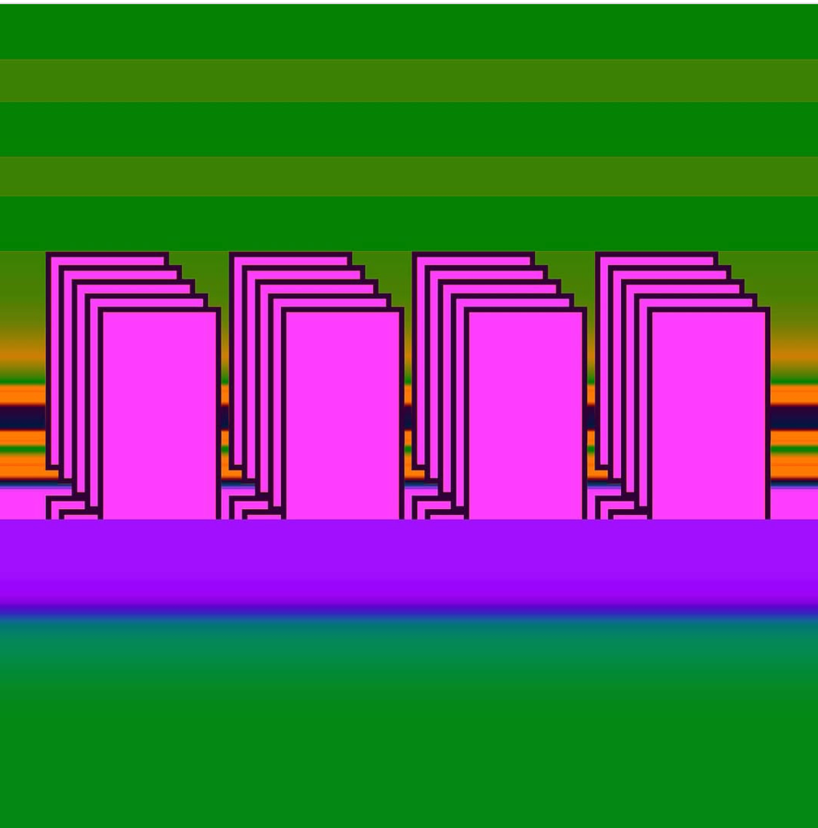
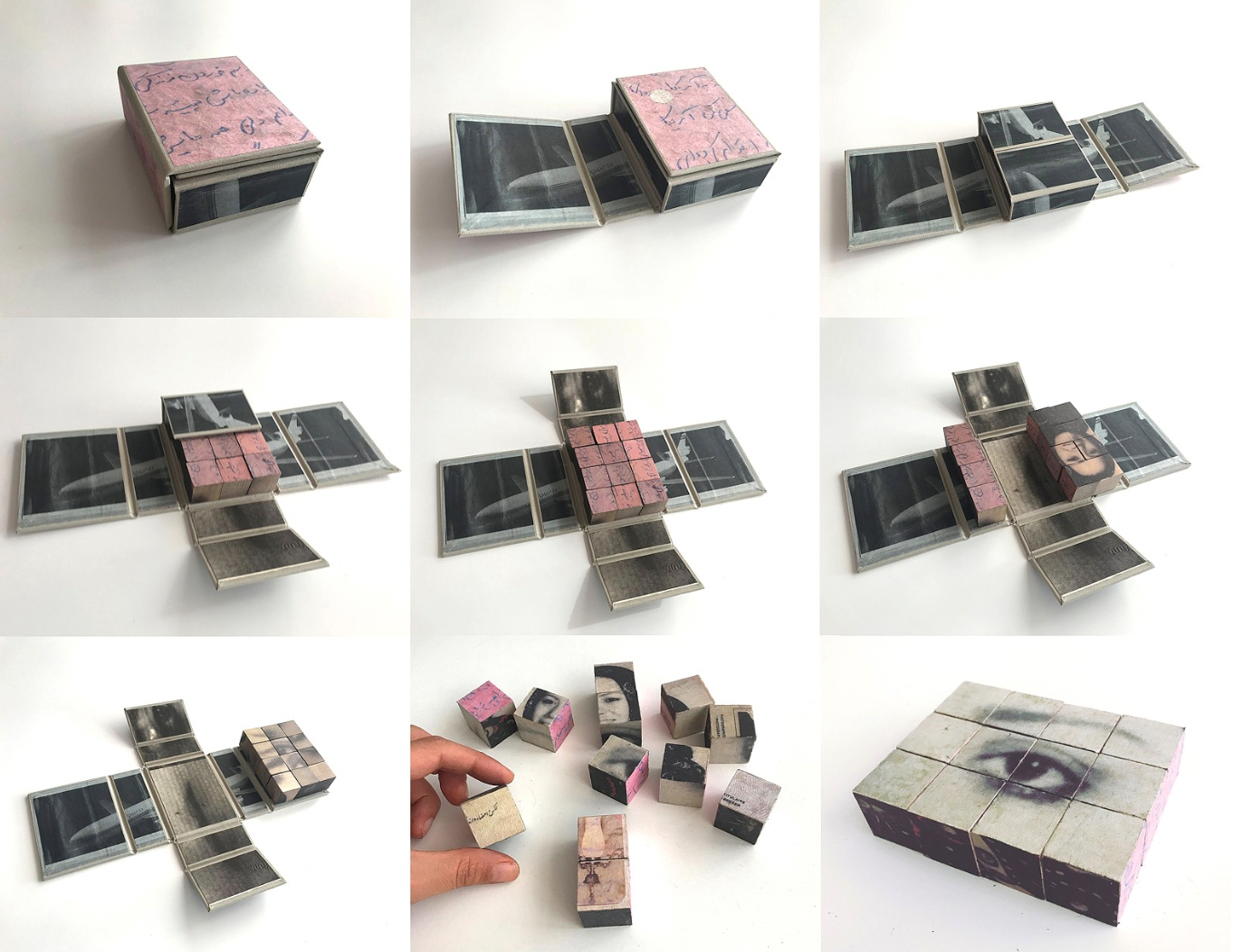
3 Single Block/Boxed
I'm combining these two because I think graphically they speak to a similar blocky cube aesthetic. It makes me think of architecture and spaces.
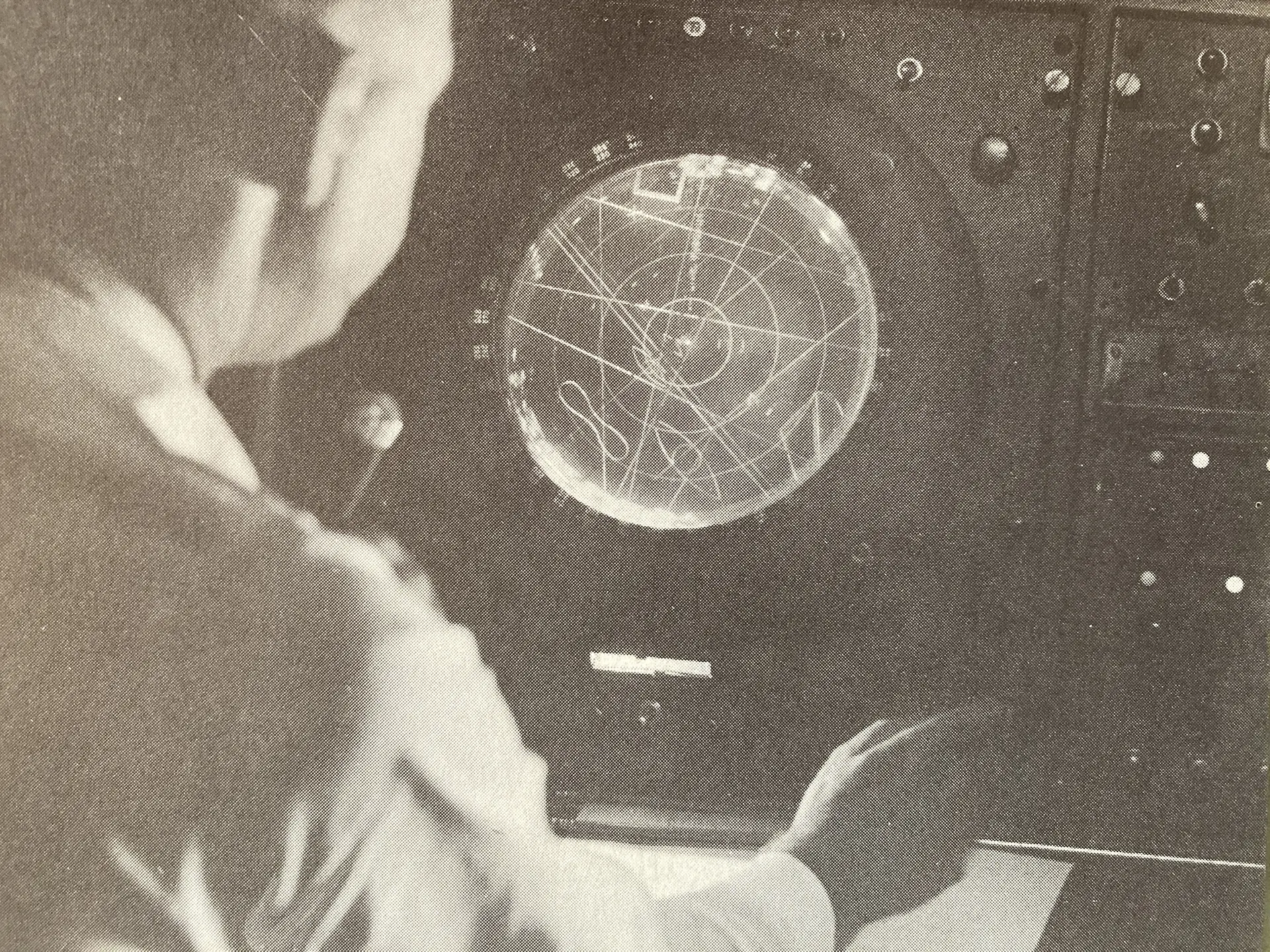
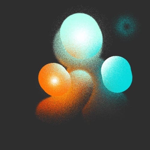
4 Orb
Circles, but make them dimensional and use them in a different way.
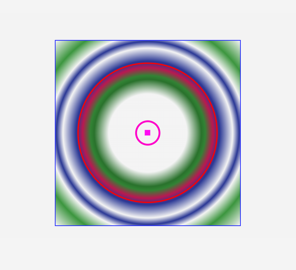
The image on the right (or bottom) is a CLOCK.
5 Transparent
Again, this could feel nostalgic if you remember transparent phones and cameras. And let's all promise now to resist just using a Transparency tool or filter. Transparency or translucency can be really interesting. It makes me think of candy. You can see two states at one time. You can hide and reveal.
You can check out all the images I pulled here. Let me know if you make your own moodboard.