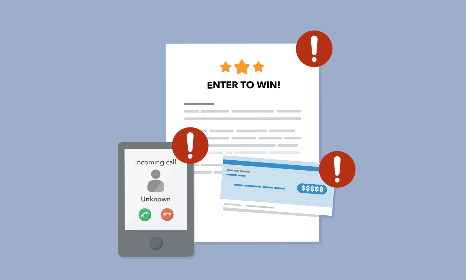
Designing A Scam
Breaking down why someone might buy it.


A different kind of spot the difference post. I got this in the mail just a couple days ago, and I had to look at it critically to make sure it was a scam. So I thought it would be interesting to break down the elements they're using to try and make it seem legitimate. Send this to your parents and grandparents.
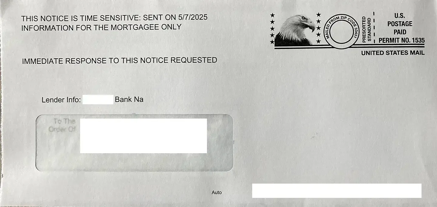
This piece originally had the tear off sides that can signal a serious piece of mail or a check is inside. It had our correct bank listed on it and our names and address. Already on the outside they are creating a sense of urgency – time sensitive, immediate response. Eagle with stars is a nice touch perhaps to give it governmental flair.
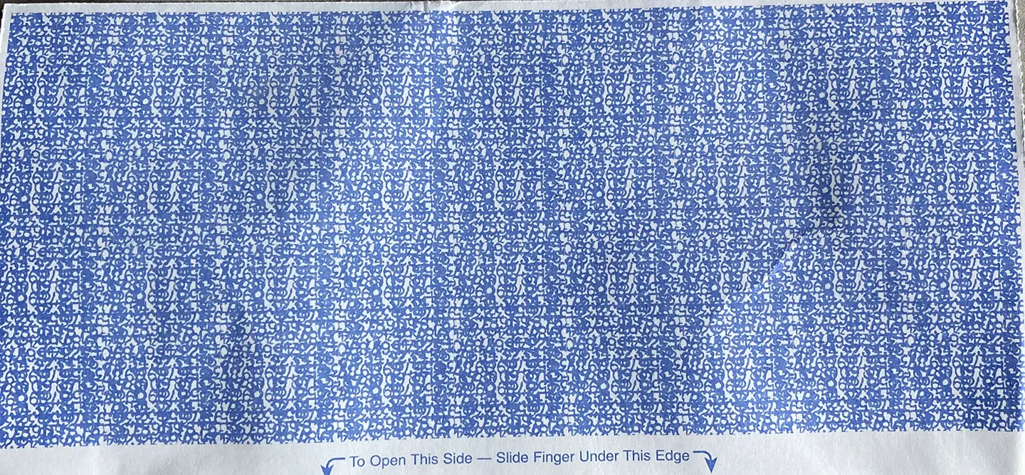
The reverse of this envelope has an official-looking security pattern on it. Again, typically signaling some kind of check or payment is inside so you don't immediately throw it away.
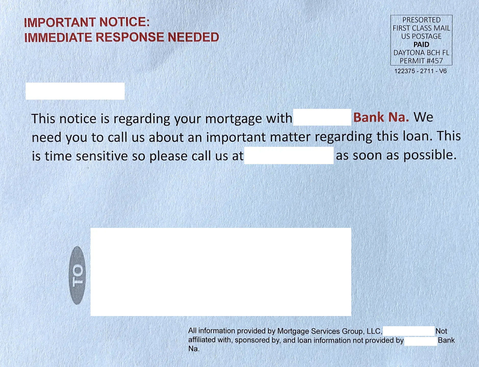
This companion postcard came the same day. Both pieces originated in Florida, so possibly a red flag there already (#floridamail). Again urgency – immediate response, important notice, important matter, time sensitive, as soon as possible. And it's on a semi-official looking light blue paper stock.
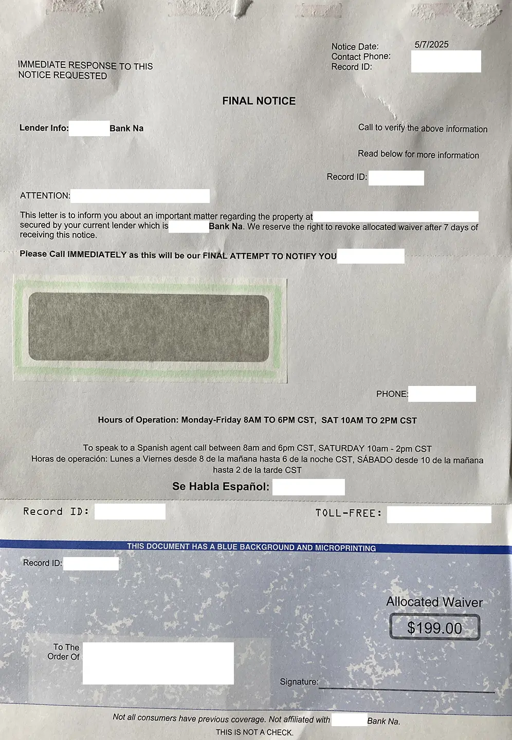
Again, on the inside, numerous attempts to create urgency without really saying what the issue might be. They even offer their number with a Spanish speaking operator. Is it a check? It looks like a check. But no, it's an "allocated waiver" whatever that is. And then "THIS IS NOT A CHECK" finally at the bottom. The fact that it mentions "previous coverage" makes me think it is some kind of insurance scam. Finally, they admit, also small at the bottom, that they are not actually affiliated with our bank. I also have no idea what "Na" after the bank name means.
The whole un-designed nature of it also lends credibility – the simple sans serif font without much other formatting feels a bit lo-fi bureaucratic.
If you're ever not sure about a text, email or piece of mail, and you want to check it out, your best bet is to call your bank (or whatever entity) directly using the number on their official website or paperwork you already have. NEVER use the number or web link on the item.
Resources: