
Here's a Pamphlet...
A case study on design for healthcare.


If I win the lottery, it's my secret dream to redesign every horrible medical pamphlet and flyer at the doctor's office. I feel like they're overly complicated (probably thanks to lawyers) and usually incredibly dated. Case in point:
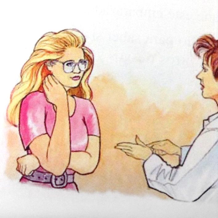
Who is this woman? What are they talking about? And why does the doctor have There's Something About Mary bangs? Anyway, a friend received the flyer below recently for a low oxalate diet because kidney stones.
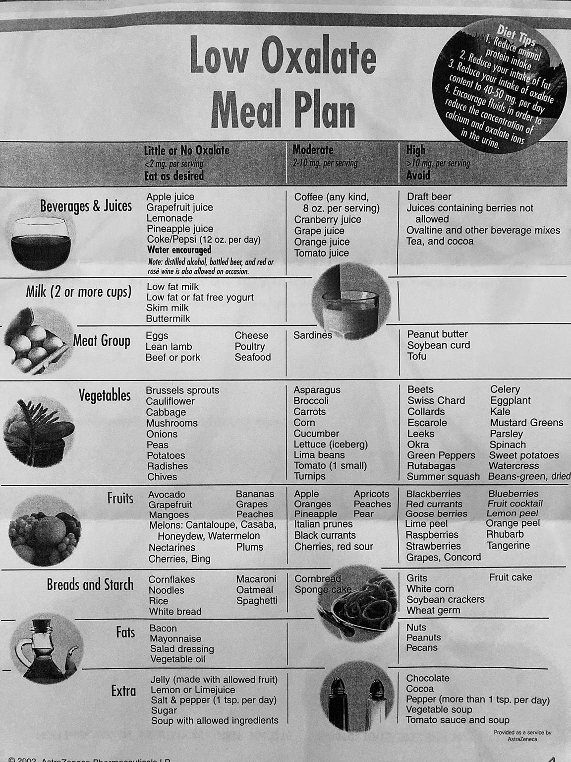
As you might notice at the bottom, it is 21 years old. Maybe this kind of information doesn't change that much. But there are a few design problems that I see. Overall, even though it has rows and columns, it just feels like words were spilled on the page.
1. Almost nothing is in alphabetical order. Or, if it is, it moves left to
right instead of top to bottom first.
2. While it's organized into food groups, I'm not sure that's the most helpful way to do it.
3. I think it's too much extra information to include Allowed foods. I mean every single food not on the Moderation/Avoid lists are therefore allowed, right?
4. It's very stereotypical American food centric. What if you eat other kinds of foods? Most people eat a much wider range of foods than they did even 20 years ago. It's a content issue rather than one I can solve though design, but I think it's worth pointing out.
I made her these quick reference guides that can live in her Photos on her phone for grocery store trips.
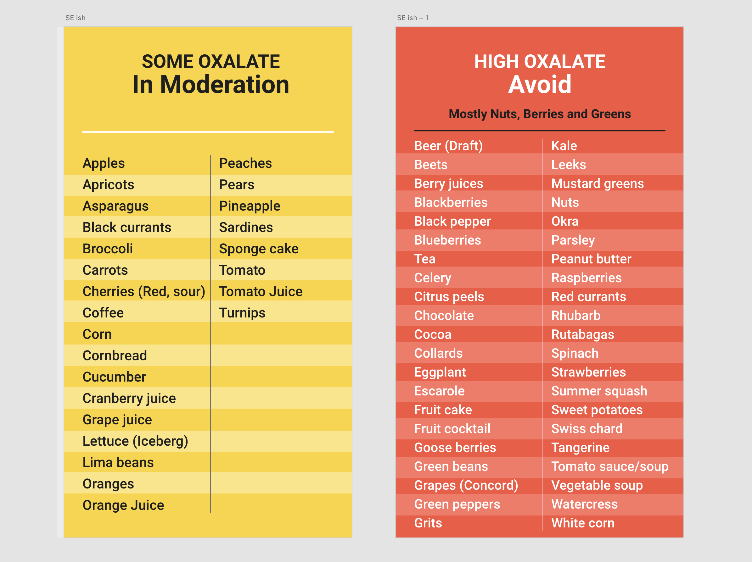
They're really simple and quick. I decided to just focus on Moderation and Avoid. I customized the lists to get rid of a few foods I know she never buys. I alphabetized everything, ditching the food groups. I think it's an easier way to check at the store if something is on the list or not. I also condensed a few things. Instead of Lime Peel, Orange Peel, and Lemon Peel, I simply listed those as Citrus Peels. There are still a few weird things about the original list that are confusing – Beer (Draft). Does this mean Bottled or Canned Beer is OK? I'm not sure so I left it as is.
The other big change is the color coding so you don't really have to think about it to tell Moderation from Avoid. I was able to make a general statement about Avoid in that it's mostly Nuts, Berries and Greens, but I didn't find any clear groups in the Moderation list. Since they're long lists of words I also made some alternating bands of color to help with readability.
I've sent these to her to test out. Maybe an Allowed foods list would be helpful. Or there could be some readability issue she's having on her phone. The Avoid list could be broken up into two and that would let me increase the point size.
In the meantime, are there improvements you would suggest? Drop them in the comments. Or send me your best (worst) medical pamphlet!
Update
In the spirit of prototype and test, she's let me know that the Allowed list would be helpful, and that a printout would work better for her. So, new prototypes to come.