
How to Choose a Logo
The hardest decision is when they're all good.

I thought it might be helpful to put together some guidelines if you ever have to pick a logo for your business. It can be a lot of pressure. You want it to last a long time, and it typically serves as the flag that customers see (and form an opinion about) first.
To get to this point, you and your designer should have had a lot of in depth conversations about the personality of your brand and what your hopes and dreams are for the business. I think I've linked this before, but Seth Godin's Working With a Designer (Four Paths) is really helpful to take a look at before you get started on any project with a designer. I'm going to assume you're not #4 – I'll Know It When I See It – this guideline will not help you.

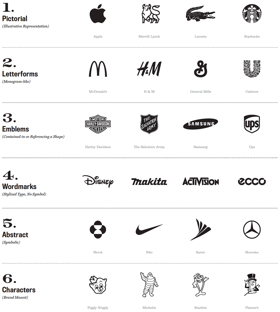
Below are some different logo types. You may have discussed which is appropriate on the front end, or they may show you some options. Some are more appropriate for different types of businesses. A bank probably doesn't need a character. A cookie company probably doesn't need something abstract/corporate.
Dialing Up and Down
One thing a designer may do is take the agreed upon brand attributes and dial them up or down for each logo they show you. For example, say your attributes are caring, innovation and technology. They'll probably all have some of those characteristics but one may dial up the technology aspect. One might have more caring signifiers. One will feel more like innovation. You have to decide which is the most important to emphasize. And you may say, why can't I have all three? They can't be equally important because that's not how hierarchy works. Also you'll likely have other brand elements that can help to support the other attributes.
Your Competitors
Which one you choose may also have to do with your competitive landscape. If your competitors are really dialing up the technology, maybe you should dial up the caring. Your strategy will be very helpful here. If all your competitors have blue or red logos, maybe yours shouldn't be either.
Big and Small
Your designer probably showed you this, but your logo should work really large and really small. Social media icons are teeny tiny. I often do a special icon just for those that is a simplified version of the logo. Also, what does it look like on items such as pens or t-shirts or (eye roll) tote bags. How does it work with the packaging if that applies?
Time to Decide
I don't think I've ever been in a logo presentation where I expected the client to make a choice in the meeting. I would always encourage them to take the logos back to their office and live with them for a bit. Lots of people like to get opinions from other people, and that's perfectly fine. But it can become a trap. Everyone will have a different opinion and will bring their own likes and dislikes to the table. Ultimately, the logo is there to communicate the business attributes and strategy to consumers. So, listening to Aunt Bertie's dislike of anything green or that one time someone told her logos should never be circles, may not serve you.
The Frankenstein
You may be tempted to ask for a Frankenstein – a little bit of this logo, a little bit of that logo. I have built logo options that were intentionally mix and match. Communicate with your designer. They may need to go back and rethink. But ask yourself whether those two things really work together, or if you're avoiding making a hard decision.
Very often there is one logo in the group that's easy to dismiss. As soon as you see it, you'll think, that's not the right direction. Sometimes there is one clear favorite. Many times there are two that people are torn over. If you're having trouble deciding, go back and look at your original brief or strategy. It may seem weird to say, but have fun. It's a really cool part of the process. For a lot of clients, seeing the logo makes a new business feel tangible for the first time.