
Ideas For Your Week
Including an anthropomorphic sheet and an early physical form of PowerPoint.

The loose theme is things/systems that are pretty boring on the surface, but are actually really interesting deep down.
💀🛏️
I love origami and have even taken an auxetic folding patterns workshop. But I cannot, to save my life, fold a bottom fitted sheet. Enter Ratfactor's Illustrated Guide to Folding Fitted Sheets. Come for the illustrations, stay for the information.
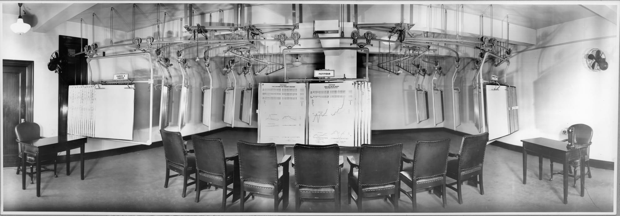
📉📈
The image above is of the DuPont Chart Room. It was a PowerPoint precursor where timely business data was held on moveable "slides" so that executives could present, sort and compare information. “One Damn Slide After Another”: PowerPoint at Every Occasion for Speech is a lengthy (in a good, researched way, I promise) history of "knowledge production" and whether or not PowerPoint, which is "installed on more than a billion computers" just sucks or is evil.
In my personal experience, PowerPoint boils down to an acceptable cheat sheet. I'm not an amazing public speaker, and it makes it easy to outline what I need to say, and keep up with what I need to say next. But it always feels like a Read Along book to me. And in reducing information to bullets, it can lose context. Its linearity offers no opportunity for comparison (as in the Chart Room), and do you really want a PowerPoint sermon?
🟨🟩🟦🟪
Do you like the NYTimes game Connections? Did you know that you can make your own?
An Open Question
How do we visualize the concept of business in 2025? At least any business done on a computer, which is an awful lot. There are only so many images of people sitting at their desk pointing to something that I can stand. Jobs used to have so much more visual richness. Even if you take a graphic designer for example, there were physical tools like t-squares, and settings like a drafting table or repro room. With so many jobs sitting at a computer (or sitting in a meeting) are we reduced to a kind of stereotypical wardrobe as signifier? Do we need to do a deep read as to what tchotchkes are on the desk? A typical business image could be seen to represent an accountancy or a non-profit. A medical billing office or a finance firm.
I'm sure with stock imagery it's much more profitable to have one or two images of a person at a computer that could be doing anything, than to have ten images with subtly different cues as to what's going on inside the machine.
But with original photography, how can we better signify the work that's happening within the computer screen? If we don't do a good job of visualizing that work, does it lose value? Does that pave a way for AI to take a job simply because the job doesn't look like anything?