It's a Mood
How to build a moodboard with signifiers.
FYI, for professional purposes, I now call moodboards Visual Strategy boards. I think it's a more accurate description of what it is. If we call the words Brand Strategy, the visuals should get equal billing. But for the sake of simplicity here I'm just gonna use moodboard or board.
Where do you start?
Generally, I start with words. I'll look at the written brand strategy and write down individual key words that I think are the most important. I will also add related words to this that help me form a better visual. Sometimes you will need to create different (but related) visual directions either from different brand documents or tease apart multiple visual directions from a single brand document. This is a really, really important step for that. Here is where you can begin to decide how they should be different or the same. How they differ may be a strategic choice or may be a boardsmanship* choice.
What are signifiers?
I like to use the concept of Signifier/Signified. It's borrowed from semiotics which sounds fancy, and is typically used to talk about linguistics, but nobody told me I couldn't use the concept for design. The simple example that I like is smoke and fire. If you see smoke (signifier) you can be pretty sure that there is fire somewhere (signified) even if you can't directly see it. Designers can use any tool in their toolbox – fonts, color, shapes, imagery, etc. – to signify emotions or qualities that they want to convey.
Break it down now:
Here are two examples from a project which had two brand directions. Both talked about how the client want to create a different relationship between customers and utilities, with the client providing the technology to mediate between the two. For this first one, control and money savings were two important aspects.
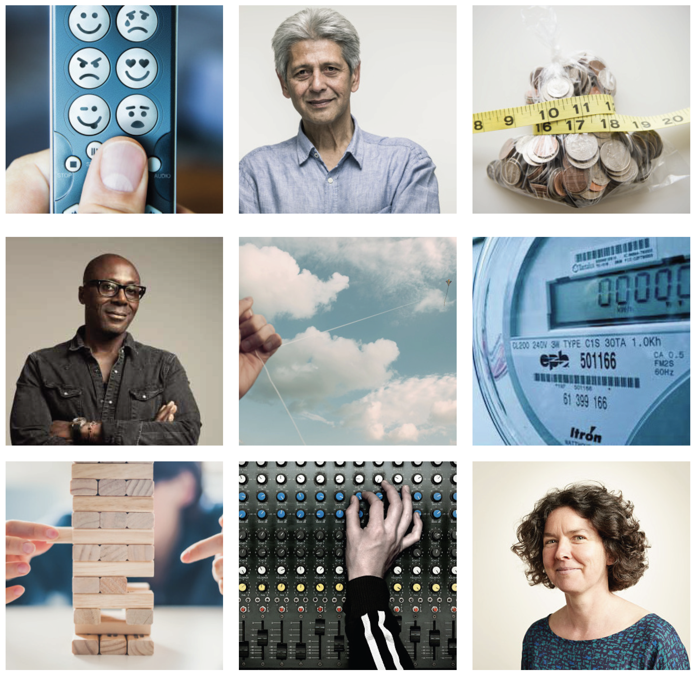
Therefore you see several signifiers of control – the panel with all the tiny knobs, the jenga, and the remote control which does double duty by sneaking in possible emotional states of the customer with the emojis. There is one nod to budget with the coins being squeezed. And one image of a utility meter to remind us that's the realm we're talking about. It can also signify control. The people are front and center in this concept as portraits to signify the human element that we're connecting to. All the images have intentionally been given a warm tone (another subtle layer). The sky and kite is also a little bit about control but it gives a sense of freedom and connects to possibilities. It is in the center intentionally.
The second direction also talked about the relationship between the customer and the utility but mentioned more specifically technology and how it would bridge this gap between them and connect them.
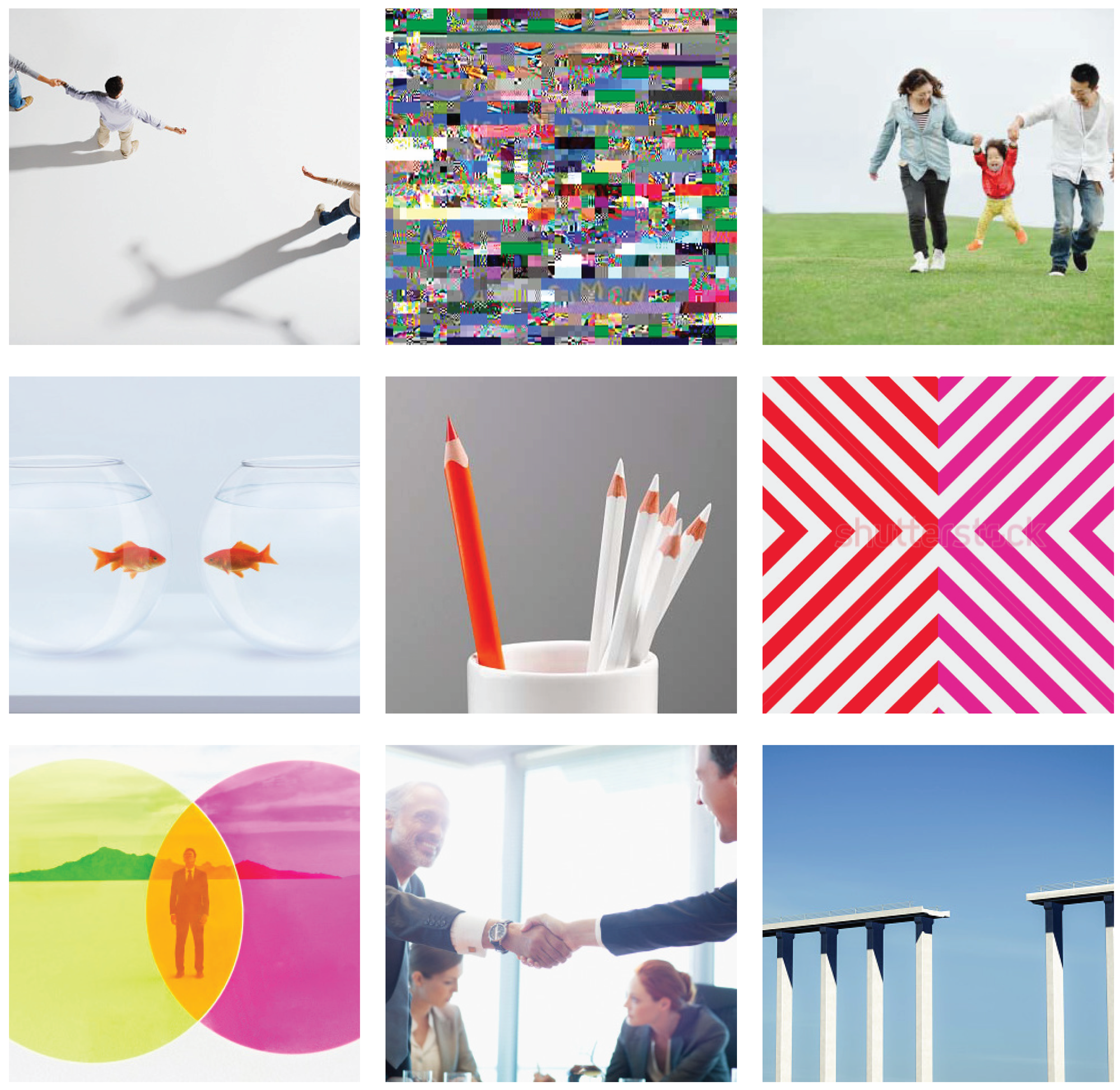
This feels very different. There are several images that signify gaps and several that signify closing gaps. The color palette is decidedly bolder here and feels more technological along with the glitch graphic (don't judge – this was from several years ago). Shapes and minimalism signify modernity. While people are present, they are not as face-forward. This brings in humanity, but emphasizes the connection point rather than either entity.
A note about proximity.
Every image you add to a board signifies something about the brand – sometimes individually and sometimes in connection with another image. Your juxtaposition of images can alter what's signified, in a similar way that Alber's Interaction of Color showed how color can do this.