
Looking vs Seeing
The difference is what makes a photographer or director really good.

This may seem like a lame philosophical comparison, but bear with me. If you look at something, you are registering it visually in your brain. You’re recording the facts. It is green. It is round. It is in the sunlight. It is an apple. But I would argue that seeing it is very different. Is the light beautiful? What does that shade of green remind you of? Looking is literal. Seeing involves answering other questions that may be subjective. Both are important parts of analyzing a work.
Once there is an approved concept to execute, I usually need to find a photographer or director to execute it. And getting a grip on how they both look and see is important to finding the right person.
As far as looking, do they work in the genre of image-making that is relevant to the project – still life, portrait, landscape, architectural, etc.? Do they seem technically knowledgeable? Can they record the facts? Assuming that all checks, then it’s really about how they see.
Here’s my seeing bar: Can they make something that otherwise seems dull into something interesting or beautiful? And this usually comes down to having a great sense of both composition and lighting. Here’s a great example I saw recently:
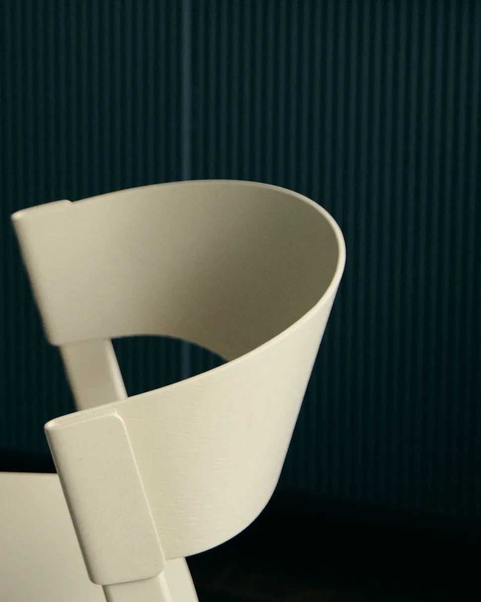
It’s only a piece of the back of a chair for crying out loud. But it made me stop and take notice. Because how beautiful is that shape. There were a million other choices in this photograph as well – keeping it monochromatic, putting the light chair on a dark background, including the stripe textural element – all of those things add up. But the ability to see that there is an interesting and beautiful way to shoot this one part of a chair is indicative of a really good photographer.
Here’s another:
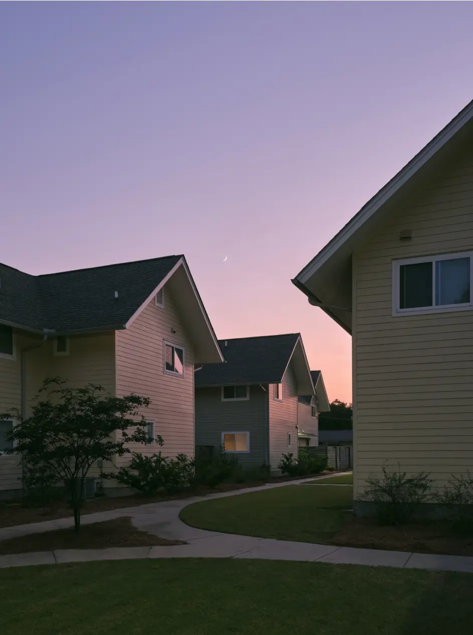
Of all the more “impressive” images on his site, this is the image that convinced me to hire him. Looking at it, it’s an image of some rather simple looking structures. However, beyond that, I see a beautiful image. He has taken full advantage of the roof angles to create an interesting composition. It feels very architectural even though the buildings don’t have any special adornment. Also, his choice of time of day is incredibly important. The sunset light creates a gradient on what would otherwise be flat surfaces. It also provides a reflection on the windows. That one window in the center with a soft glow inside serves as a great focal point.
Photography is an easy example in this format. Same principles apply to video. Same principles apply to graphic design. You can look at and define the elements on the page. Here is a block of copy. This is a particular font. Here's a specific color. But every element carries with it an additional meaning. Sometimes the combination of elements carries the meaning. Maybe it's a repetition? An implied historical context? Does the structure feel analytical or organic?
One last example:
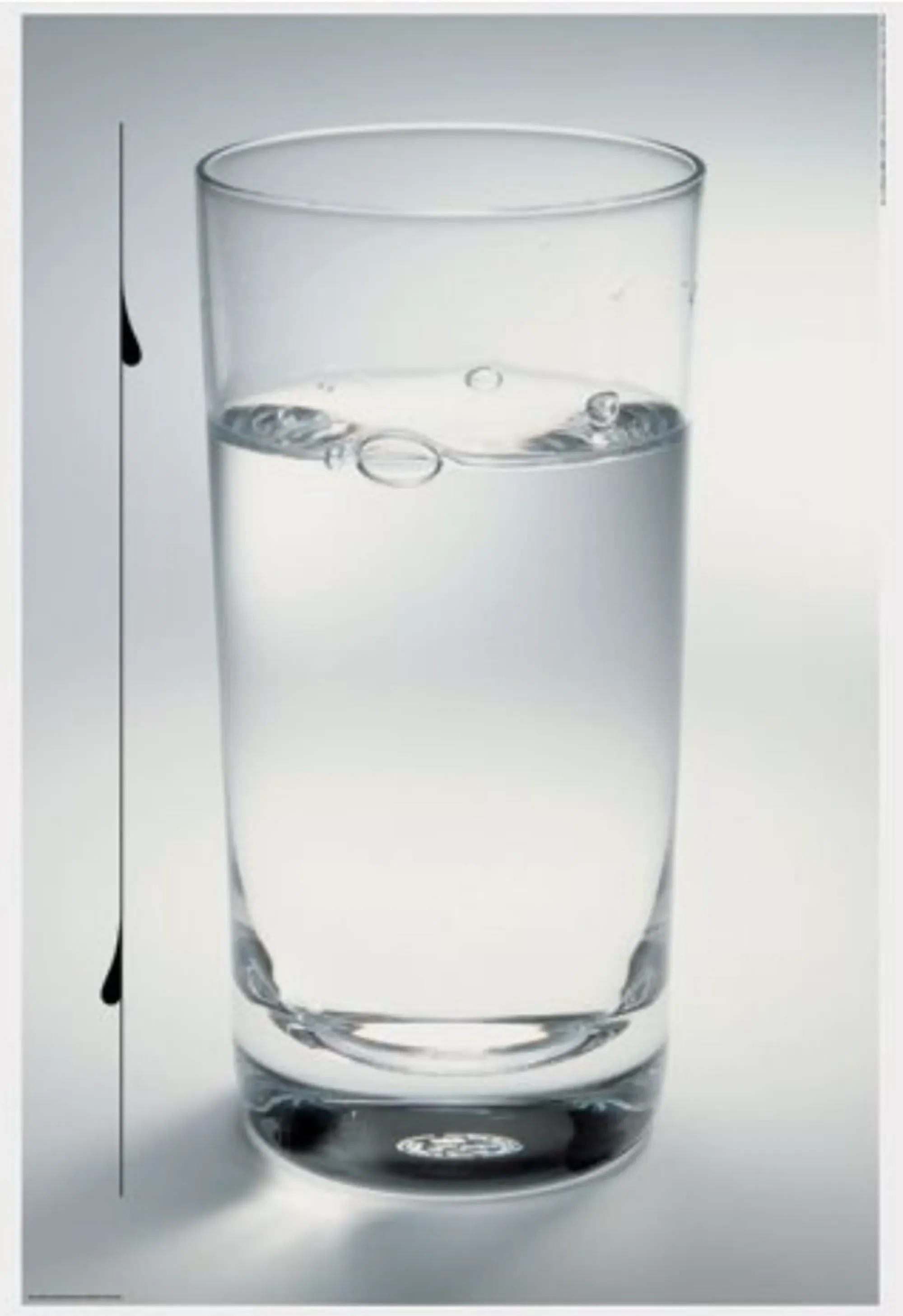
Starting with looking, it's a glass of water, simply, but well photographed (I do see those bubbles and droplets there to add a bit of interest/texture). There is a black line to the left with a couple water droplet shapes attached. But what do I see? I noticed that the droplets are meant to draw attention to the level of water in the glass. And this poster is about water conservation. The simplicity of the layout itself makes me think about how simple and elemental water is. Two design principles forced me to pay careful attention to the line/droplets element. One is the negative space. The breathing room around the glass clearly makes it stand out. The second is the use of asymmetry. The glass itself is symmetrical and dead center, which gives it importance. The only thing breaking that is the line/droplets element.
What are you looking at? What do you see?