
Making the Invisible Visible

If you want to communicate the idea of “sad,” how would you? You could simply write the word “sad,” although there are probably a lot more interesting ways to use words to convey that concept or emotion. What if you could not use words? The vast majority of graphic design uses some combination of visuals and words to communicate. But for our purposes of design process today, let’s not worry about words. Only visuals.
So how to convey sad? Maybe you could use the color blue? Or what about black? Or gray? Is the Bouba or Kiki shape more sad? What is a happy color? What is the opposite of that? What about a layout or arrangement that feels heavy? All these are ways you might begin to use visual elements to give visibility to an invisible concept or emotion.
 Contributors to Wikimedia projects
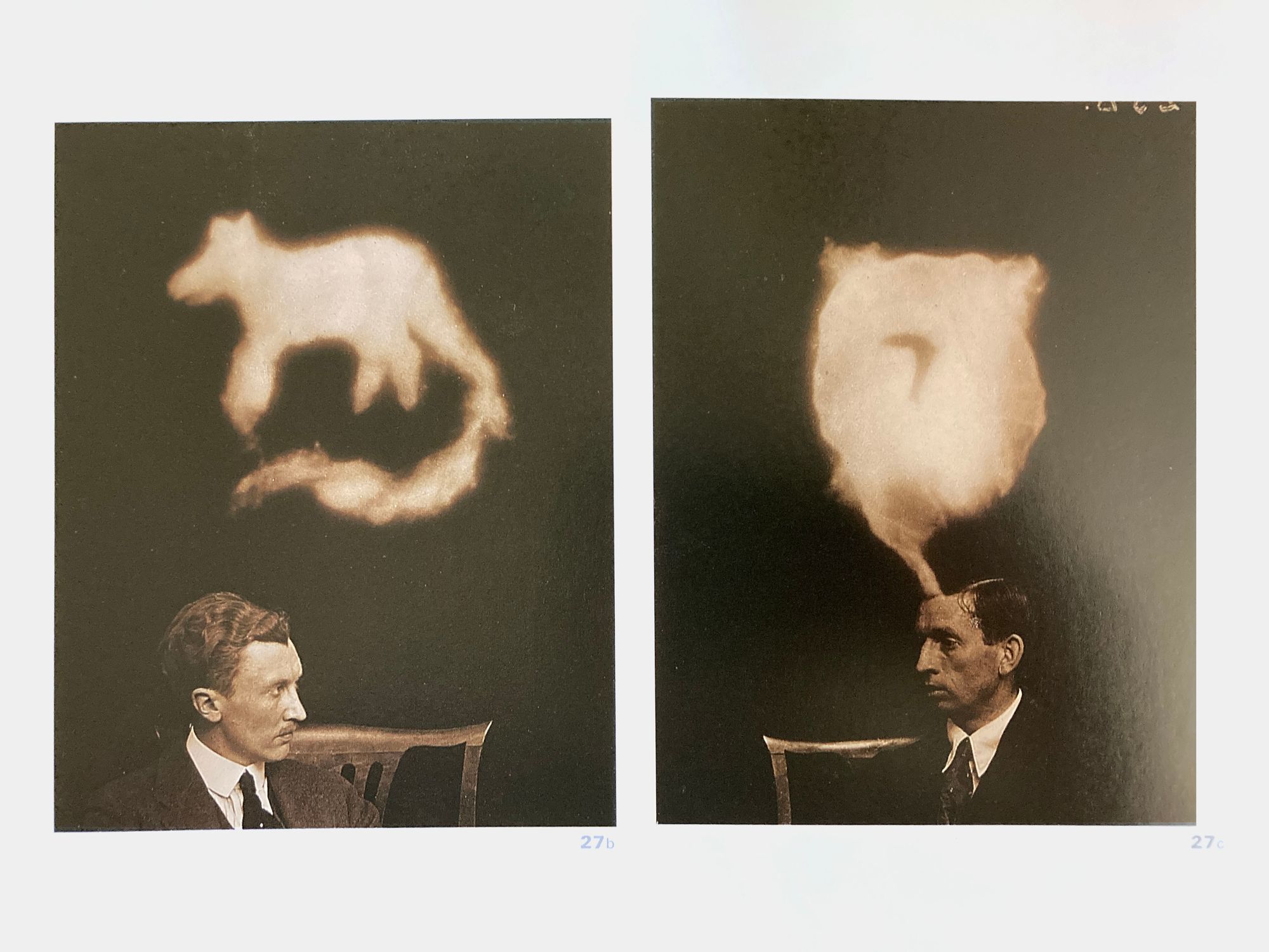
In a presentation once, I described design as using Color, Font, Image, Content, Visual Elements and Historical Style to signify Personality, Characteristics, Qualities or Emotions. I like to think about the concept of signifier/signified. A classic example is smoke. You don’t need to see the fire (signified). When you see the smoke (signifer) you understand that there is fire somewhere. Likewise, instead of writing the word sad, you can signify it with elements of design – like the color blue or a cemetery or a visual heaviness.
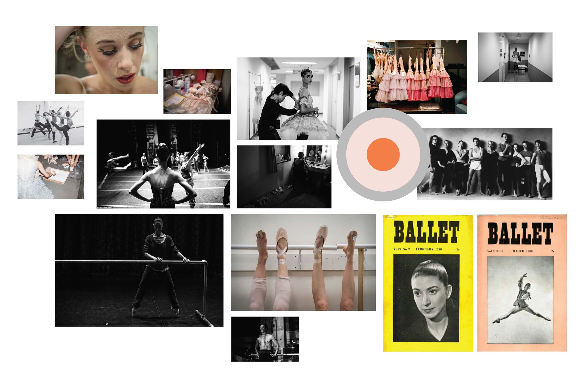
In my process, I would start working on these signifiers by writing out some key words (I know I said no words, but this is how I start). These words usually come either from a design brief or the copywriter who has written some preliminary language. I pick the words that I think have the most meaning or begin to jog some visuals in my mind. Then I add to those words related words that for me visualize even more specifically the direction that I need to go in. These get translated into visuals via a moodboard. I gather lots and lots and lots of images from various sources – way more than I need. Anything that feels close to right. Anything tangentially related to what feels right.
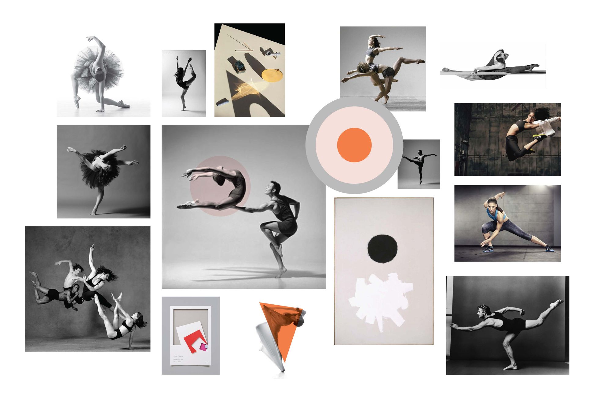
Those get edited down to a more concise moodboard. Any concept or emotion will have a range to it. A sadness related to homesickness is not the same as a sadness related to missing lunch with a good friend. The images might include photography, illustrations or diagrams, fonts, colors, shapes – any signifiers that begin to move toward the signified. I usually try to live with these images for several days, editing them down again to get to the most specific version of signifiers possible. The juxtaposition of certain images can also influence each other. This moodboard then becomes the basis for all the decisions down the road.
Are these decisions subjective or objective? A bit of both. Some associations are built-in culturally. But may be different across different cultures. Sometimes experience or historical knowledge leads you to a good signifier. Sometimes it is more subjective, but a combination of design elements all speaking to the same signified reinforce each other. This combination of elements also creates nuance for the signified – are you happy because you had a great cup of tea or because you won the lottery? Of course, everyone has personal preferences. The designer’s job is to transcend those as much as possible in the service of communication.
Here's a five dollar word – intertextuality – that simply means that you can use one text to better understand another text. And here a “text” can mean anything – a book, a painting, a movie, etc. The idea is that you might see a movie that helps you understand something you read. Likewise a color might help you understand an image better. Two photographs seen together can alter the meaning of both. A big part of creativity is making connections to things that are not obviously or typically connected. This concept of intertextuality is a way to think about the connections part of the design process. It’s a creative muscle you can learn to use and flex.
For the Designer
This is just my process. I’m sure there are many others. But I like the idea of thinking about signifier/signifed because it gets to the root of visual communication. With each design element (signifier) you choose, what are you signifying? Does it serve the goal? Every single bit of knowledge you consume, everything you see, hear, smell, taste, touch gets stored away until you need it to make a connection. Reading, looking, thinking about things that are not the project itself is truly valuable.
For the Client
I’m guessing this is the part of the process that seems the most mysterious. I’m attempting to explain objectively how I do it, but there is some subjectivity involved. We can probably all agree in the U.S. that black and orange together can signify Halloween. But other signifiers can be more subjective. Is your opinion about the design serving the end goal, or is it more personal preference? It’s totally fine if you personally dislike black and orange together. But if you’ve asked a designer to come up with a logo for your new Halloween store, there’s a reason they chose those colors. Do you want personal preference to get in the way of communication?
In the comments, let me know what part of the design process is the most mysterious to you.