
Making Things Fit
Ten Pounds of Sugar in a Five Pound Sack

In the beginning of my career, I spent six months as a Production Artist doing nothing but resizing print ads. In hindsight, it was a great education. Because there is the sexy part of design where you are artfully selecting and arranging elements to say just the right thing in just the right way. And there are more practical, technical matters where you are trying to make things fit into a space.
I'm not sure if "ten pounds of sugar in a five pound sack" is a regional phrase or not, but if you didn't guess, it means to stuff too much into a finite space. Also see: Too much sugar for a dime. I had to resize an ad recently into a spec of 1.22x2 inches. I immediately questioned this. But it was accurate. A postage stamp area of space. I don't know if selling someone this size ad is madness or genius. This is an extreme example, but reminded me of some helpful ways you can fit six pounds of sugar into a five pound sack when called to.
What can be eliminated?
Sometimes you have to ask what can go. It may be that you need to talk to the writer about shortening the copy. In the extreme example above, from the full size ad, I included the image, a small logo mark sans words, and three words of the headline. I eliminated all the body copy. This was a clear example where everyone understood that some things had to go. Very often outdoor is another place where something needs to be eliminated. As is mobile sizes for display ads.
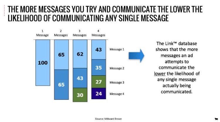
This is more about design mechanics, but I will never not post this chart:
Make several small changes, not one big one.
This is maybe the most useful thing I can tell you to do. Often, you might just have a few lines of copy too many. So, before I bug the writer, I would try several small things in concert.
1. Decrease the point size .25 or .5 pt.
2. Decrease the leading .5 or 1 pt.
3. Decrease the space between paragraphs.
4. Increase the text box width by .125 in.
5. Rag your type, checking if end lines of two or three words can be moved up into the paragraph.
6. Two column text boxes can be more efficient than one column.
You may not need all six. You might be surprised how much of a change these will make taken together. And nobody else is likely to notice really what you did. On the other hand, if you had done one big thing like reduce the point size by 3 or decrease the leading by 4, that would be noticeable.
Group unavoidable extras.
And by unavoidable extras I mean things like sponsor logos or disclaimers. You won't be able to eliminate these, so you have to corral them like sheep. A rule line can be helpful to delineate the corral. Even better is if you can make the logos all black or all gray. This makes them read visually more as one element rather than eight (however many) separate ones.
Make the disclaimer as small as possible – 5-7 pt is standard unless you have a specific number in your brand guide, or there is a legally mandated minimum. They should be legible and present, but they are not helping to communicate anything to the consumer. Other than there is a lawyer involved.