Muller's Ratchet
Understanding and misunderstanding image cropping.

Cropping an image seems deceptively simple. Anyone with a smartphone does it all the time. And I think some of the issue I've run into in explaining it, is actually because of how smartphones work vs how design software works.
Designers often prefer having some extra room around the edges of an image. We assume we will crop an image to our needs, so while we don't want too much extra space, it is helpful to have a bit of padding. Especially given all the weird and random sizes we encounter in advertising today. But here's why:
Static Crop
A smartphone will crop an image and then that crop becomes the new image. Of course you might revert to the original, but a crop on a phone is more or less a one way street. So, too, is cropping in a program like Photoshop.
Active Crop
However, cropping in a program like InDesign preserves the full image. What you're seeing in the box is essentially the selected portion of the image the designer wants you to see. The rest of it is still all there outside the bounds of the box. It's easy to move things back and forth, or zoom in or out. Nothing has actually been lost. And digital though it is, it's actually the way image cropping used to work before computers.
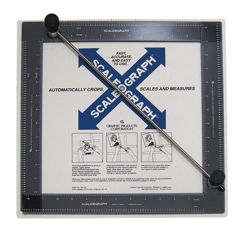
You would have a physical photograph, and on top of it you would use the tool below so that you could maintain the correct proportion of the shape of the placeholder space in your design. You would then use a grease pencil to make crop marks on the photograph where you wanted the printer to crop the image. Again, no loss of the original image. You would also use a proportional wheel to work out the percentage to enlarge or reduce the image, but that's math for another day.
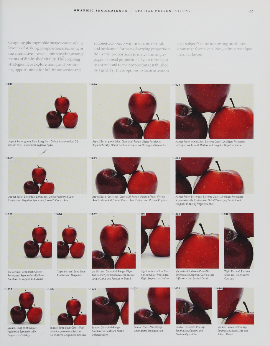
Those are mechanical considerations, but there are also design reasons to crop an image a certain way. Do you need space for text? What part of the image do you want to amplify? Do you want to focus on a detail or space? Is there important context in the image that needs to be included? Is verticality important? Or should it be cinematic? The example below does a great job of pointing out some design considerations.
I get asked a lot of weird questions about cropping. But I think they make a bit more sense if I think of how most folks are using a more static version of cropping. I would never send another designer an already cropped image as a source file. I assume they will crop it to their needs within whatever design language has been established. But some people want the image cropped exactly like the design. It doesn't give them any flexibility, but maybe that's OK. Until they try to cram it into a weird shape. You also might lose the intended meaning a particular crop was intended to convey.
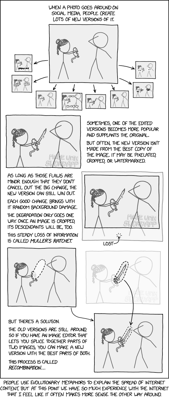
All of which brings me to this xkcd comic, Muller's Ratchet: