
Horizontals and Verticals are Apples and Oranges

Two issues which are interrelated: One is the overabundance of different shapes that digital and social ads come in these days. The other has to do with the cropping of images. These both come up regularly as issues, so here is why.
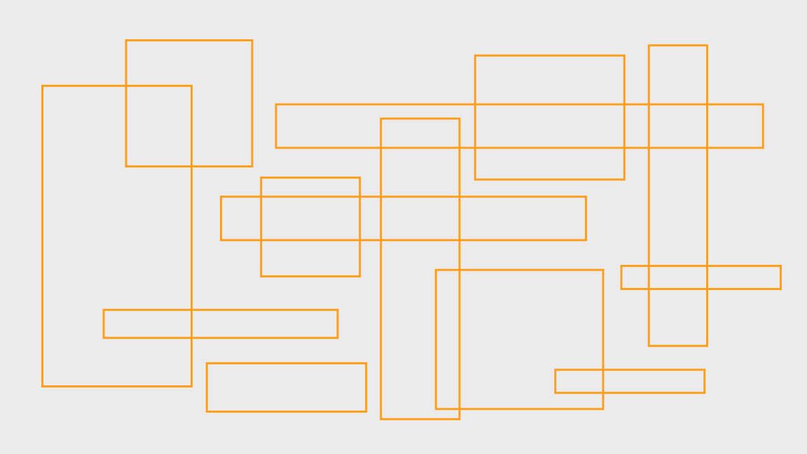
The graphic above is not a Mondrian. It's a bunch of common digital ad sizes. Notice any similarities? Yeah, no. And one of the challenges of the Graphic Designer is fitting a layout into all – and often more – of these sizes and still having it make sense. Images don't crop the same, some sizes are just too dang small for all the content (looking at you x50 sizes), horizontal and verticals are just two different creatures.
Imagine a room in your house. It's probably a rectangle of some sort. Now imagine you turn the room 90˚. Could you rearrange all the furniture into its previous orientation in a way that still works? Whether digital or print, that's ad resize. And it's why resizing ads can be more complicated than it first appears.
This is also an issue with social media platforms. For a long time, they all used a square format which was great. But now there are platforms that prefer horizontals and verticals such as Instagram Stories or TikTok. This is an issue mostly with video because we still watch TV shows and movies as horizontals, and this is how they're shot. Think of the big screen at your movie theater. Sometimes you can crop a horizontal video to fit a vertical, but mostly it doesn't work. If you're shooting something to only be used in a vertical format, then you're good to go. But typically you're using video in multiple places and therefore multiple formats.
People ask, "Can't you just shoot for all sizes?" But the answer is really no. On a commercial shoot, it would basically double the cost as you would have to both shoot and edit all the same scenes twice. So far, nobody has been willing to actually pay for that. There is no one magic format that gets you everything. Especially when there's a new format every month.
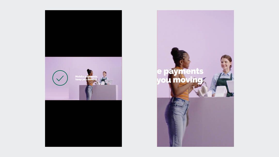
Letterboxing, which you've probably seen although may not have really noticed, is the general answer. It preserves the full frame of the video regardless of the outside dimension of the format.
This moves us into cropping. Occasionally, I'll send through a resize and the client asks why the left edge is cut off or can the image be larger or smaller to show more/less. Sometimes the answer is yes, but when the answer is no, see below.
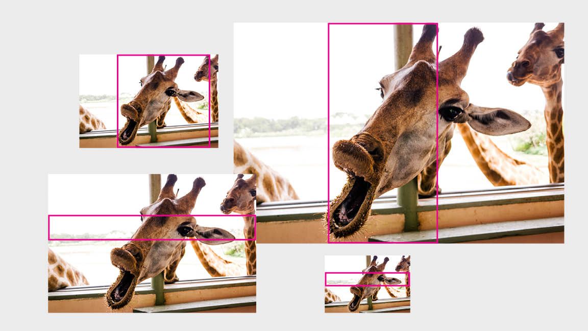
In the top right example, I can't reduce the overall image size in order to show more of the image because there is no more image at the top and bottom. Sometimes going from horizontal to vertical means you lose out on information. When you resize an image, you always want to "constrain the proportions" which means you're keeping the overall shape and proportion of the image and not squeezing it more vertical or horizontal to fit. It's bad design form and if you've seen it done you've definitely noticed it. Think funhouse mirror.
For the Designer:
With more and more sizes all the time, there are some programs that are helpful. Creatopy is one we use at the office. It generally helps with a lot of the sizes, but it's still important to check each size and make adjustments accordingly. It especially needs a little help if you have a complicated layout or if part of the concept is to have type bleed off an edge or something like that. Don't be afraid of letterboxing. People are used to it. Magician is a different job.
For the Client:
Ad resizing is not always straightforward and it may take a bit more time than you think. More and more digital campaigns are requesting more and more sizes. Where a digital campaign used to include 5 sizes, now it may be 10 or more. And that may be for multiple versions of the creative: 10 sizes x 3 creative versions = 30 individual resizes.
Also, understand that cropping is a bit of an art and an image will not crop the same in different formats. If there is part of the image that is most important to the concept, that's the part that your designer will treat as a must-see in frame. If you want something cropped differently, that's fine, but not always possible.