Spot the Difference - Apple
Why is Apple always the uber design example people ask for?

I’ve been in countless meetings, and if you're a designer I bet you have too, where regardless of industry the client will say they want to look like Apple. They love Apple’s website, how it’s so clean and cool looking. This has been going on for YEARS. It’s become an inside joke. Why?
Well, for one, Apple has spent a really long time building their brand. I think sometimes this is actually what people are reacting to – the ability of Apple to stand for a specific idea or aesthetic – less than the design aesthetic itself.
Sometimes, people will think it’s an easy design language to mimic. Meaning, it’s just a phone photographed on a plain background right? And here’s where I really want to illustrate that anything on a white background is not Apple and here’s why.
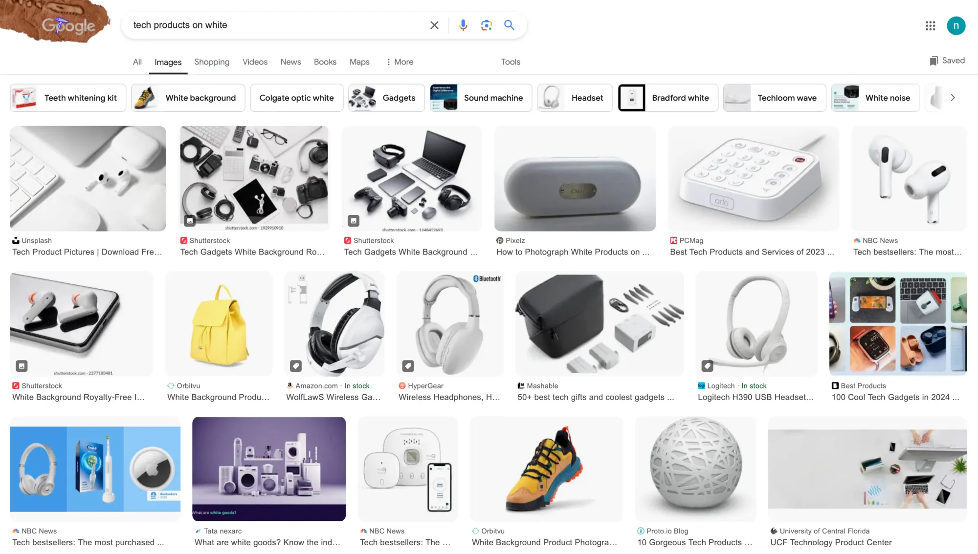
Simply putting something on a plain white background can look really, really cheap if it’s not done well. What does “done well” mean? Sometimes we talk about this as production value. It doesn’t necessarily mean you have to spend a ton of money for something to look good, but it does mean you have to care deeply about the details. And generally that involves spending time and money. There is an incredibly fine line between high-end and mid. Here is Samsung's website below. Does it feel the same as Apple's even though the products are also photographed on a plain background?
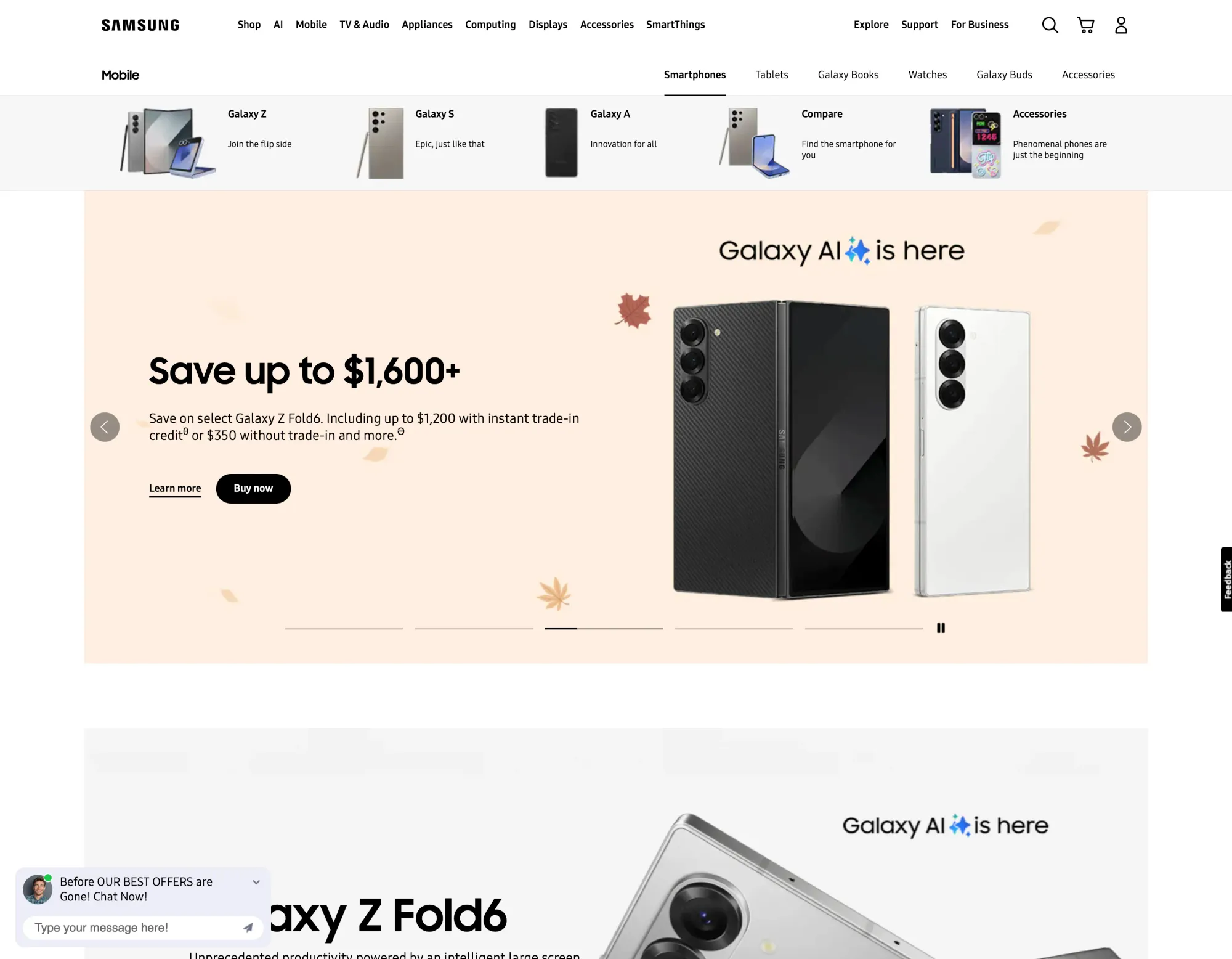
No, it does not. So let’s check out something comparable in content from Apple and play spot the difference.
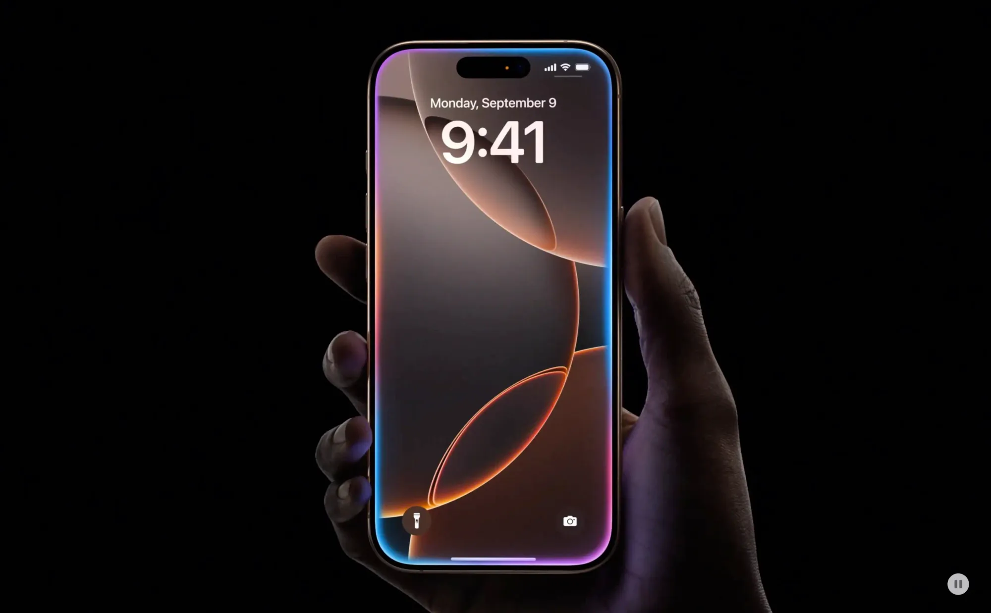
We all know a smartphone is merely an outline of a rectangle from the front. But the Apple designers make the boringness of the rectangle (or other simple product shapes, below) into a feature not a bug, by presenting it in graphic ways as a shape. And what you really see is the lock screen wallpaper. They design a new series of these wallpapers for any new product. And look how they snuck some humanity in there.
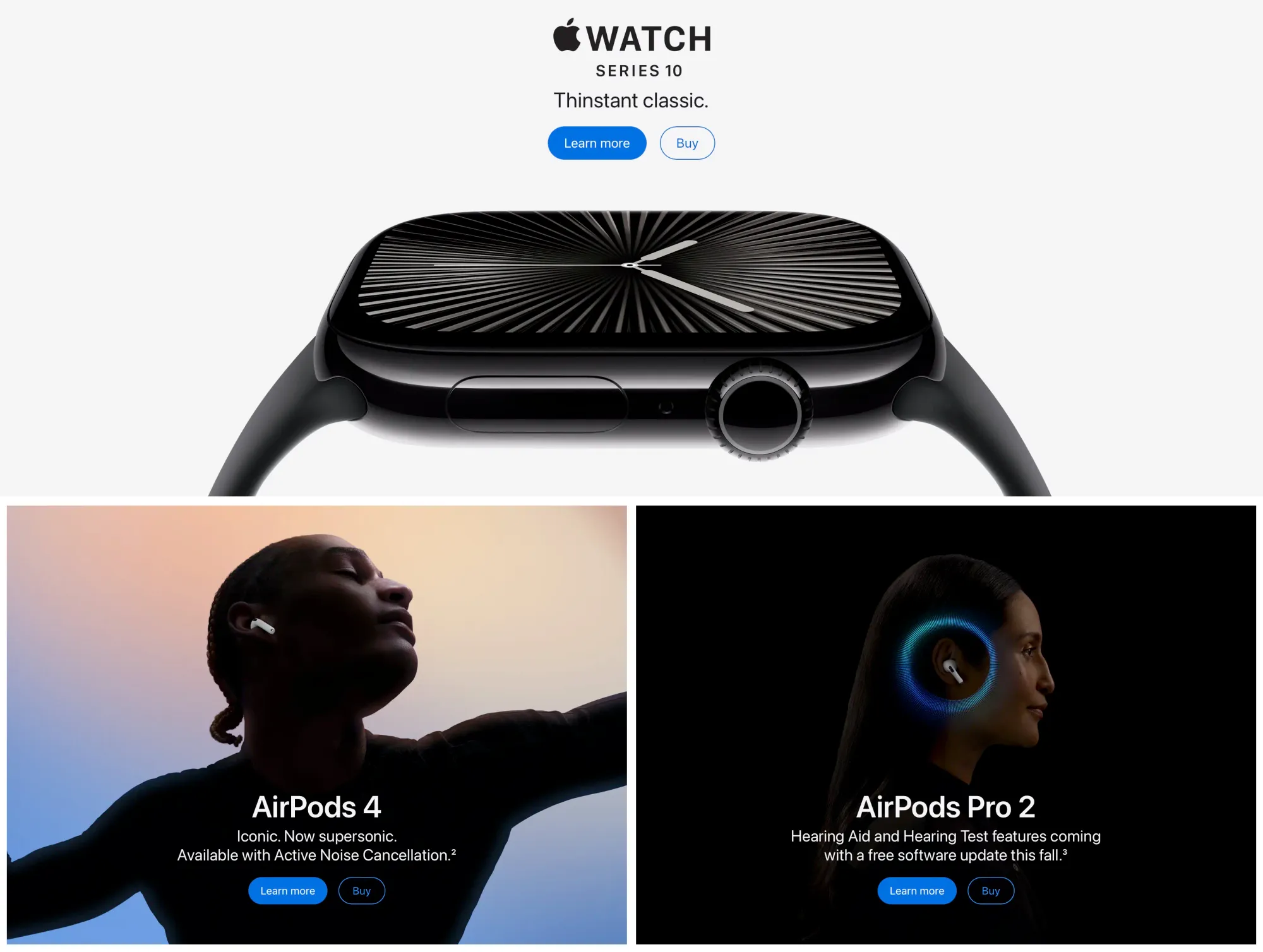
People will say I really like this or that website, and when you break it down, the website is 90% photography. The structure is pretty basic, the colors are minimal. So, are you wiling to budget for great photography like Apple?
Also, Apple generally has a lot of other well-done branding that backs all this up. Even the "let's crush real things" iPad commercial, while a terrible concept, was artfully done.
This idea of having the actor hold up the phone over his face to talk about security is simple genius. The whole thing is well done. And if you've ever bought anything from Apple, the packaging is amazing. I’m always "saving it for something."
For the Client
If you’re about to say in a meeting you want to be Apple, or like their website, think about more specifically what it is you like. Is it the minimal aesthetic? Is it what the brand means to you? Is it about how they showcase technology? Or how they showcase humanity? Is it about budget? These more specific things are all possible for your brand to communicate, but they may need to be executed differently for you.
For the Designer
You’ve heard this a hundred times. Drill down to see really what aspects are the ones that actually matter and make sense for the strategy. Sometimes people bring up Apple because they haven’t done any research and it comes to mind easily. Have an honest conversation. Is minimalism a budget or an aesthetic? Talk about the details because that's where the difference lies.
