System Collage
How a pickle recipe led me to the convergence of bad system design and collage.
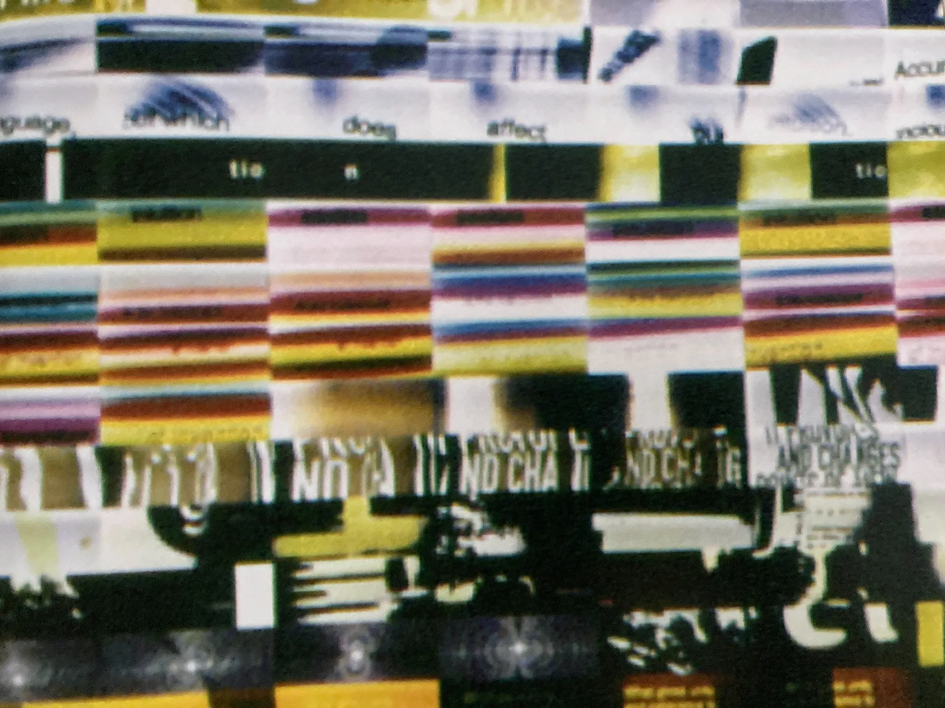
I just wanted a simple pickle recipe. But instead I got this:
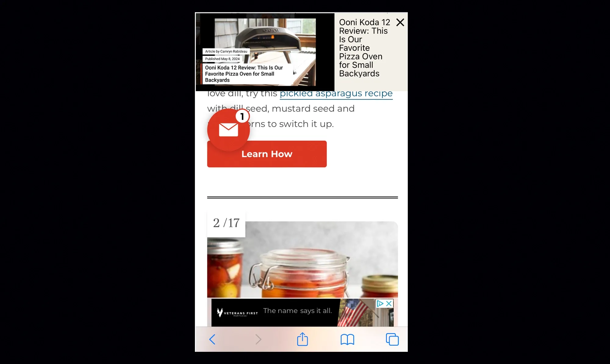
A wholly unreadable mobile webpage. And I started to wonder why? This is clearly bad. It seems like the confluence of several factors – ad servers who just need to generate impressions no matter the usability cost. Website templates whose popups want me to sign up. Unknown email icons that you couldn’t pay me to click on. And somewhere under all of that is the information I actually wanted. These systems are together creating a UX that has very little to do with me and my recipe needs. I was about to write an industry screed when the aesthetics suddenly reminded me of Ray Gun magazine.
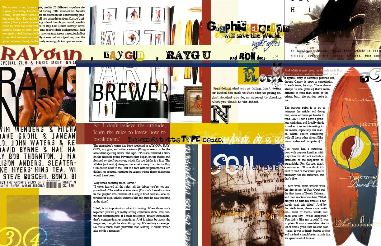
I'm sure many designers worked on it, but the look that it became known for was art directed by David Carson. It was the 90s grunge era of graphic design – you could read it. Maybe. Mostly. Sometimes. And this crazy webpage reminded me of it in principle. Both feel like collage. One is intentional and the other unintentional. Both made possible by computer systems.
The design of Ray Gun was a response to years of carefully composed, highly legible type. This very typographic forward and collage-y design style was made posssible by the computer and its new ease of constructing type in this flexible way. Nothing about typography was very flexible before that (unless you drew it). And when something new comes along, we test it to its limit. This, along with intentionally distressed and distorted fonts from foundries like Emigre, made this look not only possible, but probable.
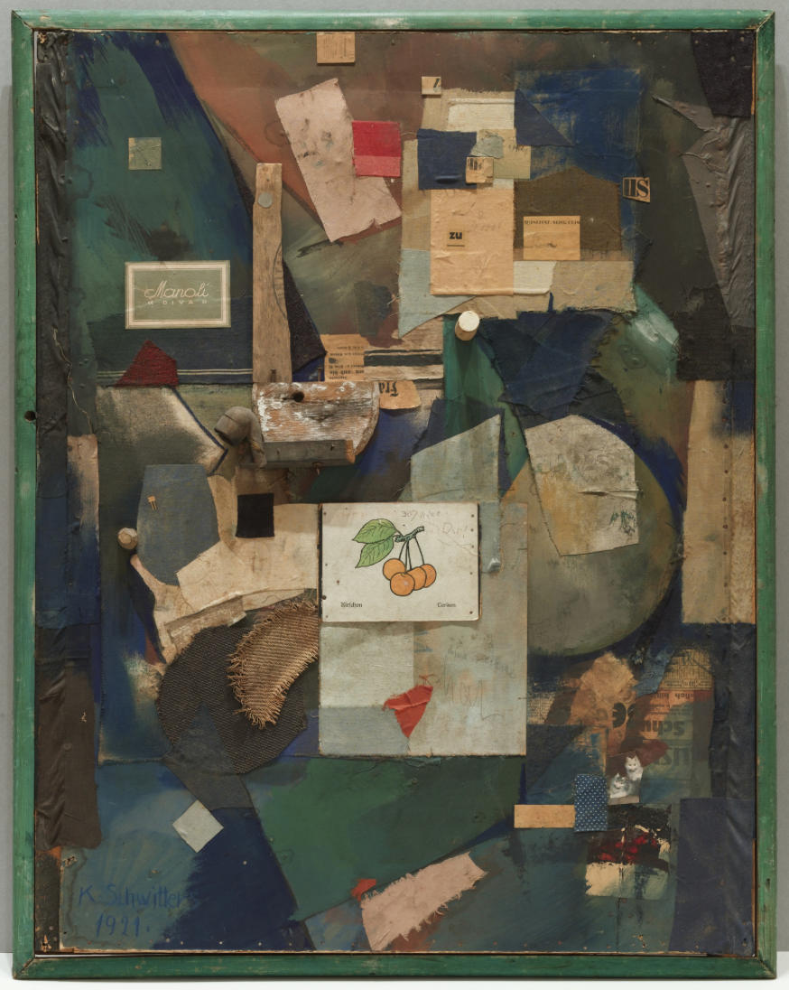
There are also Kurt Schwitters Merz pictures from the 20s. He constructed these assemblages from the cast-offs of everyday life – trash. Common but also beautiful. Layers upon layers of scraps and advertising until you can't see everything underneath.
Now we have a new kind of collage imposed by computer systems that don’t communicate with each other. Instead of an intentional obfuscating of type or information for aesthetic reasons, it happens unintentionally and without much thought of the final result. Humans of course create these systems. The system doesn’t care what that recipe page looks like. But data and dashboards feed back to create a loop that keeps this kind of thing going. It makes its own kind of collage of everyday bits of advertising and UI – which makes it interesting, but not really good.
I’ll never go back to that website. As soon as I took a screenshot I clicked off fast enough to make your head spin. This system collage is a sign of our current times and current technology. It's not communication, but a record of the detritus and cast-offs of our online experience.
