
Techy Feely
Tech’s signifiers are changing. Or are they?

In 2020, I wrote this piece about tech’s visual signifiers where I broke it down into first using 💻 hardware, then 💾 software, then 🧑💻 user experience to visualize the concept of technology. How have things changed since then?
For starters, we are still too reliant on glow-y blue nodes to continue to visually tell a tech story.

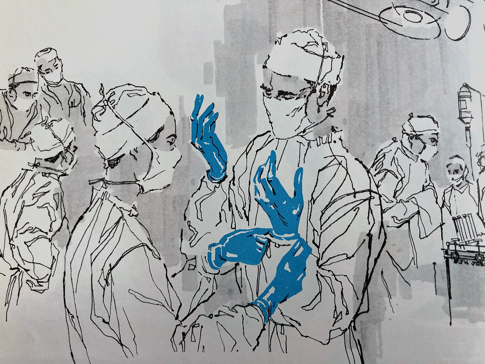
Minority Report – the movie that launched a thousand stock images.
I also saw Emily Keegin’s recent thoughts on the Claude AI Thinking campaign via her IG Stories. Sometimes she turns these commentaries into Highlights, alas it's gone for the ages. She talked specifically about the content and style of the photography – she referred to the imagery as VSCO-like – but overall I think there is a desire by the big AI companies, and more generally tech companies I'm sure will follow, to take some scary out of it.
The visual aspects that used to feel cool, and even intentionally cold, now feel inhuman. And we saw how that worked for Apple with their iPad Crush video. They're taking the “tech” out of the “nology.” The main color for the Claude campaign is a really warm, reddish brown. Props to them for busting out of the blue tech bubble. And they acknowledge the old way of visualizing tech in the beginning of the video, they just never move past a retro feel. Because how we used to feel about technology was positive.
There are two things at play here:
- AI/tech companies are more and more seen as the bad guy, and they want to soften their brand image. But this is still on the struggle bus because it feels a tad inauthentic – like they went a bit too far the other way. Also, they’re not really showing us a new way, they’re relying on nostalgia to make us more comfortable.
- As technology is just everyday normal now, it makes sense that it loses its original tech-y, glowy, edge. Unlike in days of yore, where you may have had to boot up two floppies and type some green text into your CRT monitor, most folks don’t encounter any back end of how things function at all. Can we please, please move away from the Minority Report look of things because it is a snooze. That look itself is dated now.
This dovetails into what I wrote a couple weeks ago about how do we visualize work that happens within a computer screen? And then besides work, how do we signify anything that's not work? Without simply showing the screen, it's hard to look at a person sitting at a computer and know if they are coding a website or watching Severance. This was the original genius of the 2002 Minority Report graphics because how else do you make a movie about using computers watchable? Going retro will hold for a short while. People still hate change (ex. Cracker Barrel – I mean even if you enjoy Cracker Barrel nobody feels that strongly about it without an underlying issue.) and are looking for comfort in the usual.
What the Claude campaign signaled is that they have a comfortable, useful thing that fits seamlessly into your everyday life, more than they have signaled that they have something new and cool. Which is an interesting strategy that no on else is doing so far. But what does it look like when someone has something new and cool?