
The One Rule
Examining art to learn how to give better feedback.

Buckle up folks, because I'm finally here with thoughts on feedback. In all my research, people typically write something like this: Is your feedback about making the creative better approach the goal, or is your feedback personal preference. And that's good advice. But I think there's a slightly different way that, ironically, gets more critical (in a good way, I promise).
Why Feedback Is Important
Whenever something is not quite right with the design of a project, it’s not an issue to fix it, as long as we can understand what the issue is. And not everyone is versed in design language. Designers tend to get good at interpreting. But saying you want us to “jazz it up” doesn’t give us any information on how to move forward. That means more rounds of revisions. Maybe going over budget. Often, telling us how you want something to feel differently is more useful than trying to sort it out for us.
Not useful: Can you show me more font options?
This isn’t helpful because I don’t know what the problem is with the current font, therefore I don’t know what you’re looking for that’s different.
Useful: This font doesn’t feel heavy-duty enough.
Here I understand which direction to go. I could choose a font that was bolder or less rounded or felt more industrial. And note that this feedback didn't need to include any fancy design language anyway.
The One Rule
When we would have critique in art school, we were free to love, like, meh, or dislike any work for any reason. The one rule was that we had to say “why.”
Let's apply a framework of questions to a couple pieces of art to take it out of graphic design for a moment. Then we’ll look at one piece of graphic design with the same principles. Now, you might say that art has a different purpose from design, and that is true. But the questions here apply to seeing both critically.
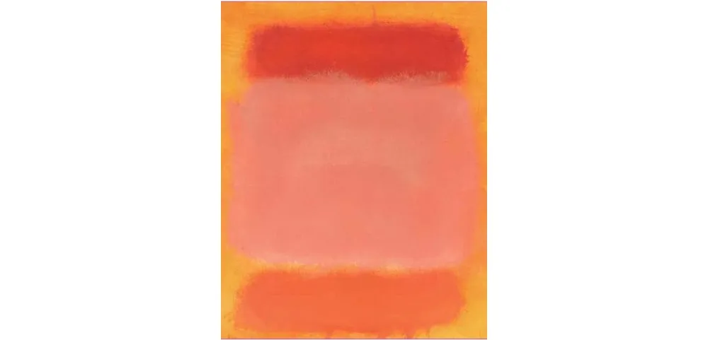
- Do you like or dislike this work? Why?
- What is the artist trying to make you feel?
- Is there anything you would change? Why?
- What parts of it are critical? Why?
- Does the work communicate its intention?
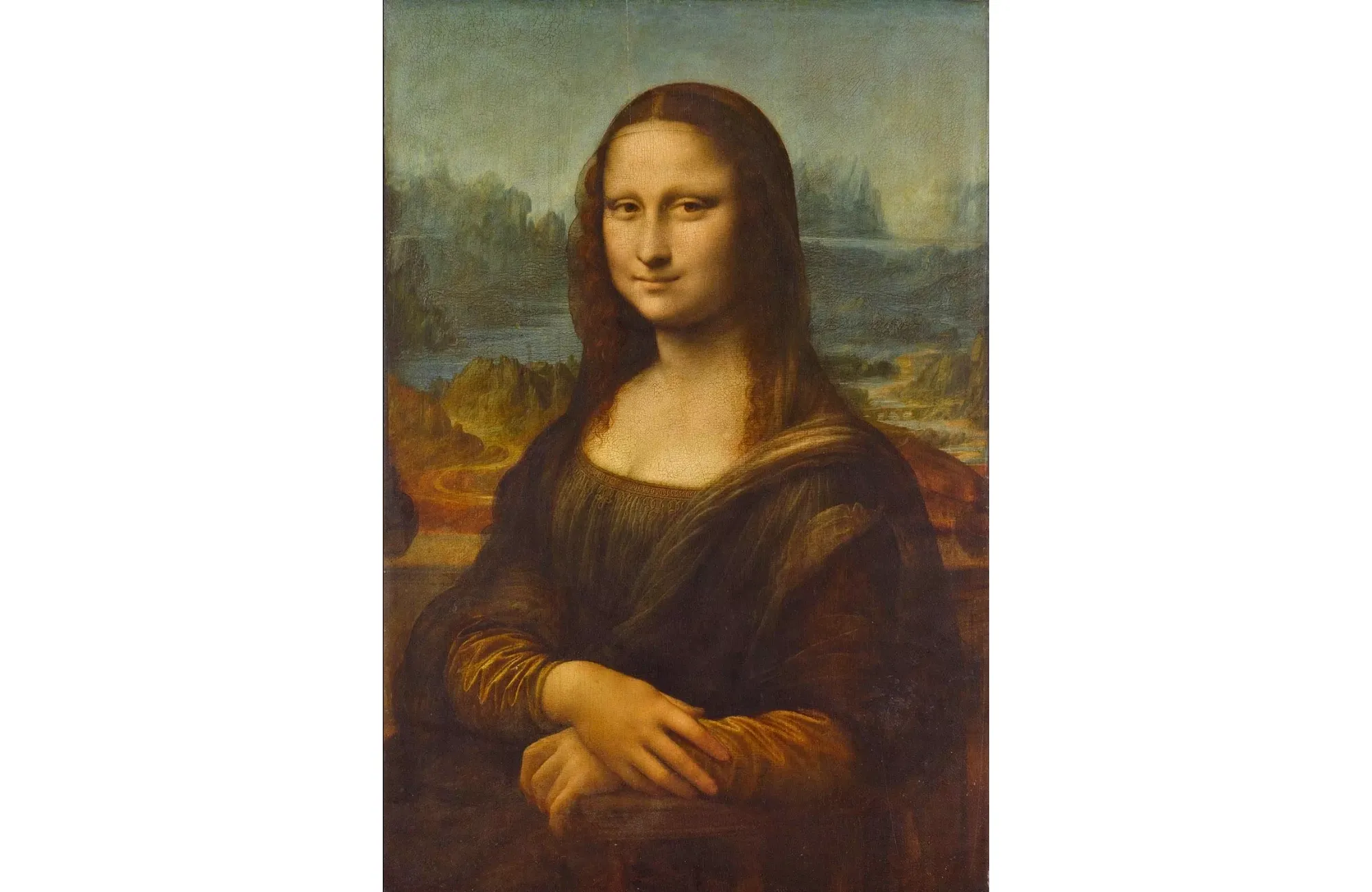
- Do you like or dislike this work? Why?
- What is the artist trying to make you feel?
- Is there anything you would change? Why?
- What parts of it are critical? Why?
- Does the work communicate its intention?

- Do you like or dislike this work? Why?
- What is the designer trying to make you feel?
- Is there anything you would change? Why?
- What parts of it are critical? Why?
- Does the work communicate its intention?
None of your answers were wrong as long as you kept to The One Rule. But did these questions allow you to look at something in a different way? Maybe deeper? Did you re-examine any impressions you came into this with? Was it easier to separate your personal preference from what the piece was trying to communicate? The next time you need to review a design, you can apply these and The One Rule. You're applying a process of looking rather than gut reaction alone.
Extra Credit
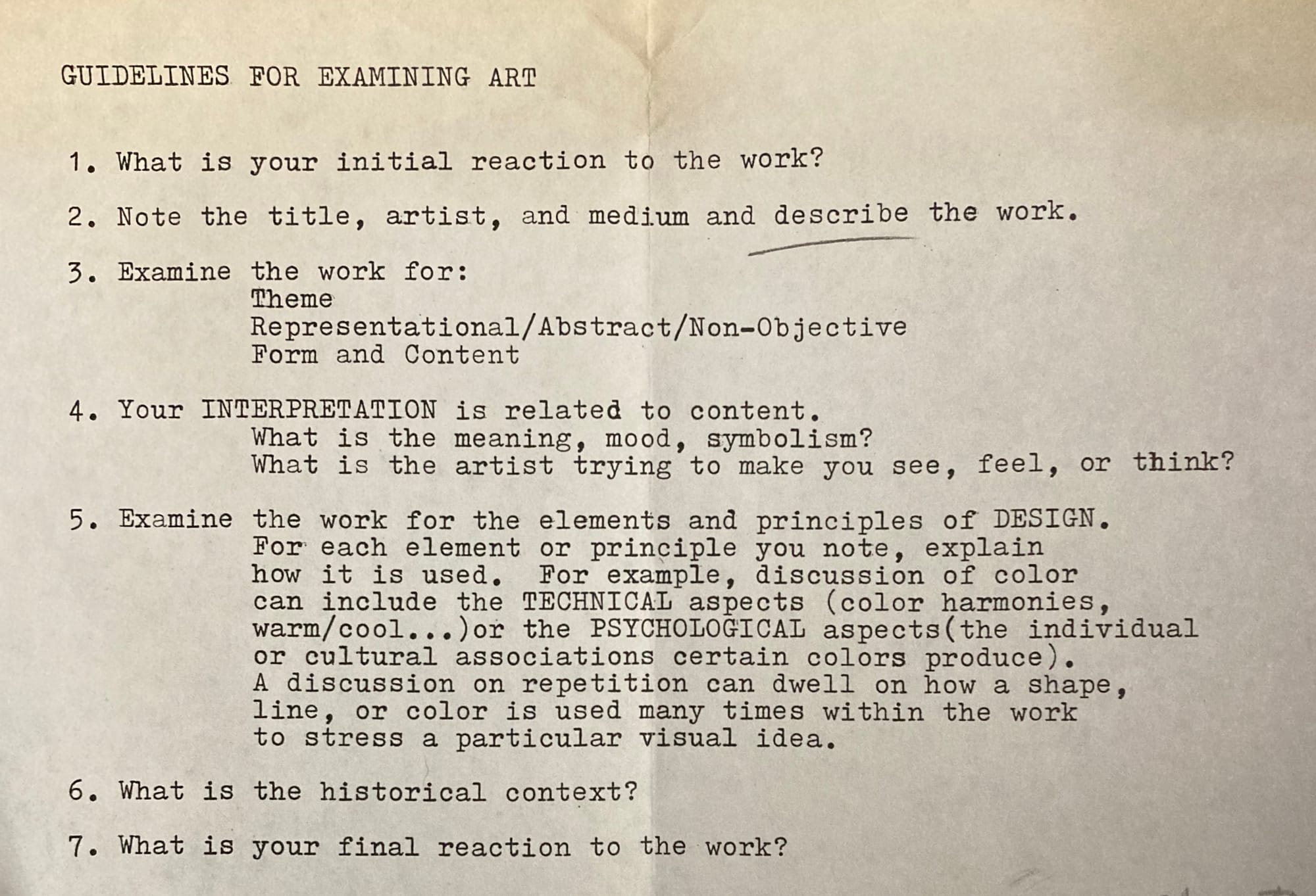
If you want to dive deeper, or head to your local museum, here are the full guidelines that this is based on – authentically yellow and creased from art school.
Museums these days have so much context available for works, and that's great. What I prefer to do is first go through and look at the art without reading anything about it. I get to decide what I think it's about, or what I feel about it. Then I can go back through and learn more. Sometimes, it makes me like a work more. Sometimes less. Here is where art is different from design. The artist's intentions can be different from my experience and that's OK.