Thinking Big, No Bigger
“If you can’t make it good, make it big. If you can’t make it big, make it shiny.”
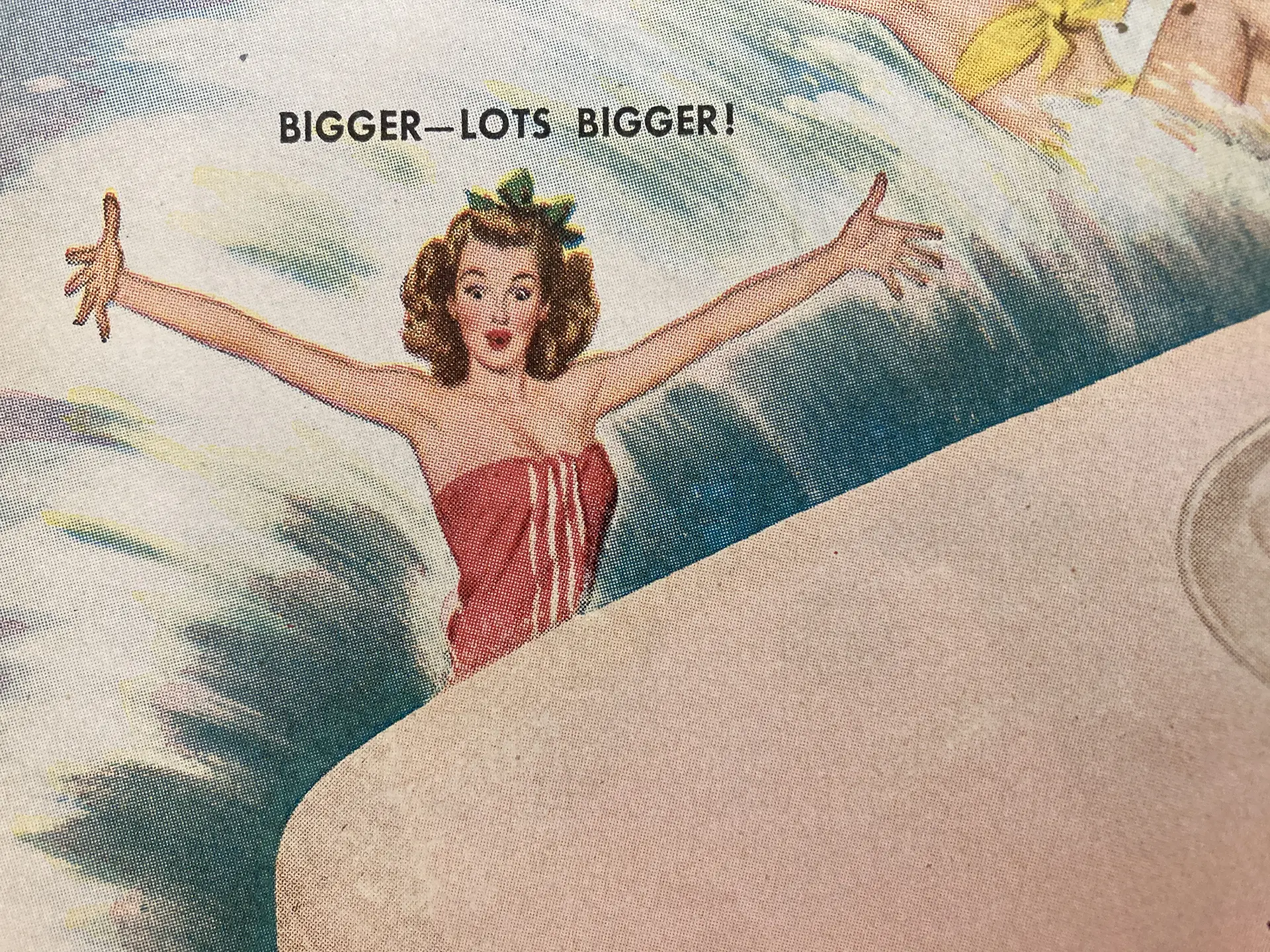
“If you can’t make it good, make it big. If you can’t make it big, make it shiny.”
It sounds like a joke, and you should make things good, but there’s some truth here. Going big can make something more important or interesting or give a different perspective, or just make it visible. And everyone loves shiny objects. But this is about large-scale projects like outdoor boards, trade shows and wall graphics. You will never be disappointed that you made something too large in this context.
Visualizing Scale
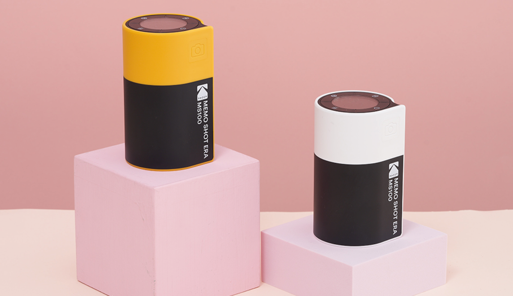
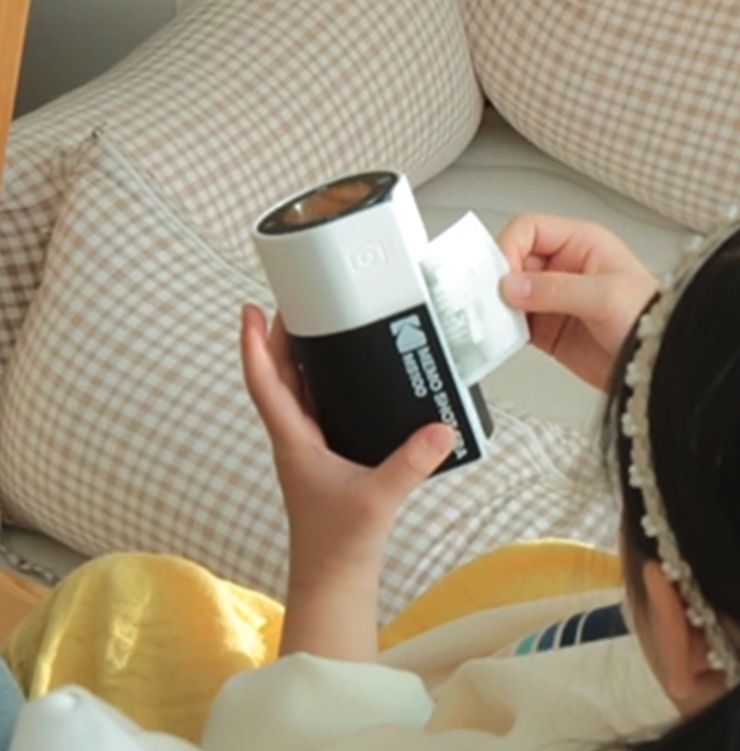
I saw this Kodak camera/printer that is shaped like a film cartridge. Super fun. And because it’s shaped like a film cartridge, I thought it was small. It wasn’t until I scrolled down to see a child holding the thing that I realized it’s bigger than I envisioned. A good example of how showing scale can be helpful in communicating size.
I typically use some silhouettes of people in my mockups for both the client’s benefit as well as mine. If I’m unsure if something is the right size, and pop one of these in (in proportion of course), I can instantly answer that question.
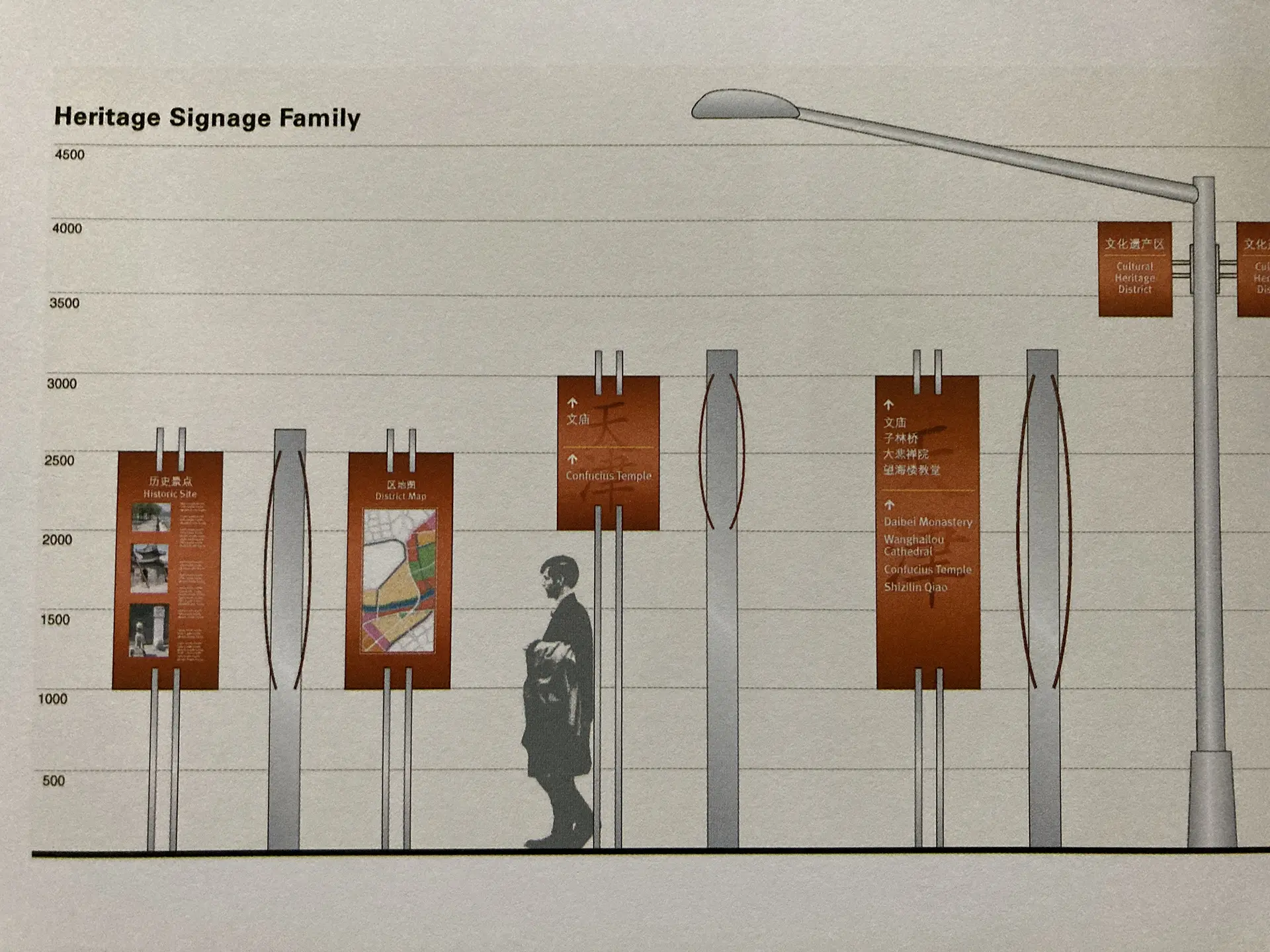
Getting in Proportion – Quick Trick
Let’s take a wall for example. Hopefully you have a measurement for it. Say the wall is 200x108 inches. For a comp, you don’t necessarily need a document full size. You can just move the decimal point to draw a box that is in proportion to that and will fit in your document: 20.0x10.8". Your box is the correct proportion and you can size it (constraining that proportion) to anything you want that fits into your document. But wait, I need to add a door and I don’t know what a foot is anymore. Say the height of your box is now 7.5". And you know you have a 9 foot wall in reality. So, 7.5" divided by 9 gives you (.83") the equivalent of a foot in your mockup world.
This is not CAD-worthy stuff here I know, but a quick way to keep things in proportion for a design comp. I like being able to iterate and try many designs, and I’m only going to build out the one that gets approved.
Thinking About Distance
Outdoor boards have not just distance, but time. I often find digital boards harder to read because unlike vinyl boards, they’re just not up for that long before they switch to another graphic. And you may only see the last half second as you pass by. The next time you drive by, you may not see the same graphic at all.
There used to be these charts where you would print out your board at X size and stand X distance away, but I never really found those super useful. Just make sure the important information is as big as you can make it. You only get 11 words on outdoor. That’s all people can be expected to read. You might need to decide whether your logo or url is more important – those elements count as part of your 11 words. You might ditch the logo if the company name is part of the url. Or only use the logo if your company is easy to search. Please don’t put a phone number here – one begrudging exception for vanity numbers. No QR codes unless you want to cause a wreck.
Near And Far
Trade shows are really crowded on top of being an incredibly busy visual environment. There are three main distances you want to consider. One is from far across the exhibition hall. Here bigger is better – you’re not driving, but you still need to be able to read something like a logo or company name from a significant distance. Color can help here. Height is also your friend.

There’s a middle distance. You’re near to the booth, but large scale elements are still impressive and draw you further in. It’s easier to read text here as long as it’s still large enough and not too lengthy.
Last there’s close distance, and you’re inside a booth. Here is where you can give folks some information at a smaller scale. You actually don’t want to make this too big. They’re reading or looking at something right in front of them. Have you ever had to back away from a large painting at a museum in order to take it all in?
In all of these scenarios, you will kick yourself when you finally see the thing in real life and realize it’s too small. But you will almost never be disappointed you made something too big. Go big.
