
Unseen Structures Pt 2
The three part structure of brand imagery that almost everyone uses.

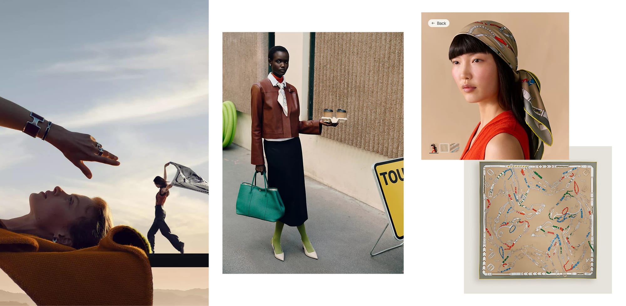
There's a hidden three part structure that lies behind almost all product brand imagery. One reason for this is that consumers want different kinds of information at different times. The other reason is budget. Let's break it down, and I'm going to use Hermès as an example, although there are other examples down the page. This is not unique to luxury brands. Any large brand from tools to tableware does this.
Part I
From a budget standpoint this is usually the most expensive production. This imagery is meant to be the primary imagery for a brand. It best communicates feelings or qualities that signal what the brand stands for. It tends to be more conceptual. In the Hermès example above, the image on left feels playful and artful. The composition is interesting and has movement. The products themselves are present, but are not the most important elements.
Part II
Brands typically need imagery to fill out a middle space between high level advertising and the sort of "just the facts ma'am" imagery that is Part III. And for brands that need a lot of imagery, this is where they bulk out their library. Because of all this, the budget is typically less than Part I. Sometimes this is referred to as catalogue imagery.
But here's the tricky part: if there is too much of a disconnect between Part I and II, consumers will get confused. Part II needs to take some of the feelings of Part I, but typically show the product in use and in some slightly more practical way. So, the Part II example above is still very sophisticated, but now we see the scarf out in the world as you might wear it.
Part III
Just show me the thing I'm about to buy. You want to see exactly what you're paying for, so often it is just the product on some kind of plain background. These images typically have the least amount of budget because they can be pretty straightforward and you need a lot of them. The Hermés examples goes a step further and also shows it on a person, but again in a simple way, with a plain studio background. The quality level of all three parts is consistently high.
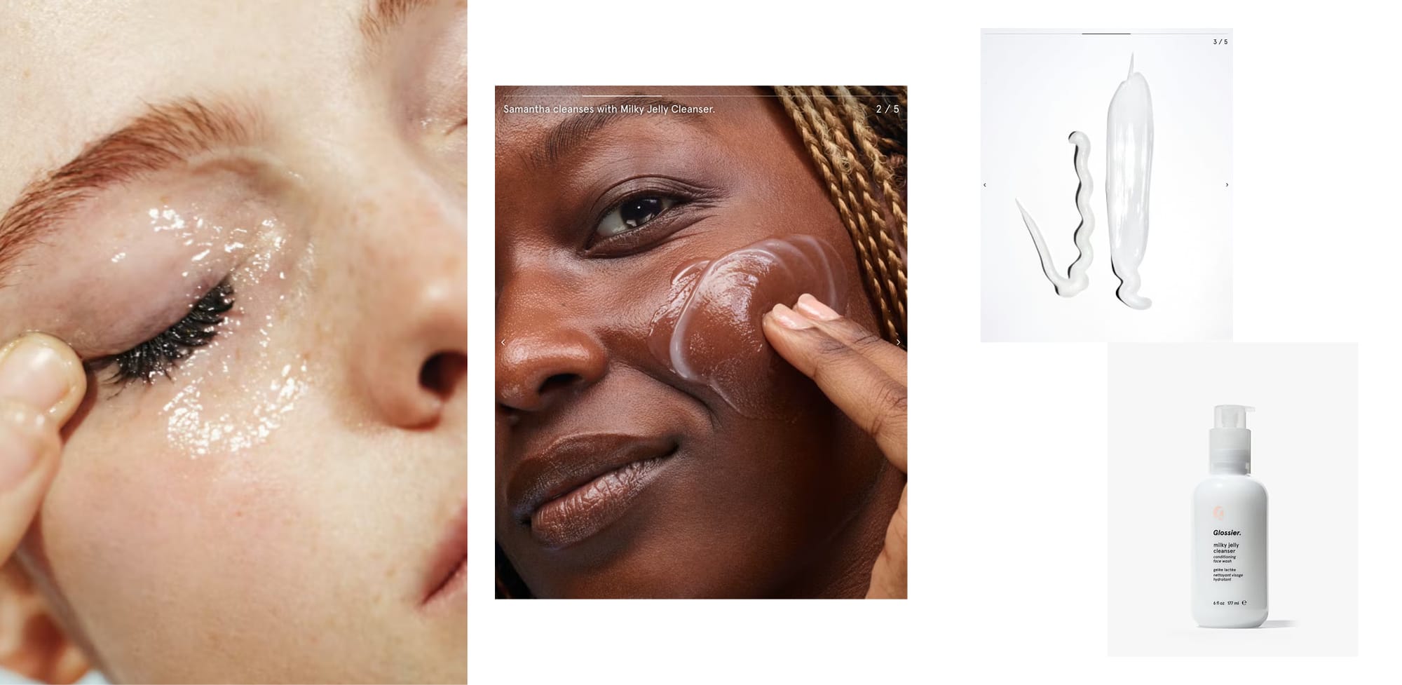
Here's an example from Glossier. The imagery on the left is a tad better quality in lighting, but the look of their brand imagery overall is a simple idea of bright and shiny which is easy to translate into Part II. This clean look with an emphasis on the textures of the products makes the very simple white on white Part III imagery make total sense.
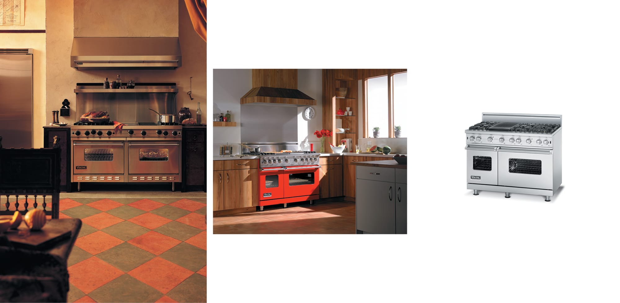
The Viking Range kitchen on the left is a full kitchen that spares no expense. The middle is a smaller vignette set that is still a cool design, but a little more practical. The right product image is only descriptive.
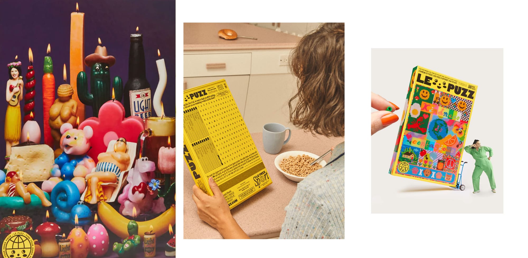
What about smaller brands? Le Puzz's Part I imagery is the artwork for the puzzles themselves. They're very different, but consistent in their slightly retro content, bright colors, and quirky themes. Their logo and brand color is so strong, it pulls everything together for me. Part II typically shows someone putting together a puzzle, or in this case, doing a puzzle on the back of the box. The cereal and tones again give nostalgic vibes (Do they still do put puzzles on the back of cereal boxes?). And their Part III is typical, but with a little twist which is on brand for them.
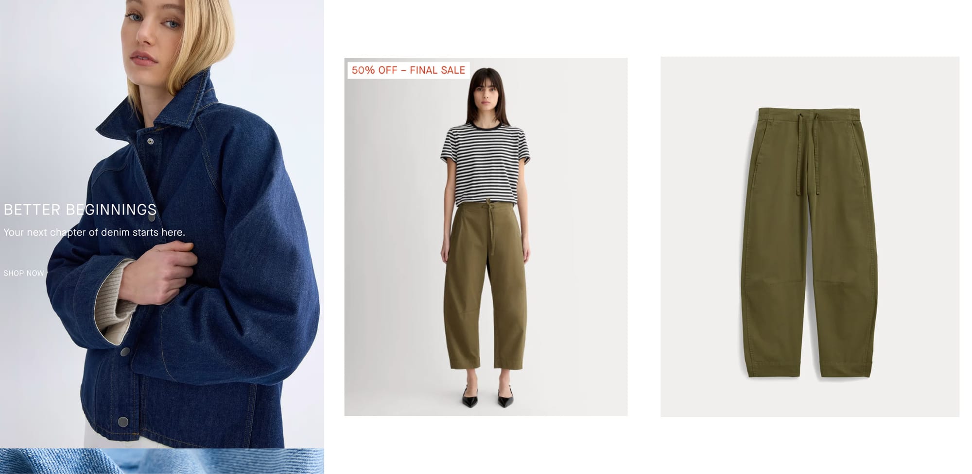
One more from Everlane because maybe it's the clearest example. All the images have the same minimalist vibe. But we go from model in an interesting pose to model in a straight forward pose, to just the pants ma'am.