Van Leeuwen / Jimothy / Coke
A fresh take on three recent brand stories.

1. Van Leeuwen brings the receipts.
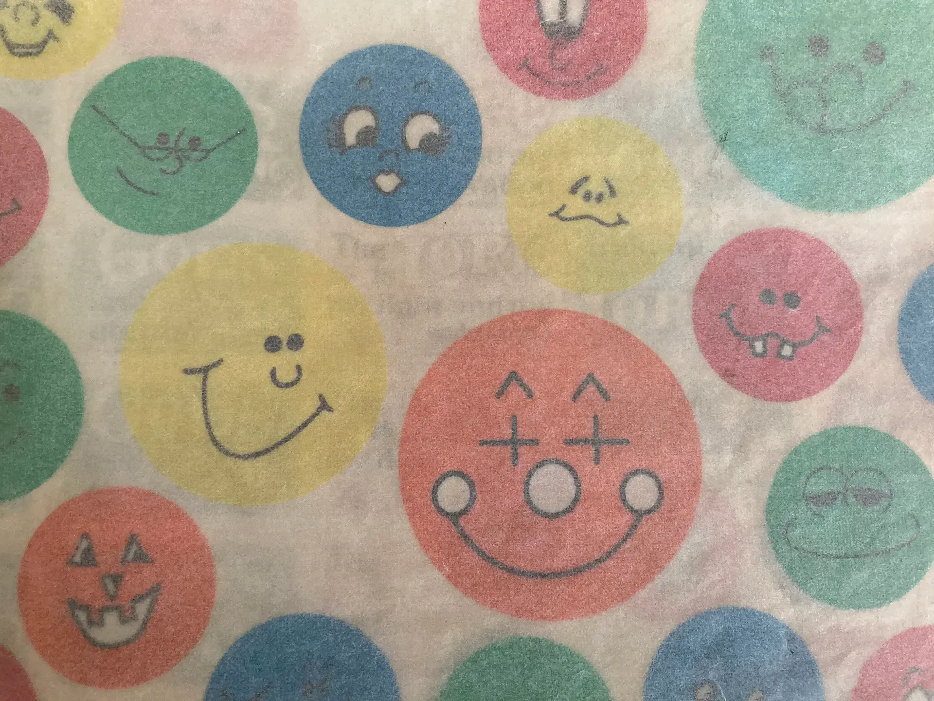
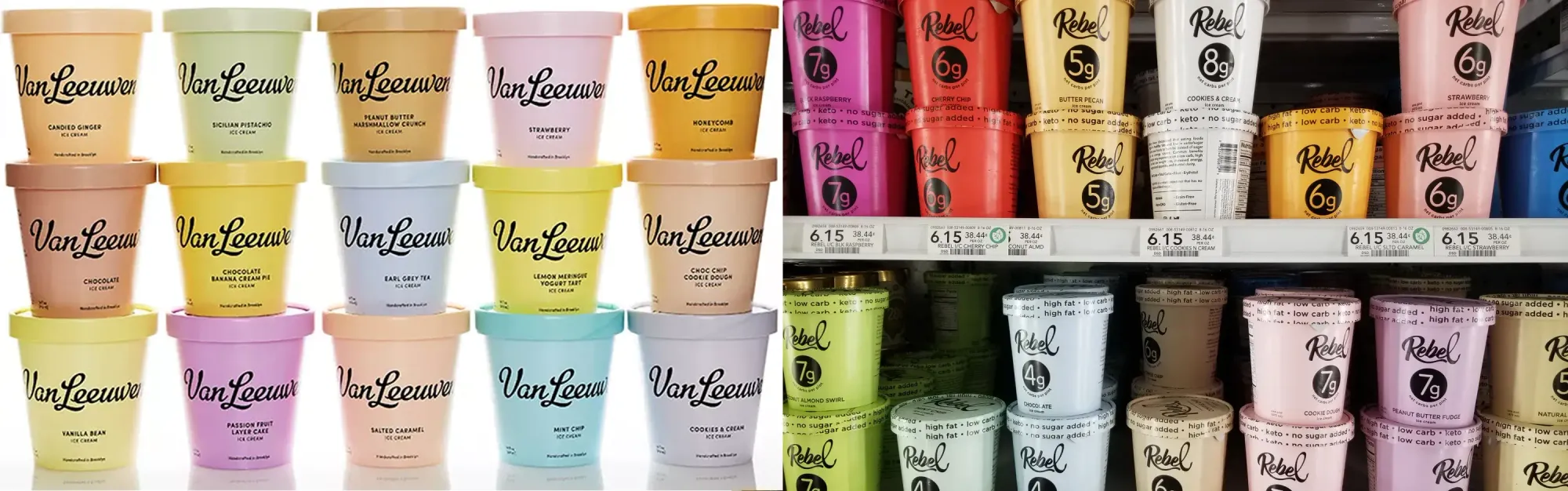
The ice cream brand known for pastel monochrome packaging just won their $23.8M case. Rebel was marketing itself differently as a better-for-you ice cream option. And it was not using a similar logo or name. It was however, copying the packaging vibe. And that's typically a harder thing to win, but Van Leeuwen busted out the behind the scenes work that went into their brand and packaging design:
Van Leeuwen arrived with the full Pentagram record, including the concepts that were rejected along the way. Rebel reportedly produced a finished Illustrator file and little else, and offered an account of independent creation the court called clearly fabricated. – Source
Showing your work for the win. Here's a detailed breakdown.
2. What Jimothy reveals about naming.
More often than I'd like, companies who don't really understand naming will mush two names of friends or family members together, and think it's super cute. It almost never results in a name that consumers attach the right meaning to, and the story behind it is invisible anyway. Jimothy is not that name. I know there were a lot of other things that went into the raccoon's popularity – the algorithm, cute animals, weird animals, people desperate for something light – it ticks all the boxes. But I'm here to posit that a raccoon named Tim would not have gone this far – that Jimothy as a name is a huge part of his popularity. It is two names pushed together, but it is the right amount of weird. And damn it's fun to say. All the kindergarteners named Jimothy in five years, this is their origin story.
3. Is Coke the new Marlboro?
There are tons of articles about Coke's new rebrand. Lots of hot takes that say the font looks like the Marlboro cigarette font. It doesn't. It actually reminds me of the More cigarette font, but let's give them some credit for using a serif, shall we. I don't really think their intention is to reference the whole "fridge cigarette" thing, but if so, let them. This is a global rebrand, so only countries that have Marlboro cigarettes and also a fridge cigarette joke will make any connection whatsoever. That's a U.S.-centric opinion. Here is the official Coke brand reveal video. And it's simple and fun. The imagery is bright and high-contrast and they're simplifying how the logo is used everywhere. I think it looks great. Consistency can be undervalued. It seems like most people are just bitching rather than saying anything super interesting.
The other thing people are up. in. arms. about is the redesign of the variants. Coke Zero fans are TERRIFIED they're going to pick up the wrong can.
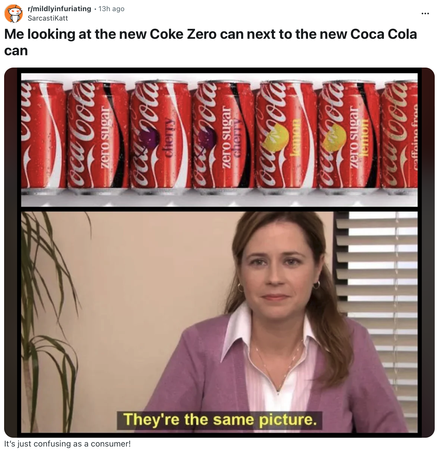
I would argue it has nothing to do with the new design – which clearly in large letters says "zero sugar" and has the black stripe – but with simple habit. The brand equity in the red can is well worth having a few folks irritated while they get used to a different package design. Also, I don't think Coke Zero drinkers (I'm one of them) really feel any cachet in signaling they're drinking a Coke Zero like some Diet Coke folks do. Interestingly, they left Diet Coke out of the new brand redesign, choosing to treat it as a separate brand. I drink Coke Zero because, well, I want a Coke. Just without the sugar. I'm totally fine if it looks like I'm drinking a regular Coke. I'm totally fine if it feels to me like I'm drinking a regular Coke. So, ultimately, I think this is a smart move.