Visual Scrap #1
Sometimes designers use imagery in concepts that we don't intend to be the final output, or to describe a mood or as inspiration. We call this scrap. I accumulated some scrap that I have found useful, and wanted to share instead of a written article this week.

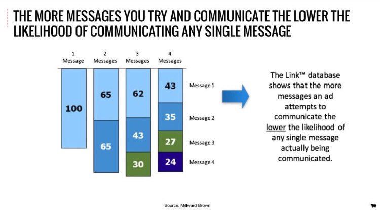
This chart is via Strat_Scraps. I can't tell you how many times I've had this conversation both internally and externally. And while I know this to be true, a chart feels like proof, right? I think the numbers assigned to the messages help to hammer it home. That Message 4 isn't going anywhere.

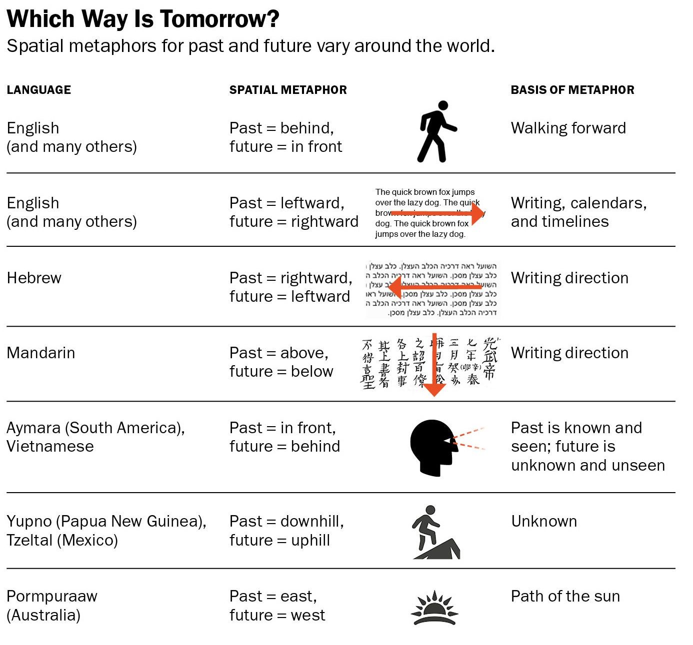
I keep coming back to this chart for several reasons. One of which is that it provides structure for things that we're taught about design. I learned a long time ago that having a person face to the right in a layout indicated the future. And this chart explains why. But it also shows that some things are not universal, and that concepts of time are intertwined with language, gestures and the environment. I originally found this on Are.na, but discovered it's from this Scientific American article if you want a deeper dive.
Here's a handy pdf cheat sheet you can dowload. If you're a designer, you probably know the difference between a bleed and non-bleed ad, but I had to explain crop marks and just this thing recently. Some folks who grew up with digital only never really learned print production. So, I made a cheat sheet which explains some common terminology – Trim, Bleed and Safety. If you're a client, you can read up. If you're a designer, you can use this as a template for your conversation or as a visual.

