
Visual Scrap #13
Some warnings have warnings.

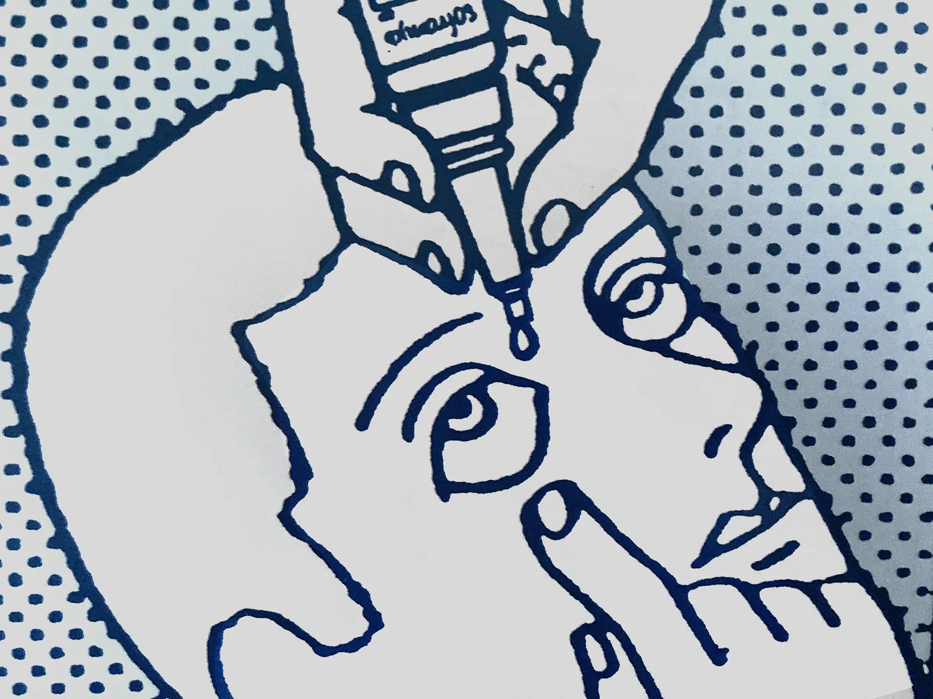
When I was collecting items for this I realized there was a theme of labels, mostly for warning or notifying you of something. Or, not.
Warning Labels with Warning Labels
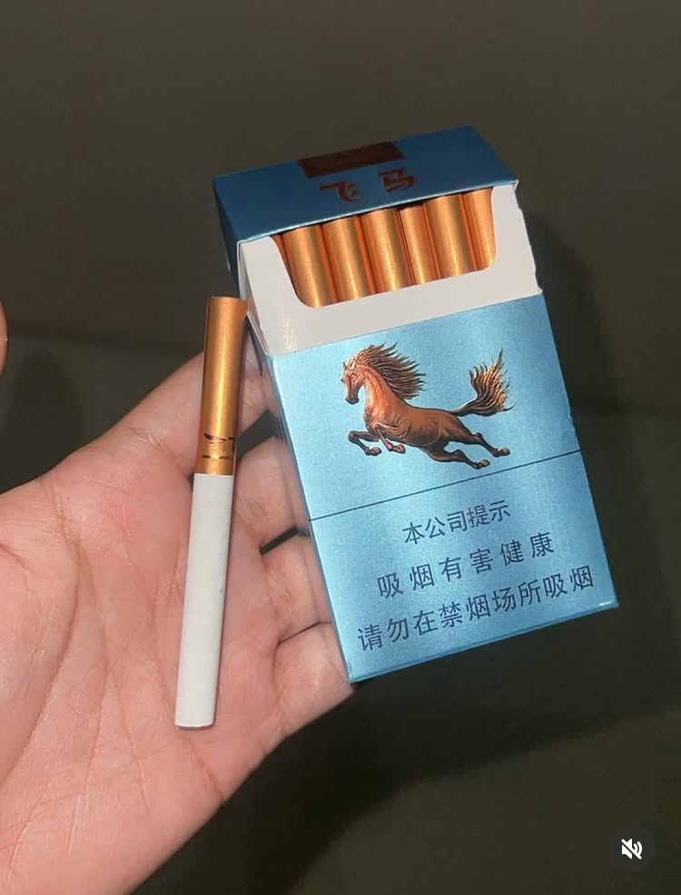
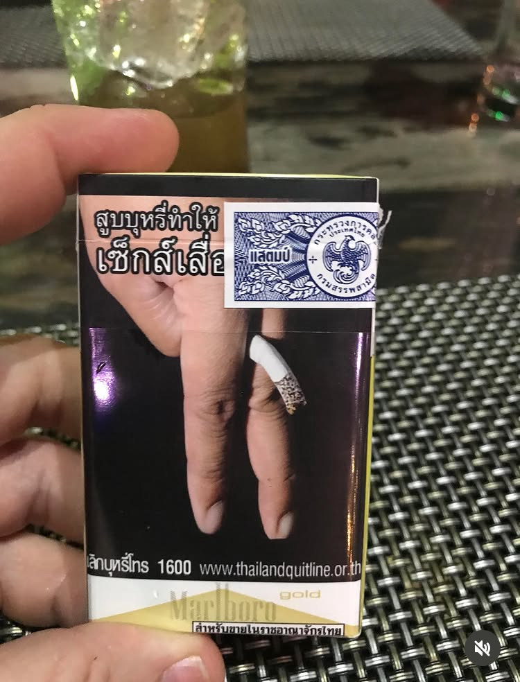
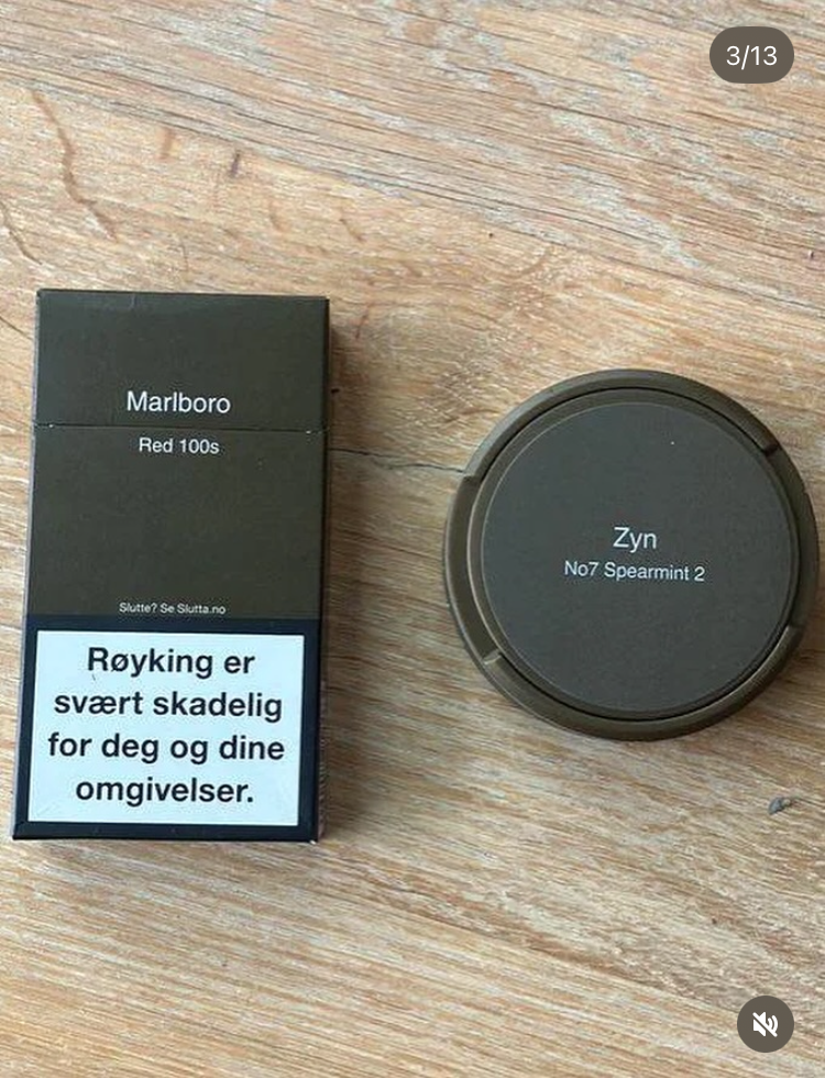
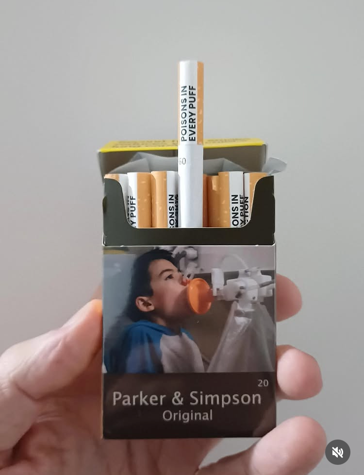
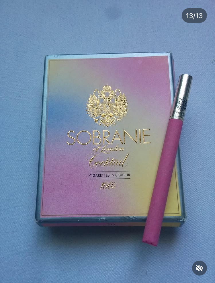
First up is a roundup of cigarette packaging from around the world. It's interesting to see who requires warning labels, who does not, and who actually gets creative with it. Also, as a real meta (Meta) moment, if you click this link to see the full set and are not signed into Instagram, you will get another warning:
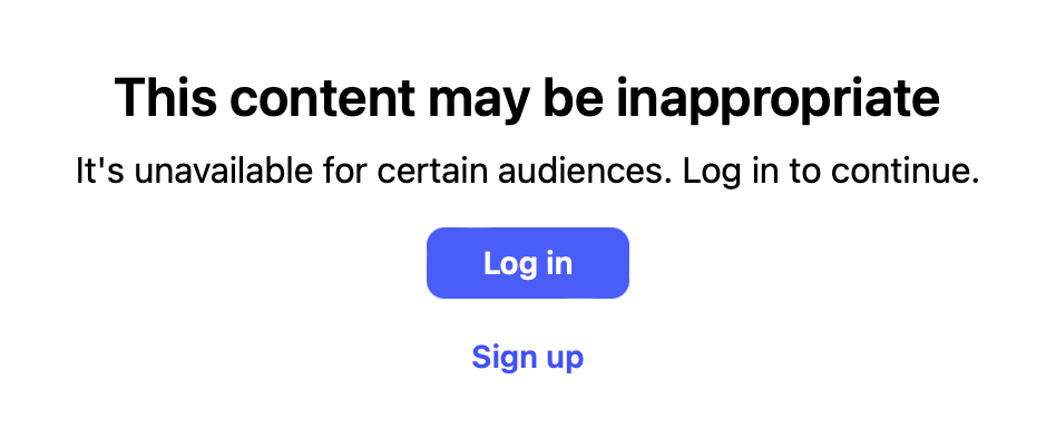
It's just cigarette packaging ya'll. Here's a taste:
A Tasty Warning
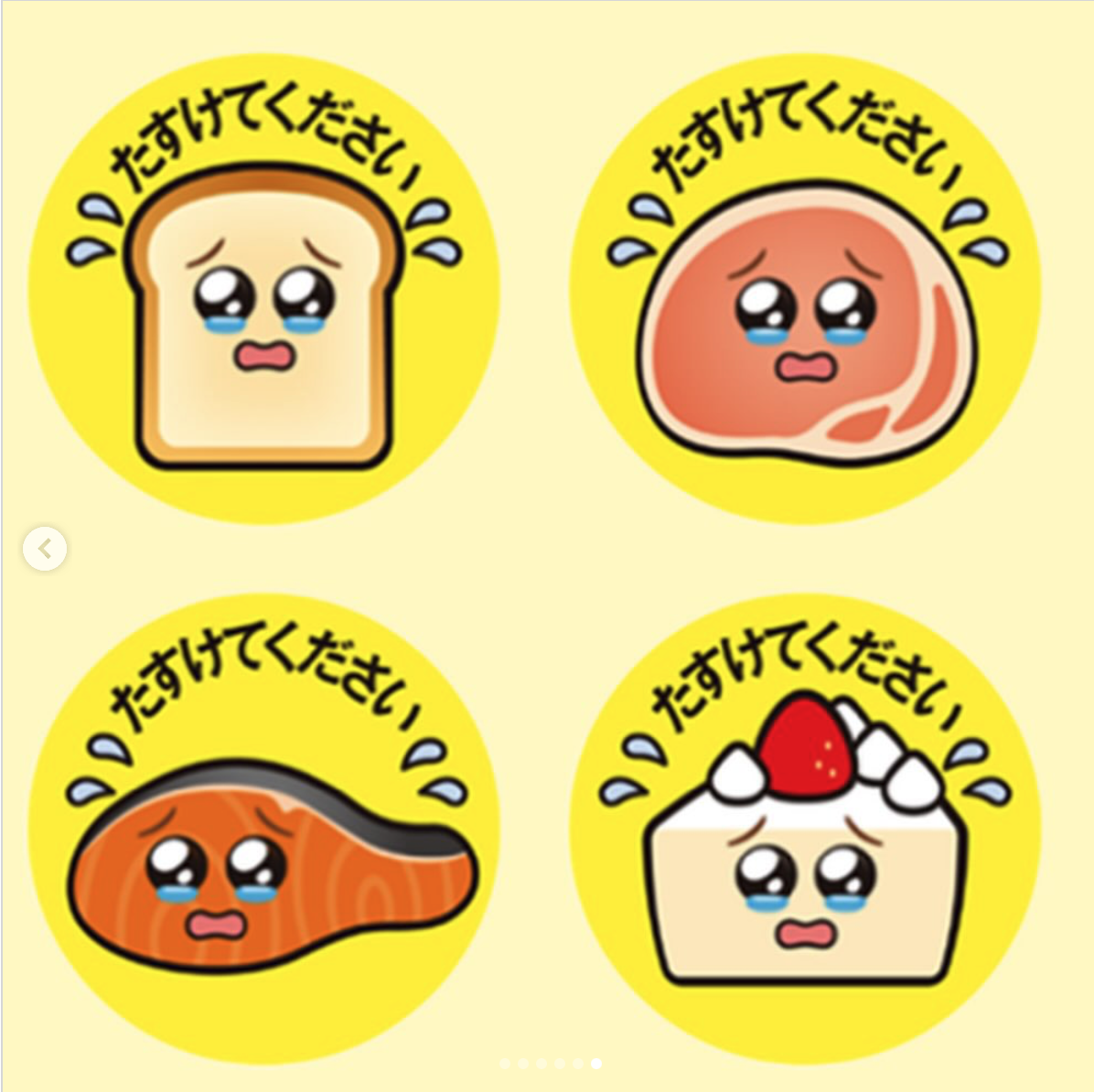
On a more positive note, to combat food waste, Japan's largest conbini, Family Mart, developed a series of cute, but sad stickers to indicate that food was in danger of going to waste as it nears its expiration date. Combined with a discount for these items, they have been a huge success. "Family Mart expects that the initiative will lead to a food loss reduction of approximately 3,000 tons per year." They read, "help us," and Family Mart is offering them for free to anyone who sells food.
Not a Warning, But Stickers
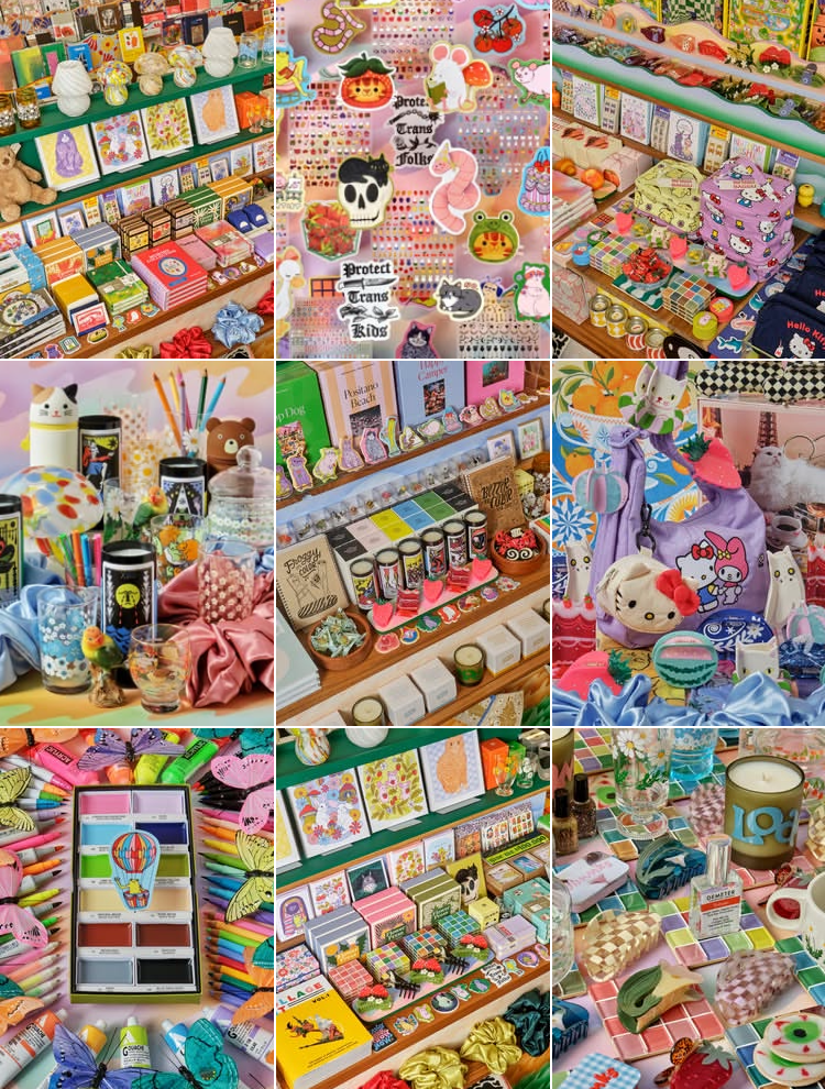
I ran across Crush & Touch Art Supply's IG page, and can't get enough of the flat-lit maximalist photography. It's so much, but it's not chaotic somehow. They feel like little puzzles. I'm here for it. It's refreshing when so many things on social media all look the same lately. And the brand consistency makes me happy.
Anti Label
"People Are So Tired of Branding, They’re Tearing the Labels Off Their Beauty Products" according to this Allure article. (NOTE: Read this in Reader View if you have it, because this is one of those websites where the ads practically obscure the article.) They mention reasons such as "visual decluttering" and "brand fatigue." Those may be true, but it's also true that luxury packaging is typically very minimal. It's a way to make cheaper brands feel more elevated. Even though they say they want to become brand agnostic, they are copying a style of luxury. It's also about being able to customize what essentially become home accessories when displayed on a shelf. Which is the more interesting take. Even without the label, are you buying this brand or that because you like how the shape or color of the bottle looks on your shelf? Some people are decanting their products into nicer containers which is actually an old idea. Search "vintage vanity set containers" on eBay or Etsy.
This also speaks to the volume of required information on products these days. For more expensive products, you might be able to get away with having that information on an outer box or paper insert that most of us throw out immediately. But most drug store brands have to have everything on the label itself. It's good that we include ingredients, and instructions where needed. But there is a lot of content that is not that useful, but there for legal reasons – soap instructions, for example.
I could actually kind of get into this for the aesthetic value. There are tutorials for removing labels. I think I'm too lazy.