
Zero Shades of Gray
Contrast isn't just a design element, but a powerful tool to make your point.

Contrast is a powerful design tool that you think you already know. I’m sure you’ve played with the contrast in a photograph or tweaked accessibility on a website. In design, when we talk about contrast, we typically mean how two colors interact with each other or the play of light and dark.
But contrast can be a really helpful tool conceptually to demonstrate difference or change. Time flattens contrast. When we see someone every day, we don’t notice all the small incremental changes that happen over time. But if we see a portrait of someone ten years ago and today side by side, we remove all those shades of gray in between, and the differences becomes apparent.
Using contrast this way can be a great help with presenting information. Below are some visual examples of different ways you can use it beyond thinking in black and white.
Concept

Both of these images show contrast between the concept of small and large. However, the comparison on the left has pretty weak contrast. Yes, there is a small and large dog represented, but without their true scale, you're missing out on the strong contrast of the image on the right.
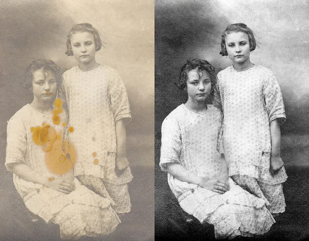
Before/After
Who doesn't like looking at a before/after of a home reno? And the more terrible the before looks, all the more impressive the after looks. Above, the conceptual contrast is increased by also increasing the actual contrast (light and dark) and changing the tone of the image. This was done as an aesthetic choice, not to convince you of anything.
The Shady Side of Contrast
Many years ago, I worked for a photographer and we used to take the before and after photos for a cosmetic surgeon in town. We took great pains to create the exact conditions, pose and lighting for both. However, next time you come across one of those spurious cosmetic before/after ads, take note. They typically do a few things to increase the conceptual contrast (in a shady way) such as: better lighting for the after, a slight smile or slightly different angle in the after, the person might be wearing a bit of makeup in the after. Many times they use all three.
Data
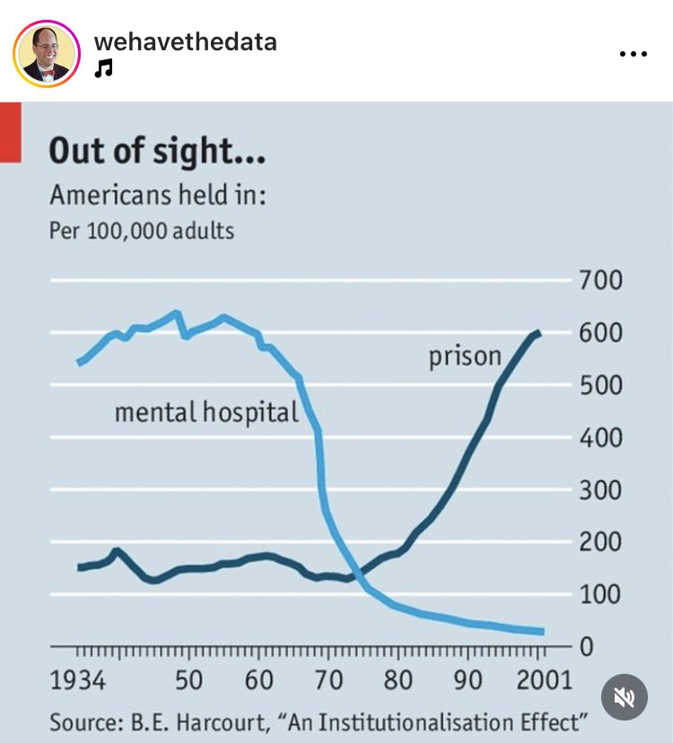
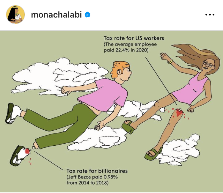
Data needs contrast. Check out the simple chart on the left. This style of chart helps show the dramatic contrast between the two trajectories. You could imagine that simply giving you the numbers wouldn't be nearly as impactful. Same with the chart on the right, along with a bit of humor. The contrast between a foot and a leg in addition to providing some needed scale, helps you imagine how big the difference is.
You can use contrast to remove the incremental grays of change or of time or of spreadsheets in order to show the starker differences between two points. And by doing this, you can often communicate for effectively and show change or difference in a more impactful way.