
Attention is Intentional

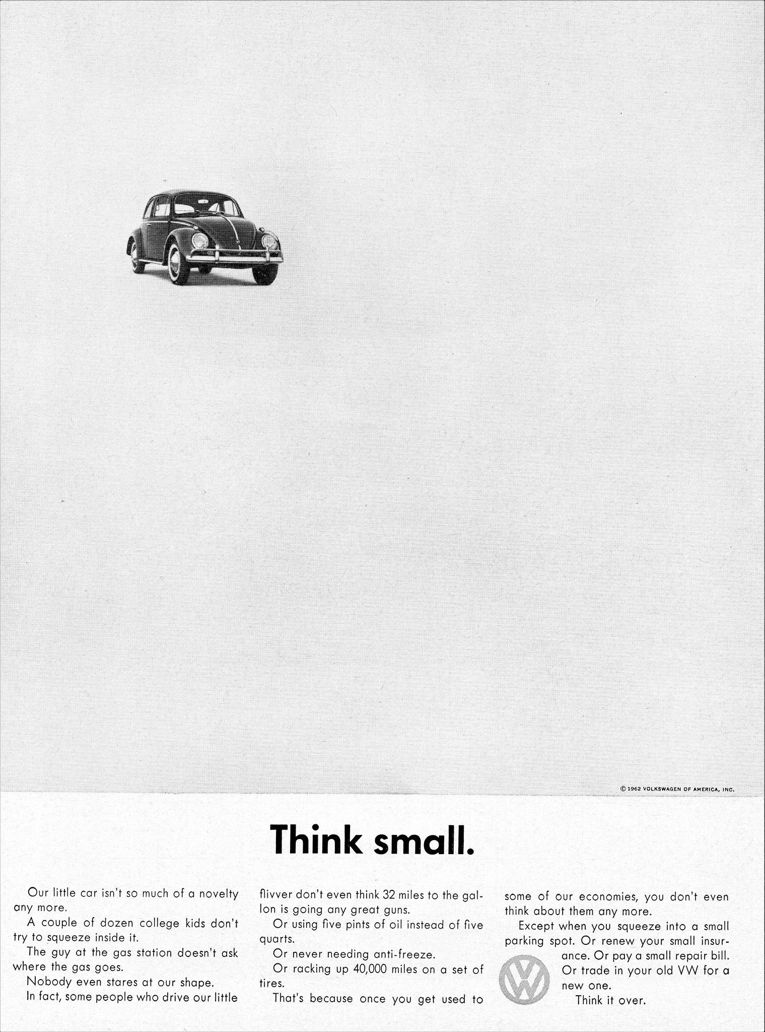
I've had this experience from the DMV to an eye surgeon's reception desk: you walk in and are confronted with no less than six flyers or signs that you're meant to read. Do you read all of them? How long would that take? Do you read any of them? Aren't they important? They usually contain a bunch of musts and notices and rules. But you can’t possibly take in all the messages in the short walk up to the desk. In putting so many "important" messages crowded around each other in the hope that you read them all, what they have actually done is assure you've read none. Here's the chart that proves it from a few weeks ago.
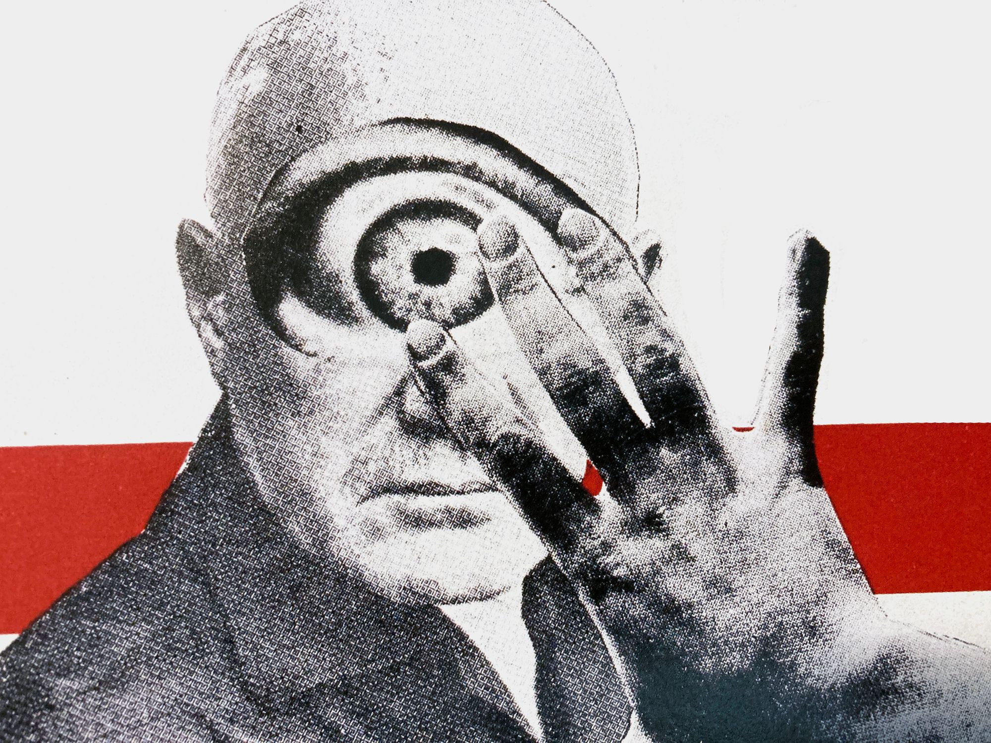
This all relates to our attention and our ability to pay attention. Our brains aren't designed to pay attention to many things at once. Multitasking is a myth. We can really pay clear attention to one thing at a time, and that's what attention is after all. Choosing what to give your focus to. Or, in the realm of the designer, directing where we want someone's attention to go.
Sometimes clients complain about white space or negative space in a design. But designers use white space to focus attention on one thing or the first thing in a hierarchy of information. It creates space around important elements so that your brain can focus. It can move distracting elements (think other ads on a newspaper page or in a busy physical evironment) just far enough away that your message can be communicated.
And the goal is communication. Some clients may feel like they're not getting their money's worth if there is too much white space. You didn't design it enough. The reality is, the client is not getting their money's worth if you have so much crammed in a space that no one can focus their attention on the main message. In choosing to draw their attention to this thing, you're asking them to put aside other things.
For the Designer:
White space or negative space is a design tool of attention. Other elements can draw attention too – color, lack of color, typography, scale, etc. But perhaps white space is the thing that can give a design the literal breathing space to communicate and therefore allow a customer the brain space to pay attention to what you want them to.
Of course, maximalism in design has its place too. The answer isn't always white space. The questions are always what are you communicating and where do you want to direct attention? What is appropriate to the task and the brand?
For the Client:
Remember that the ultimate point of whatever you are hiring a designer to do is to communicate something. Adding too many images or messages into a design can seriously hinder that ability to communicate. People can only focus their attention on one or two things at a time and that's in the best case scenario. How focused were you the last time you had a bad day? Or over scheduled yourself? Or had an argument with a loved one? Or were stressed at work? The consumer you're trying to communicate with is the same.
Clients can also get a sort of tunnel vision where their brand is naturally the most important brand to them, and they forget that consumers are constantly being bombarded with messages from a ton of brands. Yours is not automatically the most important to your consumer. Your designer can use elements such as (but not limited to) white space to help them cut through the clutter and focus their attention.