
Flip It And Reverse It
Are there some old design saws that are less true than they used to be?

You've probably heard this tried and true design advice, which is that serif fonts signal things like stability, tradition, reliability and history; and sans serif fonts signal things like modernity, elegance, simplicity. It’s not untrue, but I wonder if it’s as true as it used to be. I’ve seen a lot of very modern looking serif typefaces and a lot of sans serif that don’t particularly feel that fresh to me. Which could also be a symptom of the current corporate re-blanding. Maybe it’s time to question this, and a couple other things, and see if they warrant a fresh eye. After all, time is always relative to you.
Serif/Sans Serif
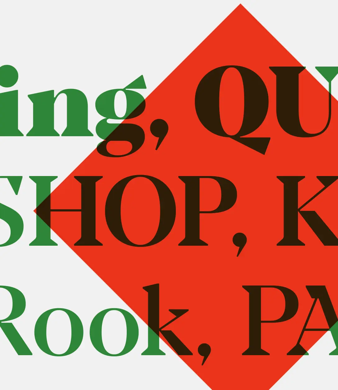
Yes, sans serif fonts are cleaner with their lack of little extras. But we may have passed the point where they feel more modern. Here are examples of great looking, modern feeling serif fonts.
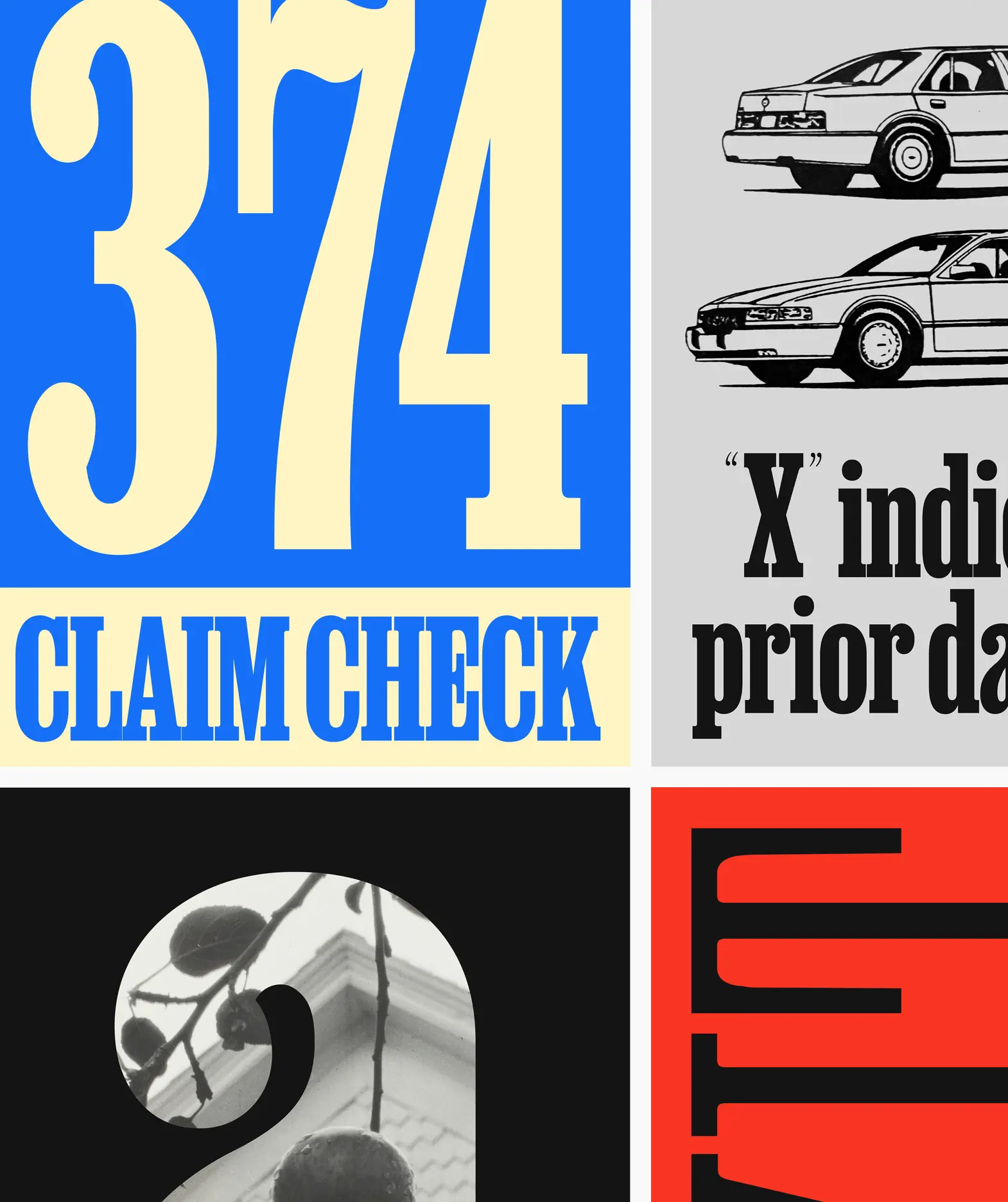
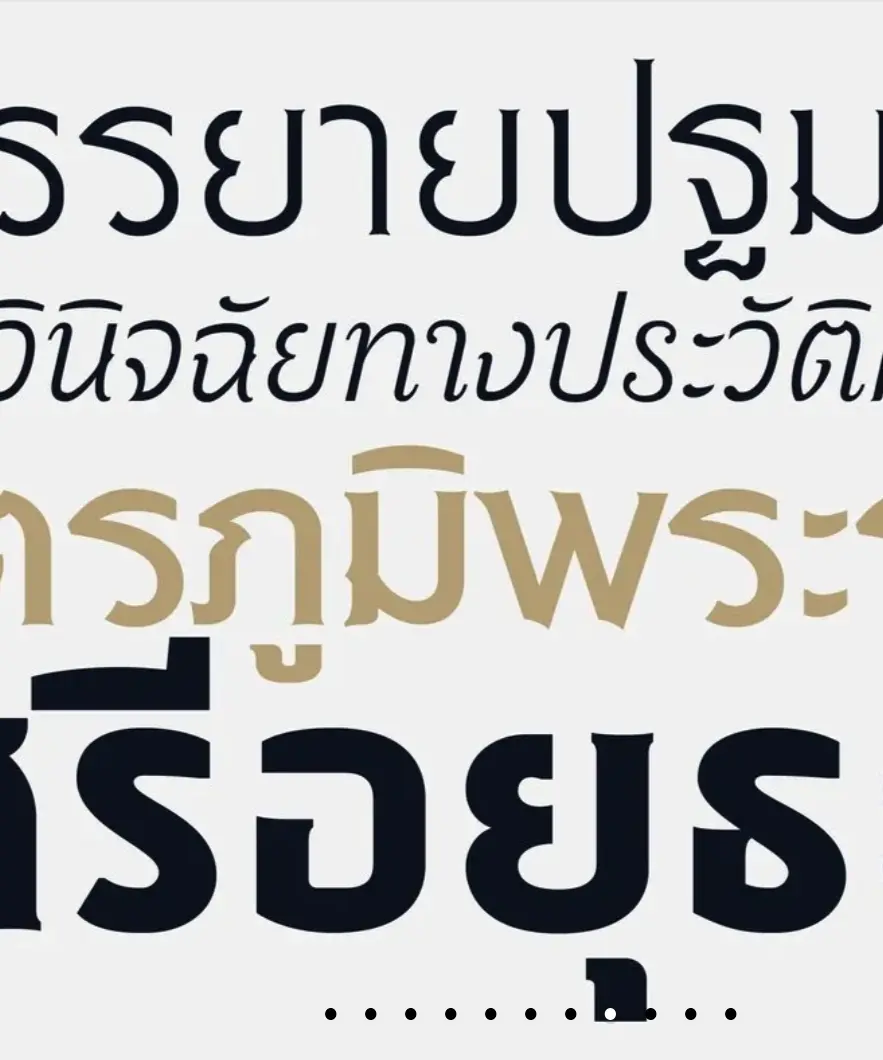
Top left: Job Clarendon Top right: Peggs Bottom left: Kibitz Bottom right: Sri Sury Wongse
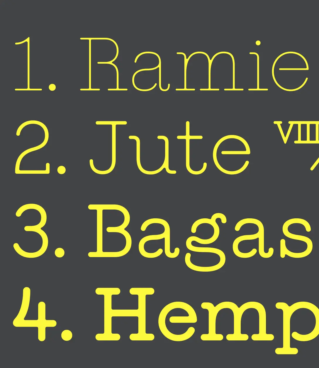
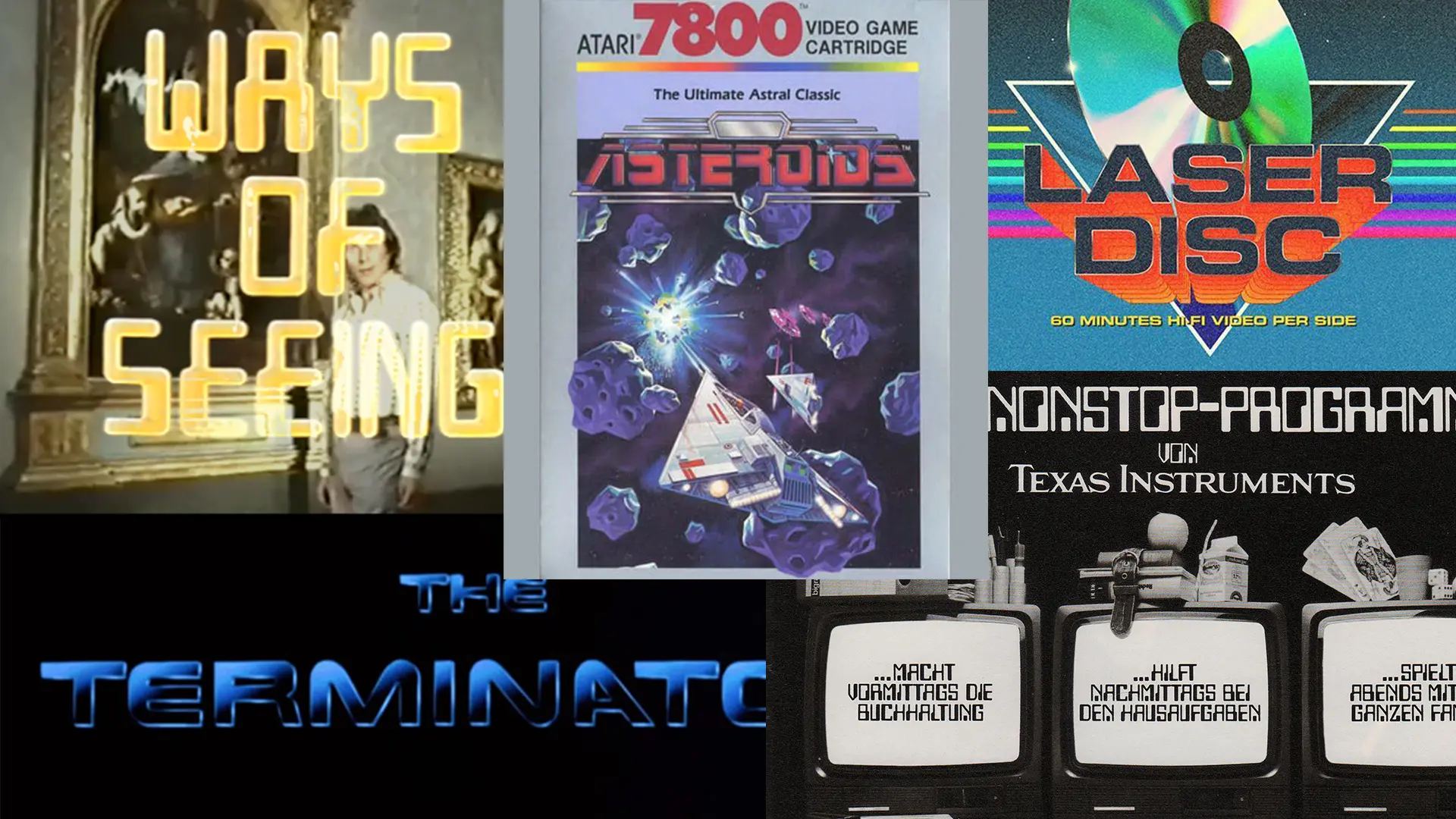
As a reminder, here is what used to pass for high tech/futuristic fonts. Do they still look like the latest in tech to you now?
As for a historical significance, it depends on what history you’re referencing. If it’s the Roman empire, then yes, a serif font like Trajan is just for you. But what if you’re referencing the Bauhaus or Victorian newspaper advertising or the 1960s? It might surprise you to find out that the first sans serif for printing was developed in 1816. Of course it existed prior to that in non-print media. We probably have the Bauhaus to thank for sans serif’s sticky association with modernity.
Masculine/Feminine
When someone uses these terms in design feedback, it’s unhelpful. You can kind of figure out what they mean, but it’s based on guessing what stereotypes a client may hold, and it’s not specific. So for example, if someone says a design feels too feminine, what they tend to mean is the colors are too soft or the shapes are too organic or it feels lighter in some way. Those are all much better, more specific ways of giving design feedback than to say it’s “too feminine” (or too masculine, same problem) because that forces the designer to be a mindreader. Masculine/feminine in design is a vast overgeneralization that gets us pink toolboxes and camo coolers.
By the way, before WWII, pink was for boys and light blue for girls. So, these concepts are far less set in stone that you might think.
Traditional/Digital
I remember when digital media was new. And at that time, in contrast, we started calling tangible media like print and outdoor and direct mail “traditional” media. In part, it was a way to distinguish what kind of media you were talking about. There was a lot of talk for a long time about how traditional media would go away. It didn’t. See here and here.
The terms themselves “traditional” and “new” are always relative to our place in time anyway. Sensing a theme in this article? There was a time when TV was new. And online ads have been around long enough you could consider them traditional. They are almost a default. But they're all simply tools in the toolbox. The vast majority of campaigns we work on today are some mix of both.
I’m proposing “physical” media and “screen” media. Physical media makes the distinction of things you can touch. It could also encompass experiences. And screen media is anything you would view on a digital screen. It tells you how the consumer will interact with it. There are so many opportunities these days to bridge physical and digital experiences for consumers anyway. There will be another “new” media down the road.
What is another concept in design that it's time to rethink?