A New Way to Think About Quiet Luxury
Expensive brands may not own quiet luxury anymore. And when restrictions lead to great work.

The idea of Quiet Luxury is unavoidable these days, and here’s an interesting article by Sam Kilb that tackles it from an intellectual property perspective.
Subtle branding involves using discreet logos, tags, or design elements that are identifiable to those who know what to look for, but are not overly conspicuous. Just because the design element is subtle doesn’t mean that it can’t be an incredibly powerful indicator of source. A classic example is the recognizable red tag on Levi’s products, a small yet distinct label that is capable of instantly communicating the brand to consumers...It doesn’t have to be a tag—some design elements, like stitching patterns, can be source-identifying and receive trademark protection provided certain requirements are met. These understated marks serve as a powerful branding tool, creating an exclusive appeal while maintaining the minimalistic ethos of quiet luxury.
But is it really only for luxury brands? He mentions Levi's in the article, which is a great example, but I didn't think of it as a luxury brand. Then I saw some work for McDonald's in Europe that also feels like quiet luxury, but it’s for McDonalds? Instead of being for the use of luxury clients alone, it seems like any brand who has stood the test of time and created iconic elements could do this.

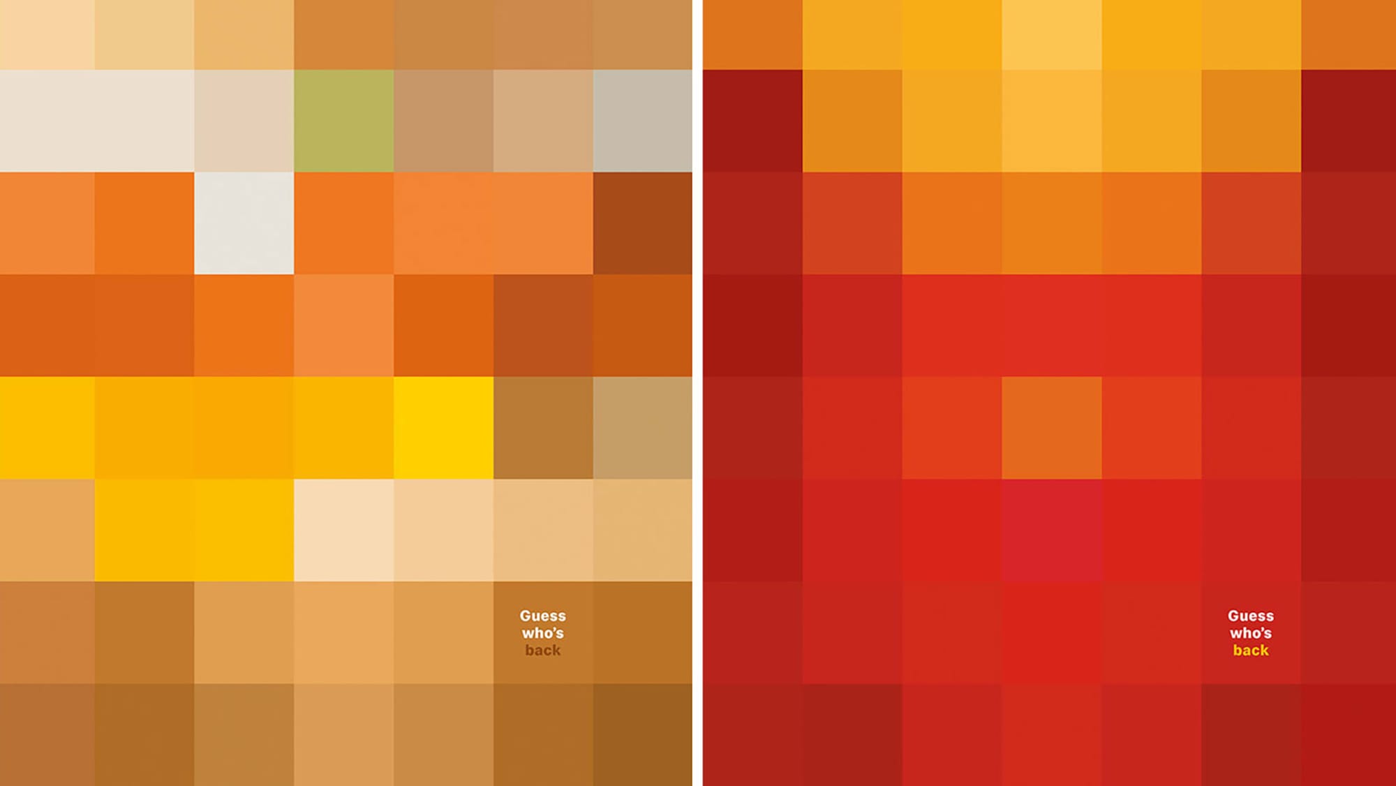
These ads have the "minimalistic ethos" of quiet luxury, but they also solve a problem. In some countries (these examples are all from Europe) there are restrictions on the kind of loud, overt advertising that companies like McDonald's tend to do here in the states. How do they get around it? Turns out that minimalism works because McDonald's has such a strong collection of iconic brand elements that translate globally.

They’re using a color palette that has become so closely related to their brand and the food itself and how that food is packaged, that there's not much need to scream McDonald's. In more mainstream spaces, is there a danger of confusion? Could people have interpreted these ads as any burger or fries? I think most of these ideas were executed site specifically, near McDonald's locations.
What might be the criteria?
This is not for newbie companies. The brand or product needs to be well established and have iconic elements that could include color, texture, packaging, details or smells. Yes, smells.
Does this diminish the luxury brand aura? It might be indicative of a larger trend that they were simply first to since luxury brands are typically well-established with iconic elements. Or maybe consumers are tired of being shouted at. Or it might turn on its head what we think of as luxury. Previously luxury has been some combo of cost and quality. Maybe an order of McDonald's fries or a pair of Levi's that fit just right are also luxuries.
Even folks that are not billionaires are much more conscious of the logos they associate themselves with these days. Everybody wants to be in a semi-exclusive club. Imagine not making the logo bigger, but removing the logo mostly? Or completely? What if instead of communicating "exclusive appeal" consumers are actually identifying with their communities. IYKYK.
Bonus Round
Since I mentioned advertising restrictions earlier, some places that have legalized cannabis have also restricted the small businesses that sell it from advertising pretty much at all. Here are the ads that solved this hurdle in a genius way.

