The Goldilocks Zone
The right amount of information at the right size for the right scale.

I want to talk about these signs I saw while sitting at a traffic light this week. Yes, there is too much information on the signs. Sort of. Because if you were holding one of these in your hand, you would be able to read the information easily. The issue is there is too much and it's too small to read two lanes of traffic away. This issue is the scale of the designs.
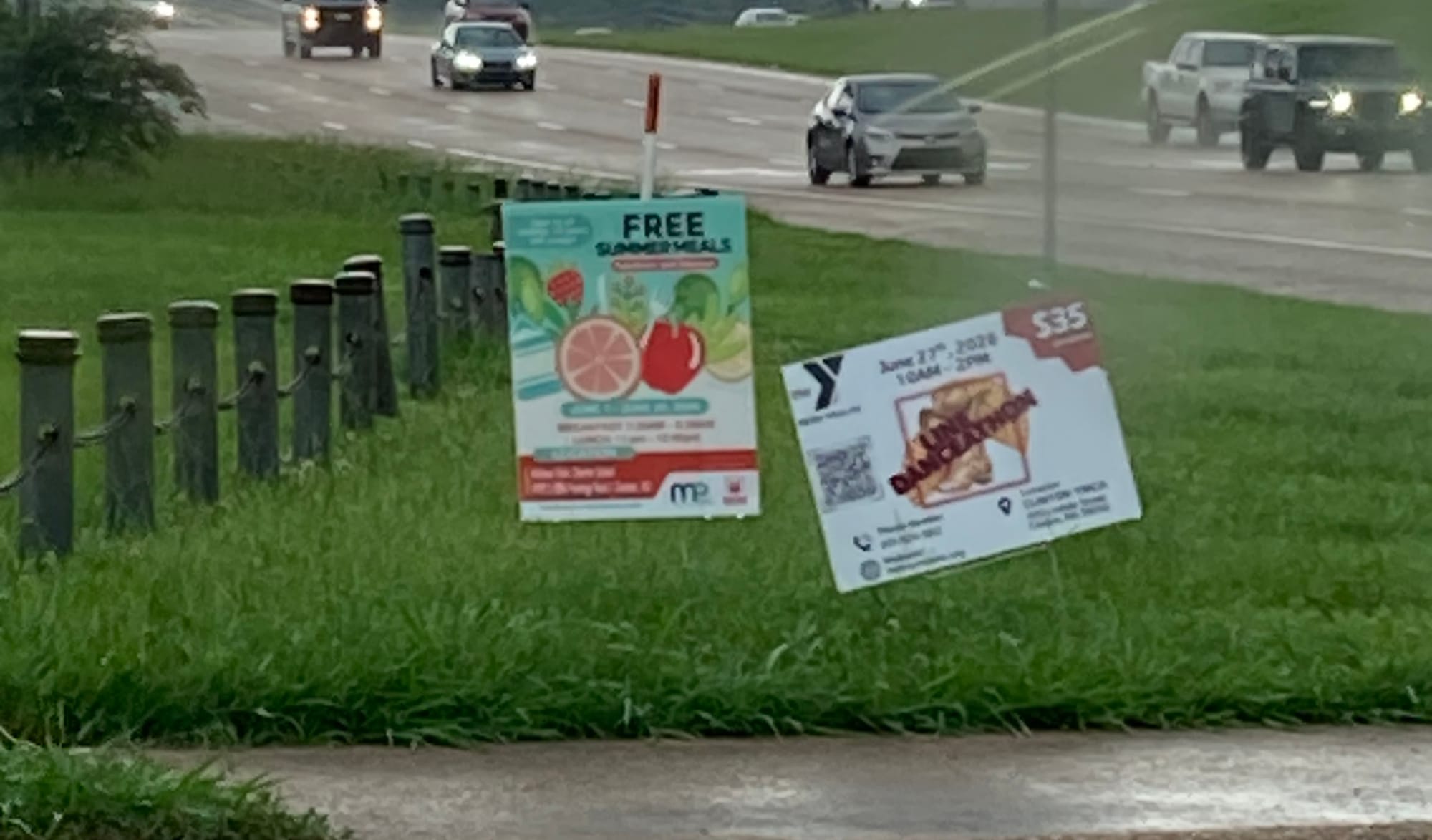
I'm not getting into fonts or colors or any of that jazz hands – only what is the appropriate design scale for the distance someone will interact with something – the design Goldilocks Zone. And it doesn't only include distance but also potentially time. Outdoor boards are a great example. You are not only at some distance, but you are also in your car speeding down the highway. Digital boards change about every 8 seconds. That's why the general rule is eleven words. And that was the rule even before time came into play with digital boards. Hate to inform you, eleven words includes contact information and logo.
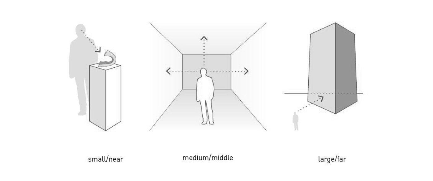
Will someone be walking by be able to stop and look closely? Are they holding it in their hands? Or do they need to read it from across the street? Can they zoom in on it? Sometimes at trade shows you need to design at multiple scales – from across the venue, and then more detail when they walk into the booth. You also see this in wayfinding. You need to be able to see the word INFORMATION from a distance, but when you walk up to it, there can be a highly detailed map.
The Obama Presidential Center is a great example of playing with this scale intentionally. From a great distance, the text on the exterior looks like an interesting pattern. From a medium distance, you can read the words and it reveals more meaning. From inside, it becomes abstraction.

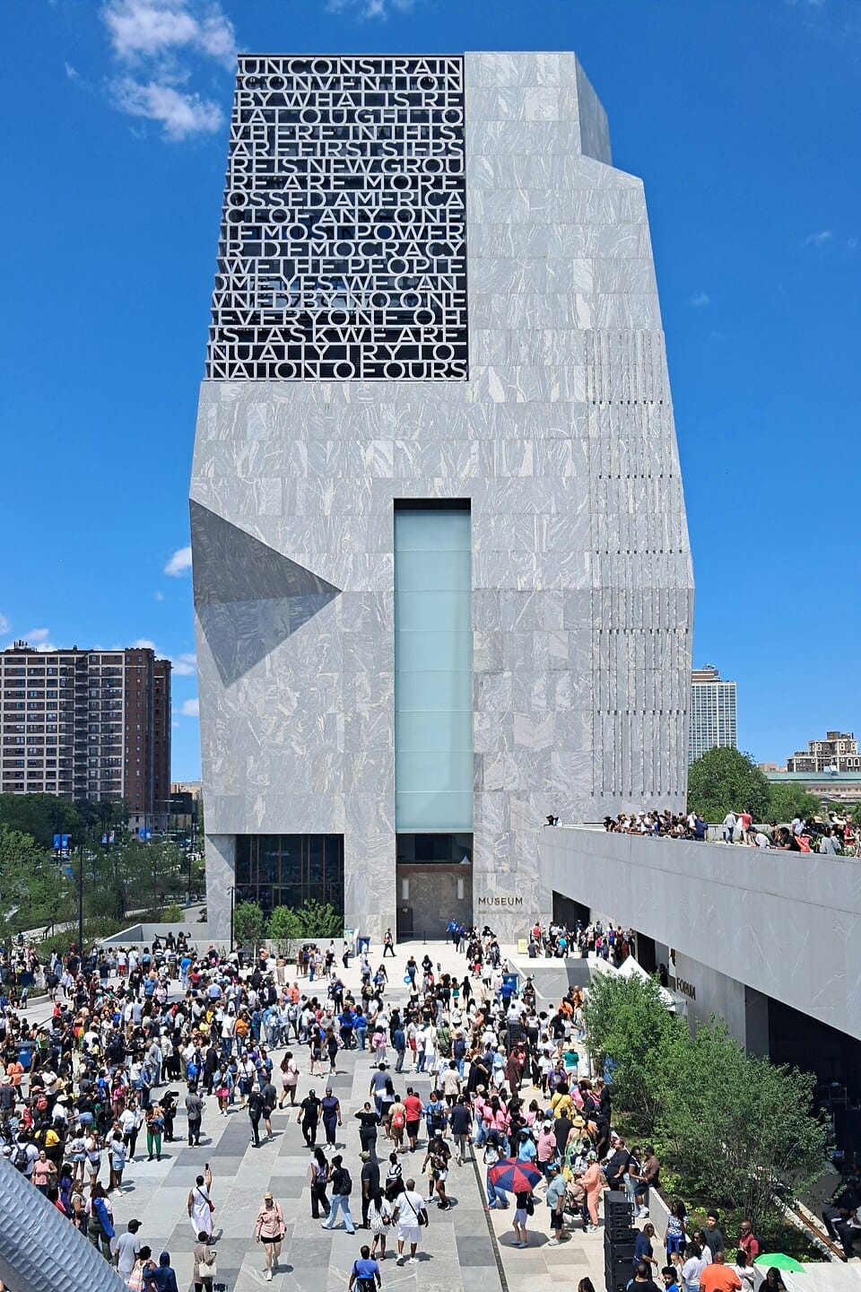

Letters as pattern Source, Letters as words Source, Letters as abstraction Source
_-_Chicago,_IL_-_June_2026.jpg)
But back to our side of the road signs. The other thing I heard recently was from IDEO U's podcast with Seth Godin. The subject was problem solving, and the question that replays in my head is:
"What are you unwilling to give up to solve the problem?"
If the road sign folks are unwilling to give up information, then they will need to give up money to make the signs larger. If they're unwilling to give up more money, then they need to give up information to solve the problem. Designers negotiate this all the time. What can I remove? What absolutely has to stay? What's in the Goldilocks Zone depends on how someone will experience it.
Telling everyone they can have it both ways all the time is a soothing fiction and a short-term win that makes our job even harder. Rarely is anyone willing to give up anything. Even if logically they know that it would be more effective that way. They're afraid they'll give up the wrong thing and somehow the world will end. Please see chart at the top of the page here. And the result is that nobody can read or pay attention to any of it anyway.