When to Break the Mold
We’re asking the wrong questions about Canva and AI.

There is a lot of love/hate these days in the design community for Canva and AI. I’ve been thinking about it, and from a design perspective, we’re asking the wrong questions. Generally, the discussion is about either designers vs. non-designers, or quality or expertise, or democratization of design, but I think the real question is when is a design template or system serving good design communication, and when is it not.
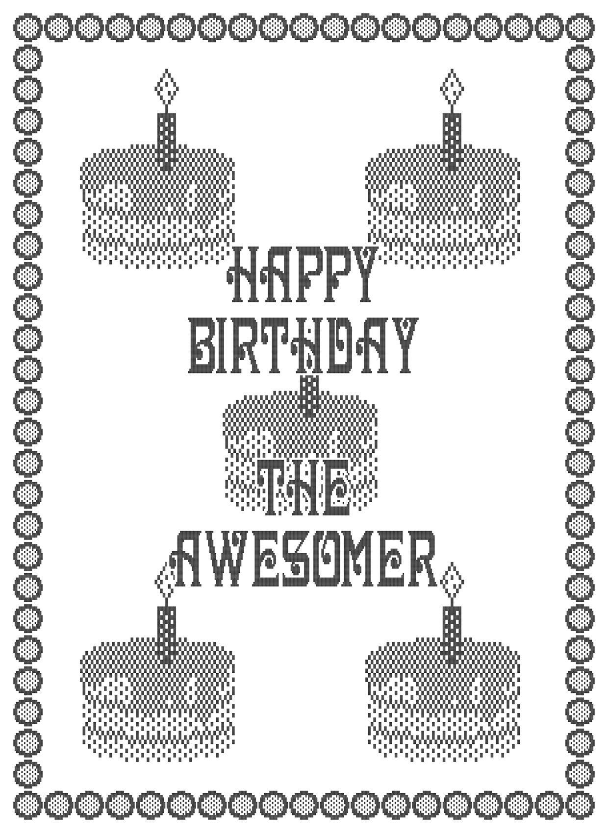
I recently went down a rabbit hole with The Print Shop. Yes, if you’re old enough, the 1984 user-friendly design software that would let you make cards, banners and flyers with your dot matrix printer. Relive it here. I never thought about it at the time, but it was the first graphic design computer program I ever used. It was meant for anyone to use, and there are limited choices. That’s what made it user-friendly for everyone and fun. There are a handful of border options, a few fonts, some clip art. Because of those limitations, anything you made with it had a distinct look. 40 years later, I can recognize it at 50 yards.

Limiting choices is also what’s good about brand standards – you are choosing to include certain design elements that signify what you want to communicate, and therefore exclude those design elements that don’t. You are creating a consistency. That’s why it works. Just like you might recognize a card made with The Print Shop, you should recognize a particular brand right away.
The downside of limited-choice or template-based programs is that it’s easy to default to the same choices everyone else is making. You see a trending template that you like, use it, and forget that tens of thousands of other people are using it too. Because it's trending. Like a card made with The Print Shop, you can recognize the look of it. Not great for your brand. Programs like InDesign don’t come pre-loaded with shapes (other than the most basic) or templates. You’re building from the ground up, and most designers prefer that.
Canva can be a great tool. You can make brand kits for folks that they can plug in and use within the system. It’s great when clients or social media directors can do some of the day-to-day stuff themselves. But otherwise, it can be easy to fall into the trap of sameness.
There have been sameness arguments circulating in the design field for years. You could call it a “trend.” But these trends originate from software constraints at least as much as the zeitgeist. If you think back to web design 10 years ago, it was the wild west. They all looked so different. Now, they all follow a pretty similar structural format – large main image with headline and CTA, scroll down to modular boxes of images, copy or some combo. On some level, this is good. It used to take ten minutes to figure out how to navigate a site. But with the growth of Wordpress templates and other site builders, sites got structurally more and more similar.
As far as AI, here’s an example of where it can fall into that trap. Amazon is rolling out AI to help with product images. Sounds great to me as someone who has wrestled with product images for Ebay and Etsy. The AI will put your product in an appropriate lifestyle setting for you. As you can see below, it looks a little weird. Sometimes the scale is way off. But the article makes a great point that when everyone is using it, everyone’s product images will just look the same again. The examples all have roughly the same lighting and basic style.
Amazon tells sellers that when products are placed in a “lifestyle context,” click-through rates “can be 40 percent higher compared to ads with standard product images.” (Like a lot of AI pitches, there’s a certain near-sightedness here. Like, what’s supposed to happen when everyone gets that 40 percent advantage? When “lifestyle context” photos are ubiquitous? Is the answer just “we’ll see”? Or maybe “it becomes more expensive to advertise on Amazon”?)
For the Designer & the Client
Any tool is a good tool in the right instance. Use design systems, templates, AI and any other automated programs where it makes sense. Where it saves time and is ethical (looking at you, AI). But don’t sacrifice brand specificity, personality and communication. Make sure you are still differentiating your brand. The systems that create sameness within the software are sneaky. Things can start to look really similar really fast.

