
Why Does the Color Look Funny?

There is no shortage of articles online explaining in depth why colors look different across different media and devices. I feel like these highly technical explanations still leave a lot of people unsatisfied. Here is my attempt at simplification.
If you have not encountered this as either a designer or client, what happens is that your designer has probably chosen a Pantone number for your special brand color. Let’s say it’s an orange. And that orange looked one way to you when you approved it on your laptop. But now that you’re viewing it on your iPhone, or you’re looking at a print out, it looks different to you. Maybe darker. Maybe more yellow. Did the designer change it at the last minute? Why wouldn’t it be the same?
Pantone is useful for serving as a standard and point of reference for anyone who uses the system. I can say Pantone 151 and the printer across the country can look in his Pantone book and look at the exact same swatch. When you pick a Pantone color, you also get a standard breakdown for RGB, CMYK and Web versions of that color that you’ll use depending on where you need to use the color.
Yes, yes, I know what you're gonna ask: Why is the color black represented by K? Some say to avoid confusion with Blue, some say because it originally referred to the Key color or plate. At any rate, K=Black.
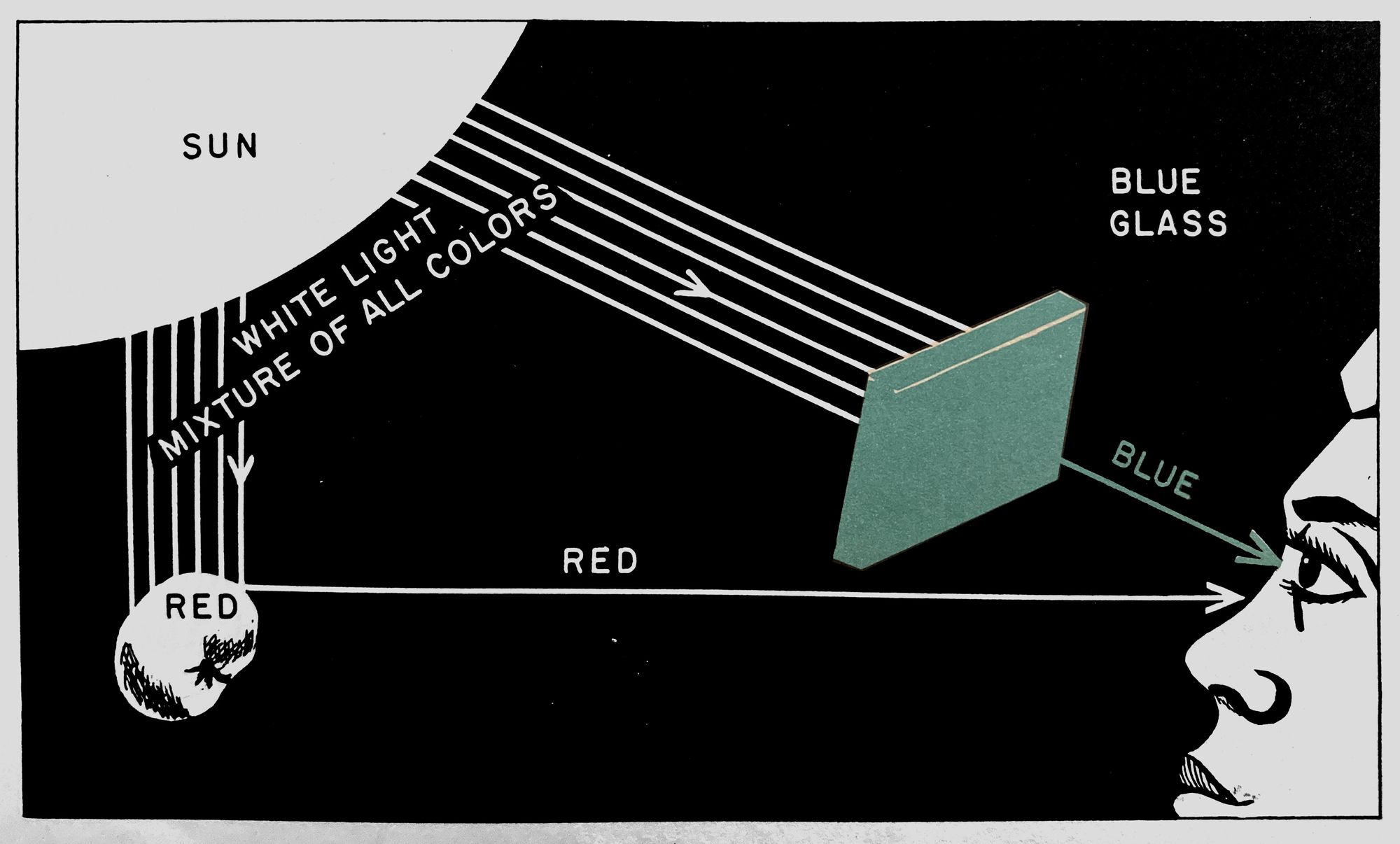
Physics
Here is where things already begin to change. Pantone determines the closest equivalents possible for those versions. So, the RGB/CMYK/Web breakdowns for Pantone 151 should in theory be consistent everywhere. But colors will not represent exactly the same in those different color spaces because they do not work the same way. Welcome to the technical world of graphic design. Generally, any CMYK color will probably be less vibrant than its RGB or Web counterpart. It’s just a limitation of the printing process and physics.
Paper & Ink
If you are printing something physical with a vendor, the paper or substrate will change how a color is perceived. Same Pantone number, but whether it's on a bright white coated paper or a grayish uncoated newsprint will make a significant difference.
Also, if you print out layouts on an office printer, this is possibly going to be the worst representation of what the color will actually be. There are a TON of variables in quality and type of ink/toner for these printers. Please, do not judge color this way.
Screens
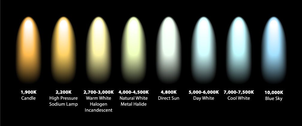
Colors will look a bit different on your laptop than on your phone. It will look different on your new phone than your three year old phone. It will look different on your TV. Have you ever bought a lightbulb for your living room and it had a nice warm glow? Then you accidentally picked up a replacement that was blue-ish or cool? You probably noticed immediately that it didn't look right. So, even light can have a color (“color temperature” for you nerds), and this affects any colors you’re viewing on top of it as on a digital screen.
For the Designer:
Bless your heart. You’ve probably run into this a ton of times. In the past, when I was dealing more with approvals on printouts, I noticed that clients would sometimes get used to the color they were seeing on the printouts rather than the Pantone swatch. Occasionally, I would opt to pick a Pantone that was close to the printout color as that would be more in line with the client’s expectations moving forward. These days, primarily using screens to present and approve, screen differences are typically the main issue. Or, physical printing where the color becomes less vibrant than they’re used to seeing on screen.
For the Client:
It’s always OK to question a color or what you’re seeing, but if your designer says it’s the Pantone 151 that you approved, understand that it can look a bit different on different screens, different papers, different printers. Your designer can possibly give you a Pantone chip that you can hold up as your color’s standard, but it will have variations. It may give you a bit more consistency to approve layouts always on the same device. If you are having something printed, you can talk to your designer or vendor about getting a "matchprint" prior to printing which will be a closer approximation of what the end result will be. Or, you can have the Pantone color “spot printed.” It will retain more vibrancy, however, it will be more expensive. Some variation in any color is expected and normal.