
Gradient Descent Into Madness
No, not THOSE gradients. Feedback gradients.

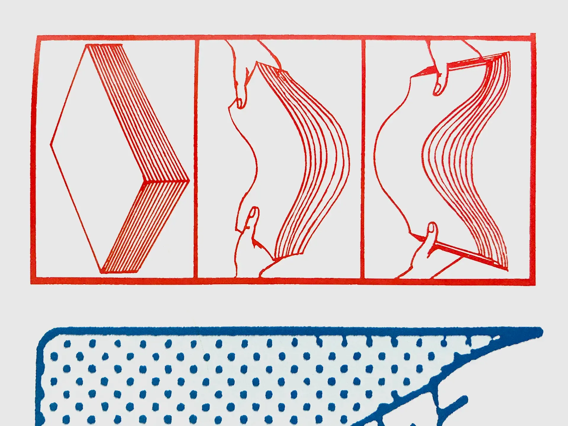
Think about the difference between these two situations. A friend reads your story and says "I'd give it 3 out of 5." That tells you the error, but not what to fix. Now imagine they say "I'd give it 3 out of 5, the middle section was confusing." That's much more useful, because it tells you which direction to change.
You'll probably read that as a designer talking about critical feedback, but it came from a different place. I am mid-way through this excellent interactive tutorial about the underlying structures that make up how modern AI works. Rob Ennals built it to explain it to his 11 year old kid. And it's been a really good layer by layer introduction to a lot of concepts I was not familiar with.
And that's where gradients come in. No, no, not the softly color shifting backgrounds that you either love or hate. In Chapter 2 – The Power of Incremental Improvement – things started feeling eerily familiar. It's actually a chapter about design feedback. And what is feedback other than incremental improvement? At least until it's not improvement.
We have all been there. We need to both 1. know the issue (what he refers to as error, which in a design space could be objective or subjective) and critically, to make any feedback actionable, we need to 2. know what to change.
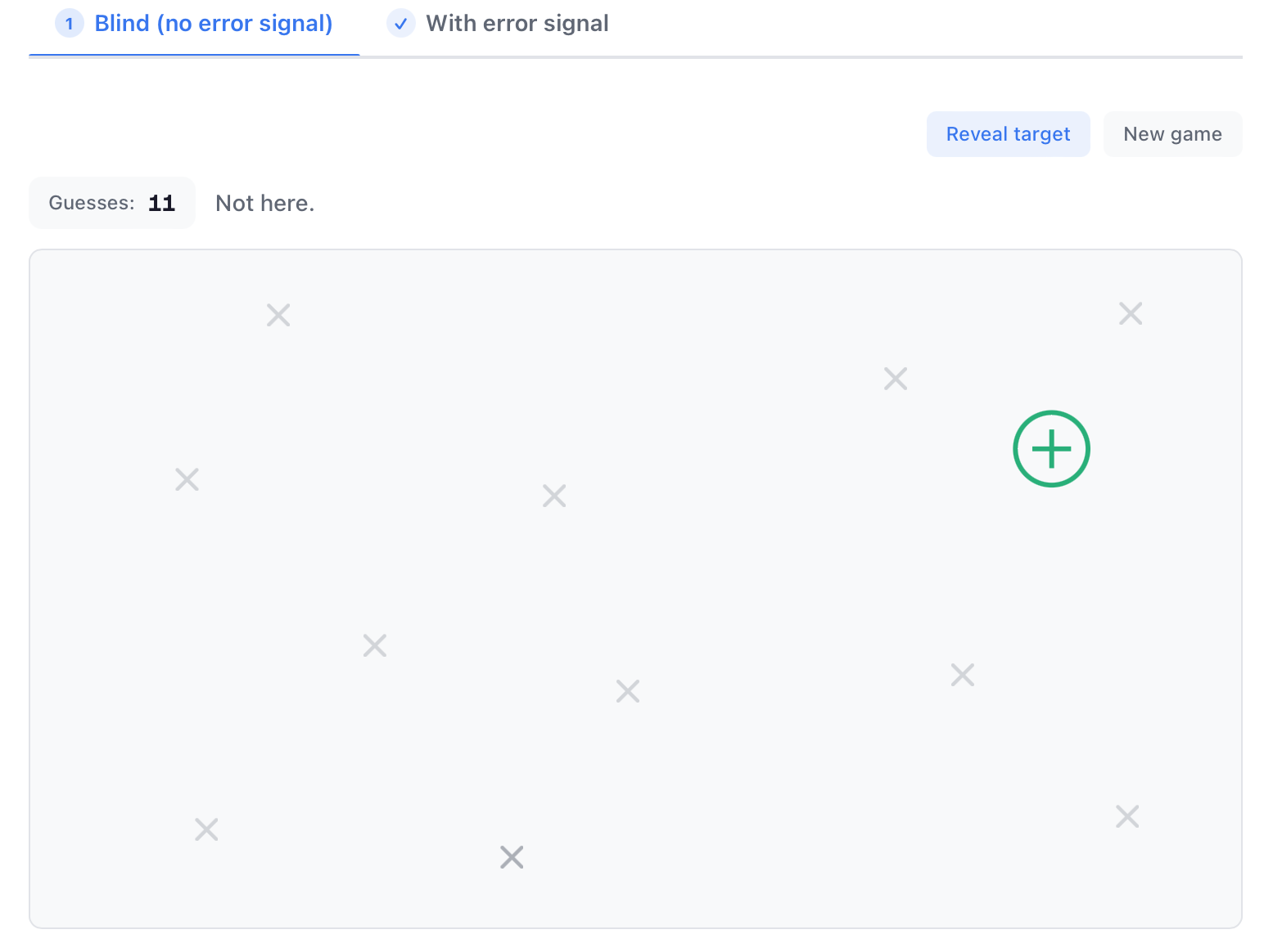
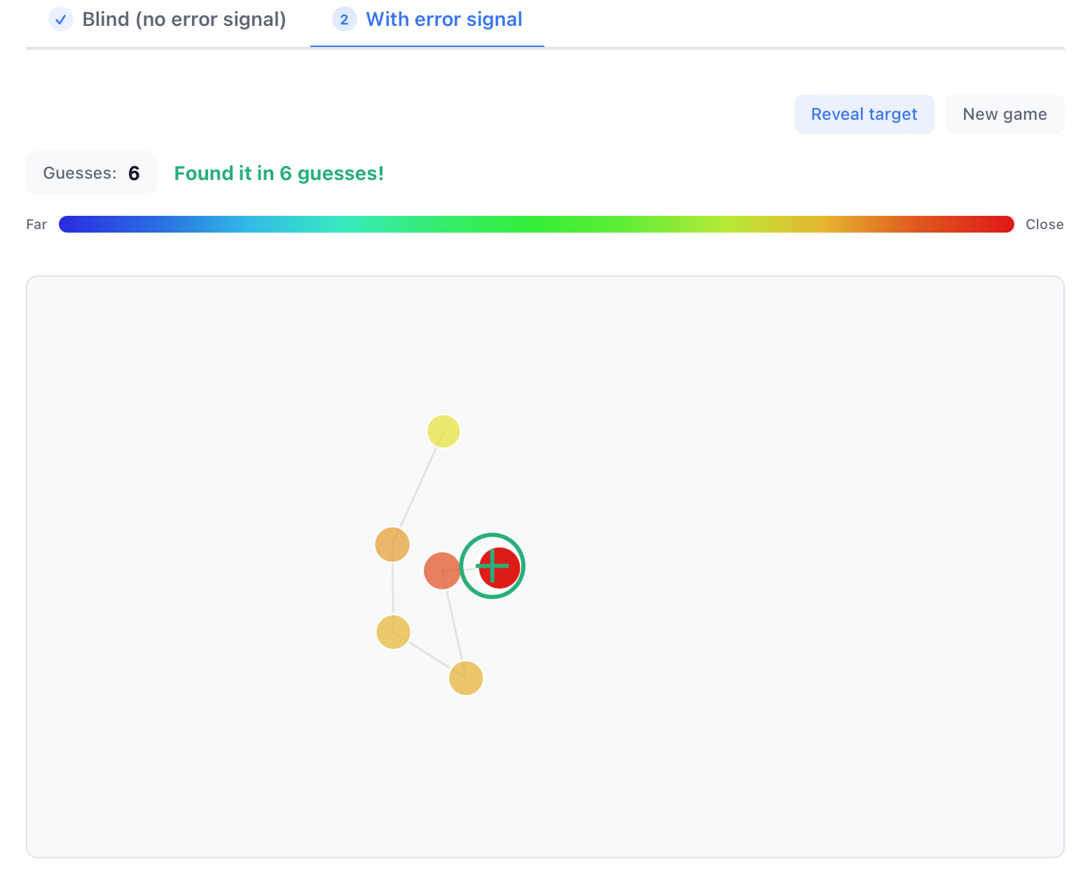
Try it yourself: Chapter 2, Search: Blind vs. Guided Source
When you have the feedback of an error signal, it's much faster to define the issue. Next time someone gives you really vague feedback, AND complains about time spent, send this to them. But once you define the issue, how do you know what action to take? Enter smooth gradients.
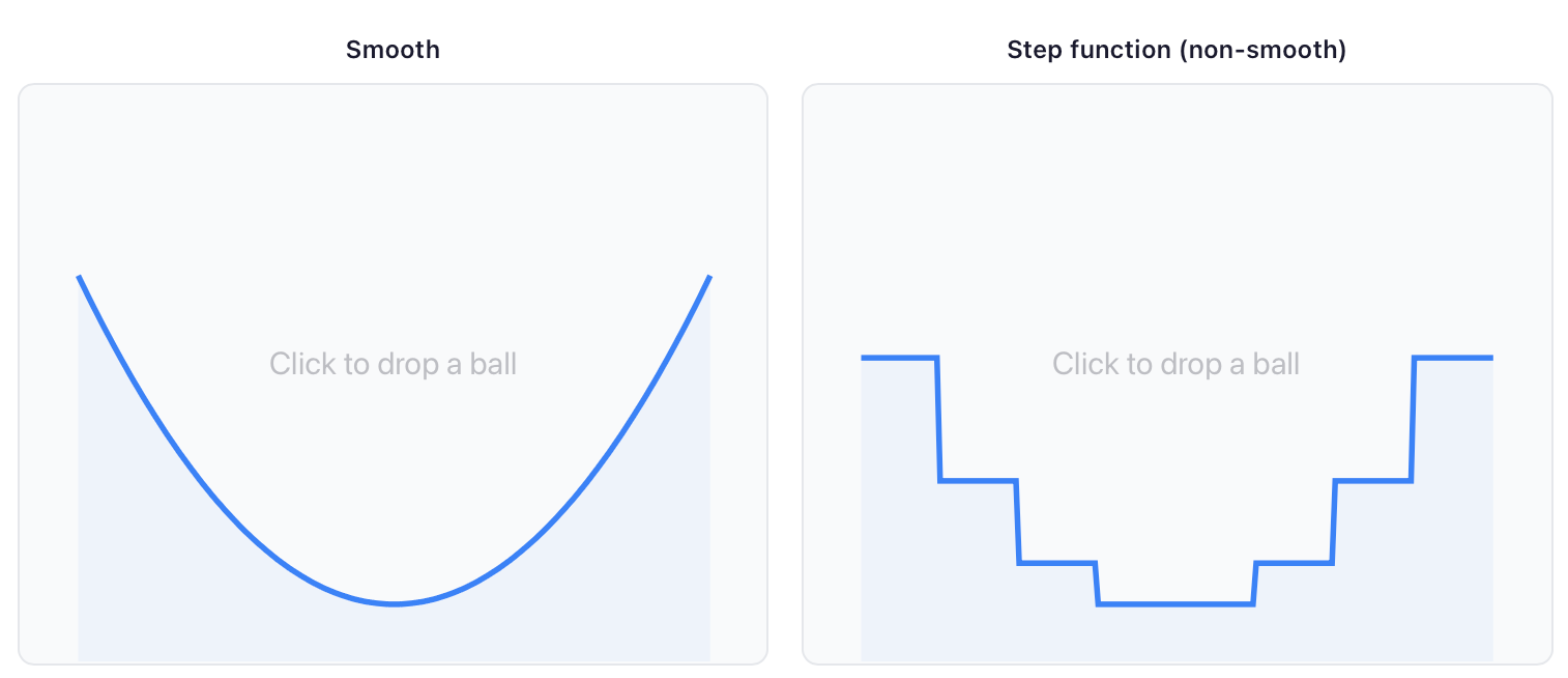
At any point on a smooth curve, you can look at the slope: the steepness right where you're standing. The slope tells you exactly which direction is downhill. Following it is called gradient descent, and it's dramatically faster than random guessing.
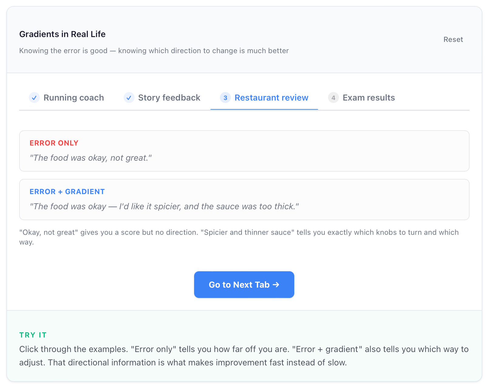
And the way to change the input is knobs. A knob refers to all the potential inputs you could dial up or down (that's another chapter). The knobs available to any design project are things like color, font, arrangement, shape, etc. Even with a huge amount of inputs, the idea of gradient descent tells you where to go.
Let's review:
You need an error signal that tells you there is an issue.
AKA
Someone says the design is close, but something is off.
Now you need a smooth gradient to figure out what direction to take.
AKA
The brief says "bold," so I think we could push the colors more.
You adjust the appropriate input knob.
AKA
Make the colors bolder.
You could start to read all this as well, AI must be pretty good at responding to design feedback then. But the knobs aren't limited to things like color and shape. The knobs are also expectation and reading the room and experience and presentation. This is more about how humans can make their feedback more useful. And maybe a more mathematical explanation of why requests like "make it pop" or "wow me" or "I just don't like it" don't work (they wouldn't work very well in your ChatXYZ either) helps it to make more sense. People still say these things.